## Line Chart: Pass Rate vs. Number of Patches
### Overview
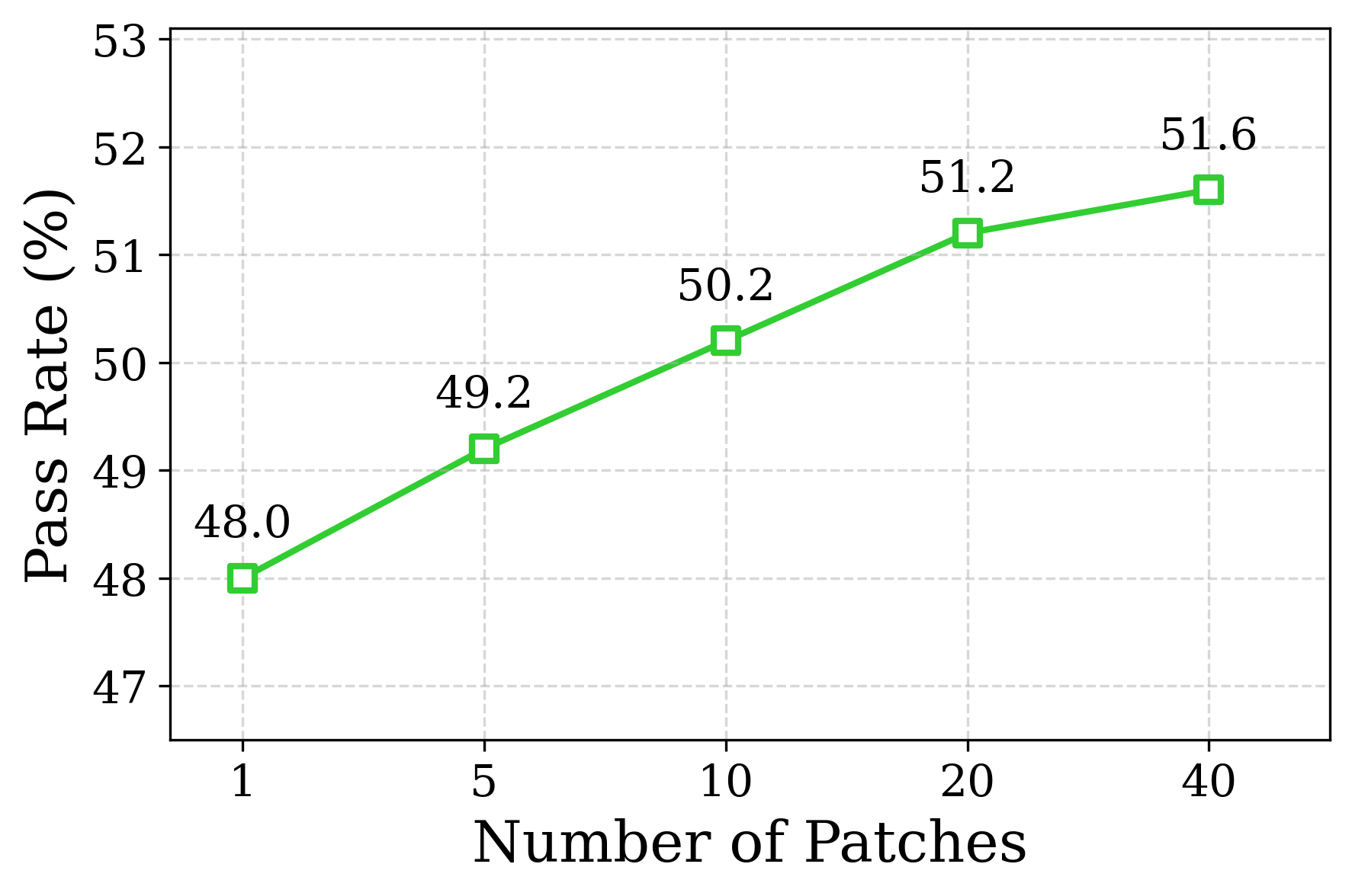
The image is a line chart showing the relationship between the number of patches and the pass rate (in percentage). The x-axis represents the number of patches, and the y-axis represents the pass rate. The chart displays a generally upward trend, indicating that the pass rate increases as the number of patches increases.
### Components/Axes
* **X-axis:** Number of Patches, with markers at 1, 5, 10, 20, and 40.
* **Y-axis:** Pass Rate (%), with markers from 47 to 53, incrementing by 1.
* **Data Series:** A single green line with square markers representing the pass rate at different numbers of patches.
### Detailed Analysis
The green line represents the pass rate. The data points are as follows:
* At 1 patch, the pass rate is 48.0%.
* At 5 patches, the pass rate is 49.2%.
* At 10 patches, the pass rate is 50.2%.
* At 20 patches, the pass rate is 51.2%.
* At 40 patches, the pass rate is 51.6%.
The line slopes upward, indicating a positive correlation between the number of patches and the pass rate.
### Key Observations
The pass rate increases with the number of patches. The rate of increase appears to slow down as the number of patches increases, particularly between 20 and 40 patches.
### Interpretation
The chart suggests that increasing the number of patches generally improves the pass rate. However, the diminishing returns observed between 20 and 40 patches indicate that there may be a point beyond which adding more patches provides minimal improvement. This could be due to factors such as increased complexity or redundancy introduced by excessive patching. The data implies that there may be an optimal number of patches to maximize the pass rate without incurring unnecessary overhead.