## Line Chart: Pass Rate vs. Number of Patches
### Overview
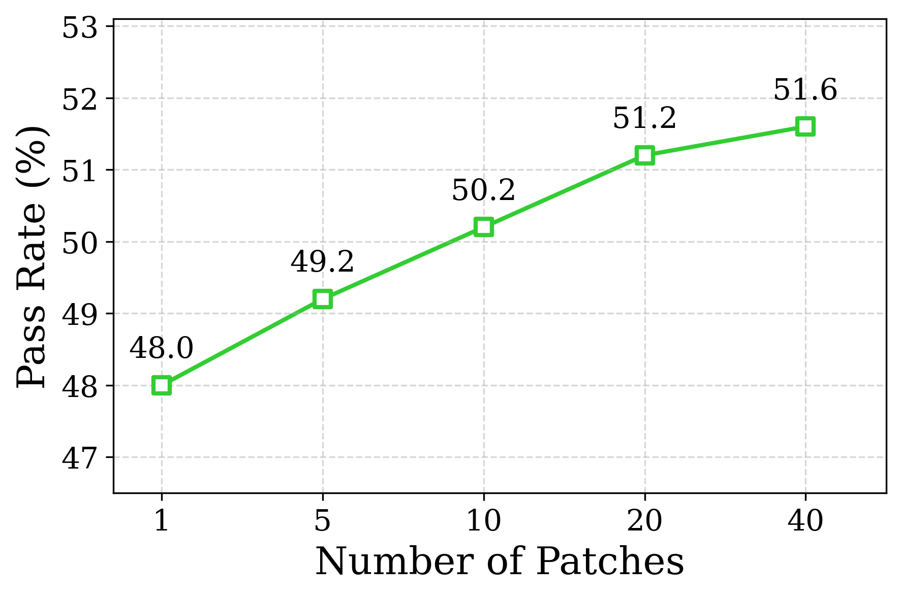
The image displays a line chart illustrating the relationship between the "Number of Patches" (x-axis) and the "Pass Rate (%)" (y-axis). The chart shows a single, positively sloping trend line, indicating that as the number of patches increases, the pass rate also increases. The data points are explicitly labeled with their exact percentage values.
### Components/Axes
* **Chart Type:** Line chart with square data point markers.
* **X-Axis (Horizontal):**
* **Label:** "Number of Patches"
* **Scale:** Non-linear, categorical. The marked tick values are: 1, 5, 10, 20, 40.
* **Y-Axis (Vertical):**
* **Label:** "Pass Rate (%)"
* **Scale:** Linear, ranging from 47 to 53. Major gridlines are at intervals of 1% (47, 48, 49, 50, 51, 52, 53).
* **Data Series:**
* A single series represented by a solid green line connecting square markers.
* **Legend:** Not present. The single series is self-evident.
* **Grid:** A light gray dashed grid is present for both major x and y axis ticks.
### Detailed Analysis
The chart plots five distinct data points. The trend is consistently upward, with the slope of the line gradually decreasing as the number of patches increases.
**Data Points (Number of Patches, Pass Rate %):**
1. (1, 48.0)
2. (5, 49.2)
3. (10, 50.2)
4. (20, 51.2)
5. (40, 51.6)
**Trend Verification:**
The green line slopes upward from left to right across all data points, confirming a positive correlation. The increase between points is as follows:
* From 1 to 5 patches: +1.2%
* From 5 to 10 patches: +1.0%
* From 10 to 20 patches: +1.0%
* From 20 to 40 patches: +0.4%
### Key Observations
1. **Positive Correlation:** There is a clear, monotonic increase in pass rate as the number of patches grows.
2. **Diminishing Returns:** The rate of improvement slows significantly at higher patch counts. The gain from 20 to 40 patches (+0.4%) is less than half the gain from 10 to 20 patches (+1.0%).
3. **Non-Linear X-Axis:** The x-axis uses a non-linear scale (1, 5, 10, 20, 40), which visually compresses the space between higher values. This emphasizes the performance gains at lower patch counts.
4. **Explicit Labeling:** Each data point is precisely labeled, removing ambiguity in reading the y-axis values.
### Interpretation
The data suggests that increasing the "Number of Patches" is an effective strategy for improving the "Pass Rate." This could relate to a technical process where applying more patches (e.g., code fixes, data samples, or model adjustments) leads to higher success or completion rates.
The most significant gains are achieved with the initial increases in patches (from 1 to 10). The curve begins to plateau after 20 patches, indicating a point of diminishing returns where adding more patches yields progressively smaller improvements. This pattern is common in optimization scenarios, suggesting that while more patches are beneficial, there is an optimal range (likely between 10 and 20 patches) where the cost/benefit ratio is most favorable. The chart does not provide context on what "patches" or "pass rate" specifically refer to, but the quantitative relationship is clearly demonstrated.