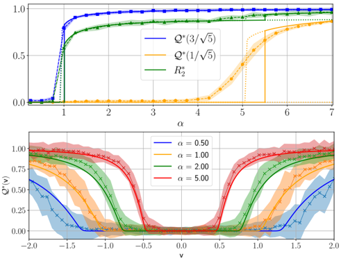
## Line Graphs: Performance Metrics vs. Parameter α and Distribution of Q*(v)
### Overview
The image contains two vertically stacked plots. The top plot shows the relationship between a parameter `α` and three performance metrics (`Q*` and `R₂`). The bottom plot shows the distribution of a function `Q*(v)` across a variable `v` for four distinct values of `α`. The plots appear to be from a scientific or technical paper, likely related to statistics, machine learning, or signal processing.
### Components/Axes
**Top Plot:**
* **X-axis:** Label is `α`. Scale is linear, ranging from 0 to 7, with major ticks at every integer.
* **Y-axis:** Label is `Q*`. Scale is linear, ranging from 0.0 to 1.0, with major ticks at 0.0, 0.5, and 1.0.
* **Legend:** Located in the top-right quadrant. Contains three entries:
1. `Q*(3/√5)` - Represented by a solid blue line.
2. `Q*(1/√5)` - Represented by a solid orange line.
3. `R₂` - Represented by a solid green line.
* **Additional Elements:** Each solid line has a corresponding dashed line of the same color, which appears to be a theoretical or asymptotic reference.
**Bottom Plot:**
* **X-axis:** Label is `v`. Scale is linear, ranging from -2.0 to 2.0, with major ticks at intervals of 0.5.
* **Y-axis:** Label is `Q*(v)`. Scale is linear, ranging from 0.00 to 1.00, with major ticks at 0.00, 0.50, and 1.00.
* **Legend:** Located in the top-right quadrant. Contains four entries, each corresponding to a different value of `α`:
1. `α = 0.50` - Blue line with a light blue shaded region.
2. `α = 1.00` - Orange line with a light orange shaded region.
3. `α = 2.00` - Green line with a light green shaded region.
4. `α = 5.00` - Red line with a light red shaded region.
* **Additional Elements:** The shaded regions around each solid line likely represent confidence intervals, standard deviations, or some measure of variance.
### Detailed Analysis
**Top Plot Analysis (Q* vs. α):**
* **Trend for `Q*(3/√5)` (Blue):** The curve exhibits a sharp, sigmoidal increase. It starts near 0 for `α < 0.8`, rises steeply between `α ≈ 0.8` and `α ≈ 1.2`, and then plateaus very close to 1.0 for `α > 1.5`. The dashed blue line follows a similar but slightly delayed step-like path.
* **Trend for `R₂` (Green):** This curve also shows a sigmoidal increase but is less steep than the blue curve. It begins rising around `α ≈ 0.9`, crosses 0.5 at approximately `α ≈ 1.1`, and approaches 1.0 asymptotically, reaching ~0.95 by `α = 7`. The dashed green line is a horizontal line at y=1.0, suggesting it's an upper bound or ideal value.
* **Trend for `Q*(1/√5)` (Orange):** This curve has the most gradual increase. It remains near 0 until `α ≈ 3.5`, then rises steadily, crossing 0.5 at approximately `α ≈ 5.2`, and reaches about 0.85 by `α = 7`. The dashed orange line shows a sharp step increase at `α ≈ 5.5`.
**Bottom Plot Analysis (Q*(v) vs. v):**
* **General Shape:** All four curves are symmetric bell-shaped distributions centered at `v = 0`. The shaded regions indicate the spread or uncertainty around the mean curve.
* **Effect of α:**
* `α = 0.50` (Blue): The distribution is the widest and shortest. The peak at `v=0` is approximately 0.60. The curve decays slowly, reaching near zero around `v = ±1.5`.
* `α = 1.00` (Orange): The distribution is narrower and taller than for α=0.50. The peak is approximately 0.85.
* `α = 2.00` (Green): The distribution is significantly narrower. The peak is very close to 1.00. The curve decays rapidly, approaching zero around `v = ±0.7`.
* `α = 5.00` (Red): This is the narrowest and tallest distribution. The peak is essentially 1.00, forming a sharp, almost rectangular peak between `v = -0.2` and `v = 0.2`, before dropping off steeply.
### Key Observations
1. **Performance Hierarchy:** In the top plot, for any given `α > 1`, the metric `Q*(3/√5)` outperforms `R₂`, which in turn outperforms `Q*(1/√5)`. The performance gap is largest at intermediate `α` values (e.g., α=4).
2. **Phase Transition:** The top plot shows clear phase-transition-like behavior, especially for the blue curve, where performance jumps from near-zero to near-maximum over a very small range of `α`.
3. **α Controls Precision:** The bottom plot demonstrates that the parameter `α` directly controls the "sharpness" or precision of the function `Q*(v)`. Higher `α` leads to a more concentrated, higher-amplitude response centered at `v=0`.
4. **Symmetry:** The perfect symmetry of the bottom plots around `v=0` suggests the underlying process or function is even (i.e., `Q*(v) = Q*(-v)`).
### Interpretation
These plots likely illustrate the performance and behavior of a statistical estimator, a signal detection metric, or a kernel function as a function of a tuning parameter `α`.
* **Top Plot Interpretation:** This shows how different performance metrics (`Q*` under different conditions and `R₂`) improve as the parameter `α` increases. `α` could represent signal-to-noise ratio, sample size, or model complexity. The sharp rise indicates a critical threshold where the system transitions from failure to success. The dashed lines represent theoretical limits or approximations, showing where the empirical results (solid lines) converge.
* **Bottom Plot Interpretation:** This reveals the mechanism behind the top plot's trends. `Q*(v)` appears to be a response function or a likelihood function. As `α` increases, this function becomes more selective (narrower) and confident (taller peak). A higher `α` means the system is better at distinguishing or responding to signals at `v=0` while suppressing responses to `v` values away from zero. This increased selectivity and confidence directly translates to the higher performance metrics observed in the top plot.
* **Relationship Between Plots:** The two plots are intrinsically linked. The bottom plot explains *why* the metrics in the top plot improve with `α`. The sharpening of the `Q*(v)` distribution (bottom) leads to better discrimination or estimation accuracy, which is quantified by the rising `Q*` and `R₂` values (top). The specific curves `Q*(3/√5)` and `Q*(1/√5)` in the top plot likely correspond to evaluating the `Q*(v)` function from the bottom plot at specific, fixed values of `v` (namely `v = 3/√5 ≈ 1.34` and `v = 1/√5 ≈ 0.45`). The blue curve (`v=1.34`) rises later because it takes a higher `α` for the narrowing distribution in the bottom plot to have significant value at that farther distance from the center.