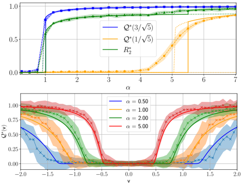
## Chart: Performance Metrics vs. Parameters
### Overview
The image contains two charts. The top chart displays three curves representing performance metrics (Q*(3/sqrt(5)), Q*(1/sqrt(5)), and R₂) plotted against a parameter α (alpha). The bottom chart shows Q* values plotted against another parameter ν (nu) for different values of α (0.50, 1.00, 2.00, and 5.00). Both charts use a line plot with shaded areas to indicate uncertainty or range.
### Components/Axes
**Top Chart:**
* **X-axis:** α (alpha), ranging from approximately 0 to 7.
* **Y-axis:** Performance metric value, ranging from 0 to 1.
* **Legend:** Located in the top-right corner.
* Blue line: Q*(3/sqrt(5))
* Orange line: Q*(1/sqrt(5))
* Green line: R₂
**Bottom Chart:**
* **X-axis:** ν (nu), ranging from approximately -2.0 to 2.0.
* **Y-axis:** Q* value, ranging from 0 to 1.0.
* **Legend:** Located in the top-left corner.
* Blue line: α = 0.50
* Orange line: α = 1.00
* Yellow line: α = 2.00
* Red line: α = 5.00
### Detailed Analysis or Content Details
**Top Chart:**
* **Q*(3/sqrt(5)) (Blue Line):** The line starts at approximately 0 at α = 0, rapidly increases to approximately 0.8 by α = 1, and then plateaus around 0.95-1.0 for α > 2.
* **Q*(1/sqrt(5)) (Orange Line):** The line remains close to 0 until approximately α = 5, where it begins to increase rapidly, reaching approximately 0.6 by α = 6.5.
* **R₂ (Green Line):** The line starts at approximately 0 at α = 0, increases rapidly to approximately 0.8 by α = 1, and then plateaus around 0.9-1.0 for α > 2.
**Bottom Chart:**
* **α = 0.50 (Blue Line):** The curve exhibits a minimum value of approximately 0 at ν = -1.5 and ν = 1.5, with peaks around ν = 0, reaching a maximum value of approximately 0.8.
* **α = 1.00 (Orange Line):** The curve exhibits a minimum value of approximately 0 at ν = -1.5 and ν = 1.5, with peaks around ν = 0, reaching a maximum value of approximately 0.9.
* **α = 2.00 (Yellow Line):** The curve exhibits a minimum value of approximately 0 at ν = -1.5 and ν = 1.5, with peaks around ν = 0, reaching a maximum value of approximately 0.95.
* **α = 5.00 (Red Line):** The curve exhibits a minimum value of approximately 0 at ν = -1.5 and ν = 1.5, with peaks around ν = 0, reaching a maximum value of approximately 1.0.
### Key Observations
* In the top chart, Q*(3/sqrt(5)) and R₂ exhibit similar behavior, reaching a plateau quickly as α increases. Q*(1/sqrt(5)) increases much more slowly and only starts to rise significantly at higher values of α.
* In the bottom chart, the shape of the Q* curve changes with α. As α increases, the peaks become sharper and the minimum values approach 0 more closely. The maximum Q* value also increases with α.
* The shaded areas in both charts indicate uncertainty or variability in the data.
### Interpretation
The charts likely represent the performance of a system or algorithm as a function of two parameters, α and ν. The top chart shows how different performance metrics respond to changes in α. The rapid increase and plateau of Q*(3/sqrt(5)) and R₂ suggest that these metrics quickly reach a saturation point as α increases. The slower increase of Q*(1/sqrt(5)) indicates that it is more sensitive to changes in α at higher values.
The bottom chart demonstrates how the performance (Q*) changes with ν for different values of α. The curves suggest that the optimal value of ν is around 0, and that the performance is highly dependent on α. Higher values of α lead to sharper peaks and better overall performance.
The presence of shaded areas suggests that the results are not deterministic and may be subject to noise or variability. The charts provide valuable insights into the behavior of the system and can be used to optimize the values of α and ν to achieve the desired performance. The relationship between α and ν is complex, and the charts highlight the trade-offs involved in choosing different parameter settings.