## Pie Chart: Percentage Distribution
### Overview
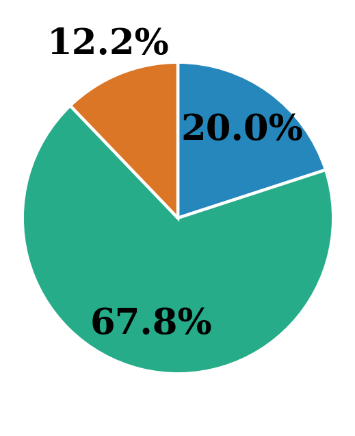
The image displays a simple pie chart divided into three segments, each labeled with a percentage value. The chart has no title, legend, or categorical labels, presenting only the proportional distribution of three unnamed categories.
### Components/Axes
* **Chart Type:** Pie Chart.
* **Segments:** Three distinct segments, differentiated by color.
* **Labels:** Each segment contains a numerical percentage label.
* **Legend:** None present.
* **Title:** None present.
* **Spatial Layout:** The chart is centered on a white background. The segments are arranged clockwise from the top.
### Detailed Analysis
The chart is composed of the following three segments, listed clockwise starting from the top-right:
1. **Blue Segment (Top-Right Quadrant):**
* **Color:** Medium blue.
* **Label:** "20.0%"
* **Approximate Size:** Represents one-fifth of the total circle.
2. **Orange Segment (Top-Left Quadrant):**
* **Color:** Burnt orange.
* **Label:** "12.2%"
* **Approximate Size:** The smallest segment, representing roughly one-eighth of the total.
3. **Green Segment (Bottom Half):**
* **Color:** Teal green.
* **Label:** "67.8%"
* **Approximate Size:** The dominant segment, occupying more than two-thirds of the entire chart area.
**Data Verification:** The sum of the labeled percentages is 20.0% + 12.2% + 67.8% = 100.0%, confirming the chart represents a complete whole.
### Key Observations
* **Dominant Category:** The green segment (67.8%) is overwhelmingly the largest, indicating a clear majority share.
* **Minority Categories:** The blue (20.0%) and orange (12.2%) segments together constitute the remaining 32.2%, with the orange segment being the smallest minority.
* **Missing Context:** The chart provides no information about what the categories represent (e.g., market share, survey responses, budget allocation). The data is purely numerical and proportional.
### Interpretation
This pie chart visually communicates a **highly skewed distribution** among three unnamed entities. The primary insight is the existence of a dominant majority (green, ~68%) and two smaller minorities (blue ~20%, orange ~12%).
**What the data suggests:** Without categorical labels, the data's meaning is abstract. However, the structure implies a scenario where one option, group, or outcome is significantly more prevalent than the other two combined. This could represent:
* A market with one leading product and two smaller competitors.
* The results of a vote or poll with a clear winner.
* The composition of a whole (like a budget or resource pool) where one component consumes the vast majority.
**Notable Anomalies:** The complete absence of a title, legend, or category names is the most significant anomaly. This renders the chart illustrative of a *type* of distribution but useless for conveying specific, actionable information. It functions as a template or a generic example of proportional data.
**Peircean Investigative Reading:** The chart is an **icon** (it resembles a pie chart) and an **index** (it points to the existence of a three-part whole). However, it fails as a **symbol** because the symbols (colors, segments) are not mapped to specific meanings. The viewer can deduce the *relationship* between the parts (one is large, two are small) but not the *identity* of the parts. The chart's value is in demonstrating a lopsided proportional relationship, not in communicating specific facts.