## Chart Type: Pie Chart
### Overview
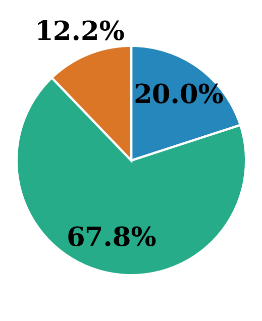
The image is a pie chart displaying three categories with their respective percentages. The categories are represented by different colors: blue, orange, and green. The green category occupies the largest portion of the pie, followed by blue, and then orange.
### Components/Axes
* **Categories:** The pie chart is divided into three categories, each represented by a different color.
* **Percentages:** Each category is labeled with a percentage value indicating its proportion of the whole.
* **Colors:** The colors used are blue, orange, and green.
### Detailed Analysis
* **Blue Category:** Located in the top-right quadrant, representing 20.0% of the pie.
* **Orange Category:** Located in the top-left quadrant, representing 12.2% of the pie.
* **Green Category:** Occupies the majority of the pie chart, located in the bottom half, representing 67.8% of the pie.
### Key Observations
* The green category is the largest, accounting for over two-thirds of the pie chart.
* The orange category is the smallest, representing only 12.2% of the pie chart.
* The blue category represents a fifth of the pie chart.
### Interpretation
The pie chart visually represents the distribution of a whole into three parts. The green category dominates, suggesting it represents the largest portion of whatever is being measured. The orange category is the smallest, indicating it represents the smallest portion. The blue category falls in between. Without further context, it's impossible to determine what these categories represent, but the chart clearly shows their relative proportions.