\n
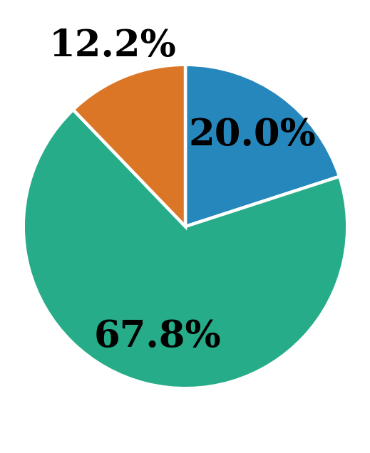
## Pie Chart: Percentage Distribution
### Overview
The image presents a pie chart illustrating the distribution of percentages across three categories. The chart is visually divided into three segments, each representing a different percentage of the whole.
### Components/Axes
The chart lacks explicit axis labels or a formal legend. The percentages are directly labeled on each segment. The segments are differentiated by color: teal, blue, and orange.
### Detailed Analysis
The pie chart displays the following data:
* **Teal Segment:** Represents 67.8% of the total. This segment occupies the largest portion of the pie chart, positioned at the bottom.
* **Blue Segment:** Represents 20.0% of the total. This segment is positioned at the top.
* **Orange Segment:** Represents 12.2% of the total. This segment is positioned to the top-right.
The sum of the percentages is 67.8% + 20.0% + 12.2% = 100.0%, confirming that the chart represents a complete distribution.
### Key Observations
The teal segment dominates the distribution, representing a significant majority (67.8%) of the whole. The blue segment represents a substantial minority (20.0%), while the orange segment represents the smallest portion (12.2%).
### Interpretation
The data suggests a highly skewed distribution, where one category (represented by teal) is significantly more prevalent than the other two. This could represent a variety of scenarios, such as market share, demographic breakdown, or resource allocation. Without further context, it is difficult to determine the specific meaning of the data. The large difference between the teal segment and the other two suggests a strong dominance of the category it represents. The chart effectively visualizes the relative proportions of each category, highlighting the disparity in their contributions to the whole.