# Technical Data Extraction: Test-time Search Against a PRM Verifier
This document provides a comprehensive extraction of the data and trends presented in the provided image, which contains two technical charts related to machine learning performance.
## 1. General Metadata
* **Main Title:** Test-time Search Against a PRM Verifier
* **Language:** English
* **Layout:** Two side-by-side plots (Left: Line Graph; Right: Bar Chart).
---
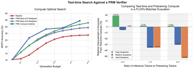
## 2. Left Plot: Compute Optimal Search
### Component Isolation
* **Header:** Compute Optimal Search
* **Y-Axis:** MATH Accuracy (%)
* **Range:** 10 to 45
* **Markers:** 10, 15, 20, 25, 30, 35, 40, 45
* **X-Axis:** Generation Budget
* **Scale:** Logarithmic (Base 2)
* **Markers:** $2^1, 2^3, 2^5, 2^7, 2^9$
* **Legend [Top-Left]:**
* **Red (Circle):** Majority
* **Purple (Circle):** ORM Best-of-N Weighted
* **Green (Circle):** PRM Best-of-N Weighted
* **Blue (Circle):** PRM Compute Optimal
### Trend Verification & Data Extraction
All four series show a positive correlation between Generation Budget and MATH Accuracy, following a logarithmic growth curve (diminishing returns as budget increases).
1. **PRM Compute Optimal (Blue):**
* **Trend:** Steepest initial ascent. It outperforms all other methods significantly in the mid-range budget ($2^2$ to $2^6$) before converging toward the PRM Best-of-N line at the highest budget.
* **Key Points:** Starts at ~10.5% ($2^0$). Reaches ~33% at $2^4$. Peaks at ~39% at $2^8$.
2. **PRM Best-of-N Weighted (Green):**
* **Trend:** Steady upward slope, consistently higher than ORM and Majority.
* **Key Points:** Starts at ~10.5%. Reaches ~29% at $2^4$. Ends at ~38% at $2^9$.
3. **ORM Best-of-N Weighted (Purple):**
* **Trend:** Follows a similar trajectory to PRM Best-of-N but remains consistently 2-4 percentage points lower.
* **Key Points:** Starts at ~10.5%. Reaches ~28% at $2^4$. Ends at ~34% at $2^9$.
4. **Majority (Red):**
* **Trend:** The lowest performing baseline. Shows the slowest rate of improvement.
* **Key Points:** Starts at ~10.5%. Reaches ~23% at $2^4$. Ends at ~29% at $2^9$.
---
## 3. Right Plot: Comparing Test-time and Pretraining Compute
### Component Isolation
* **Header:** Comparing Test-time and Pretraining Compute in a FLOPs Matched Evaluation
* **Y-Axis:** Relative Improvement in Accuracy From Test-time Compute (%)
* **Range:** -50 to 20
* **Markers:** -50, -40, -30, -20, -10, 0, 10, 20
* **X-Axis:** Ratio of Inference Tokens to Pretraining Tokens
* **Categories:** $<<1$, $\approx 1$, $>>1$
* **Legend [Bottom-Left]:**
* **Green:** Easy Questions
* **Blue:** Medium Questions
* **Orange:** Hard Questions
### Data Table Reconstruction
The chart measures the relative gain/loss of using test-time compute versus pretraining compute for different difficulty levels.
| Ratio of Inference to Pretraining Tokens | Easy Questions (Green) | Medium Questions (Blue) | Hard Questions (Orange) |
| :--- | :--- | :--- | :--- |
| **$<<1$** | +19.1% | -5.6% | 0.0% |
| **$\approx 1$** | +2.2% | -35.6% | -35.3% |
| **$>>1$** | +2.0% | -30.6% | -52.9% |
### Trend Analysis
* **Easy Questions:** Test-time compute is consistently beneficial, though the magnitude of improvement drops significantly as the ratio of inference tokens increases (from +19.1% to ~+2%).
* **Medium Questions:** Test-time compute is generally less efficient than pretraining compute, showing significant negative relative improvement (losses) as the ratio increases, bottoming out around -35.6%.
* **Hard Questions:** Shows the most dramatic negative trend. While neutral at low ratios, it collapses to -52.9% at high ratios, indicating that for hard questions, compute is much more effectively spent on pretraining than on test-time search.