## Scatter Plot: Accuracy vs. Time-to-Answer for Different k-Values
### Overview
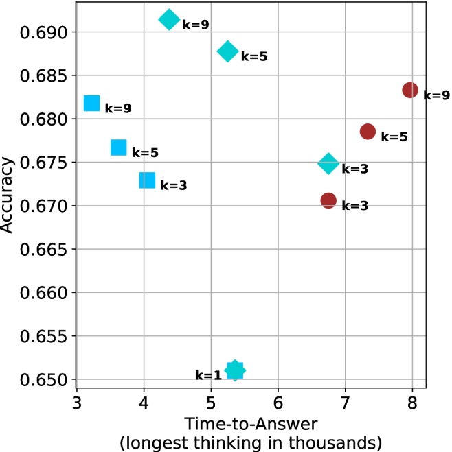
The image is a scatter plot comparing model **Accuracy** (y-axis) against **Time-to-Answer** (x-axis) for different experimental conditions, labeled by a parameter `k`. The data is grouped into three distinct series differentiated by marker shape and color, with an additional single outlier point. There is no separate legend; labels are placed directly next to each data point.
### Components/Axes
* **Y-Axis:** Labeled **"Accuracy"**. Scale ranges from **0.650** to **0.690**, with major grid lines at intervals of 0.005.
* **X-Axis:** Labeled **"Time-to-Answer (longest thinking in thousands)"**. Scale ranges from **3** to **8**, with major grid lines at integer intervals.
* **Data Series & Labels:** Data points are identified by shape, color, and an adjacent text label indicating the `k` value.
* **Blue Squares:** Located in the left region of the chart (Time-to-Answer ~3-4).
* **Cyan Diamonds:** Located in the central region (Time-to-Answer ~5-7).
* **Red Circles:** Located in the right region (Time-to-Answer ~7-8).
* **Cyan Star:** A single point located at the bottom-center.
### Detailed Analysis
**Data Point Extraction (Approximate Coordinates):**
| Marker Shape | Color | Label | Approx. Time-to-Answer (x) | Approx. Accuracy (y) |
| :--- | :--- | :--- | :--- | :--- |
| Square | Blue | k=9 | 3.2 | 0.682 |
| Square | Blue | k=5 | 3.6 | 0.677 |
| Square | Blue | k=3 | 4.0 | 0.673 |
| Diamond | Cyan | k=9 | 5.3 | 0.691 |
| Diamond | Cyan | k=5 | 5.5 | 0.688 |
| Star | Cyan | k=1 | 5.4 | 0.651 |
| Diamond | Cyan | k=3 | 6.8 | 0.675 |
| Circle | Red | k=3 | 6.8 | 0.671 |
| Circle | Red | k=5 | 7.3 | 0.678 |
| Circle | Red | k=9 | 7.9 | 0.683 |
**Trend Verification by Series:**
* **Blue Squares (Left Group):** The line formed by these points slopes **downward**. As Time-to-Answer increases from ~3.2 to 4.0, Accuracy decreases from ~0.682 to 0.673.
* **Cyan Diamonds (Middle Group):** The relationship is non-linear. The highest Accuracy points (k=9, k=5) are clustered at a moderate Time-to-Answer (~5.3-5.5). The k=3 point has a longer Time-to-Answer (~6.8) and lower Accuracy (~0.675).
* **Red Circles (Right Group):** The line formed by these points slopes **upward**. As Time-to-Answer increases from ~6.8 to 7.9, Accuracy increases from ~0.671 to 0.683.
* **Cyan Star (k=1):** This is a standalone point with the lowest Accuracy (~0.651) at a moderate Time-to-Answer (~5.4).
### Key Observations
1. **Performance Clusters:** The data forms three distinct clusters based on Time-to-Answer, each associated with a different marker/color.
2. **k-Value Impact:** Within each cluster (except the single k=1 point), a higher `k` value generally correlates with higher Accuracy. However, the relationship with Time-to-Answer varies by cluster.
3. **Optimal Region:** The **Cyan Diamond** series achieves the highest overall Accuracy values (peaking at ~0.691 for k=9) within a middle range of Time-to-Answer (5-6).
4. **Outlier:** The **k=1** point (Cyan Star) is a significant outlier, showing drastically lower Accuracy than all other points, despite having a Time-to-Answer similar to the high-performing Cyan Diamond k=5 and k=9 points.
5. **Trade-off Variability:** The trade-off between speed (Time-to-Answer) and performance (Accuracy) is not consistent. The Blue series shows a negative trade-off (slower = less accurate), the Red series shows a positive trade-off (slower = more accurate), and the Cyan series shows a complex, non-monotonic relationship.
### Interpretation
This chart likely visualizes the performance of different algorithms or model configurations (represented by the three color/shape groups) across a spectrum of computational budgets (Time-to-Answer). The parameter `k` is a key hyperparameter within each configuration.
The data suggests that:
* The **Cyan Diamond** configuration is the most effective for achieving high accuracy, but it requires a moderate, non-minimal thinking time. Simply increasing `k` within this configuration yields diminishing returns or even a slight decrease in accuracy at the highest `k=9` point compared to `k=5`.
* The **Blue Square** configuration is the fastest but sacrifices accuracy, and its performance degrades as `k` increases, suggesting `k` may have a detrimental effect in this regime.
* The **Red Circle** configuration is the slowest but shows a clear benefit from increasing `k`, indicating it may be a more complex model that scales better with additional computation.
* The **k=1** point serves as a critical baseline, demonstrating that a minimal `k` value is insufficient for achieving competitive accuracy in the Cyan configuration, regardless of thinking time.
In essence, the chart reveals that the optimal choice of model configuration and `k` value depends heavily on the available computational budget (Time-to-Answer) and the desired accuracy threshold. There is no single "best" point; the selection involves a strategic trade-off.