\n
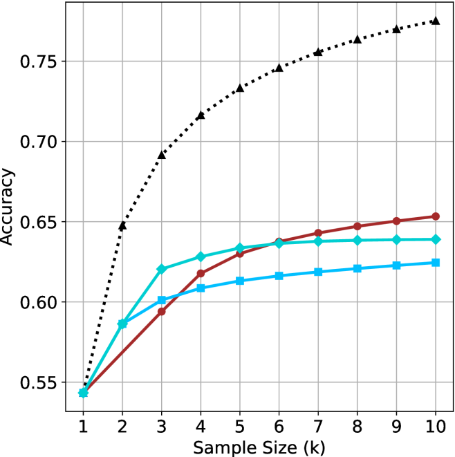
## Line Chart: Accuracy vs. Sample Size
### Overview
This image presents a line chart illustrating the relationship between sample size (in thousands) and accuracy. The chart displays four distinct data series, each represented by a different colored line, showing how accuracy changes as the sample size increases. The chart has a grid background for easier readability.
### Components/Axes
* **X-axis:** Labeled "Sample Size (k)", ranging from 1 to 10 (in thousands). The axis is marked with integer values.
* **Y-axis:** Labeled "Accuracy", ranging from 0.55 to 0.76. The axis is marked with values in increments of 0.05.
* **Data Series:** Four lines are present, each representing a different experimental condition or model.
* Black dotted line
* Red solid line
* Blue solid line
* Green solid line
### Detailed Analysis
Let's analyze each line individually, noting trends and approximate data points.
* **Black Dotted Line:** This line exhibits the most rapid increase in accuracy with increasing sample size. It starts at approximately 0.55 at a sample size of 1k and quickly rises to around 0.72 at 3k. The rate of increase slows down as the sample size increases, reaching approximately 0.76 at 8k and leveling off around 0.76 at 10k.
* **Red Solid Line:** This line shows a moderate increase in accuracy. It begins at approximately 0.56 at 1k, rises to around 0.63 at 3k, and continues to increase, reaching approximately 0.66 at 10k. The slope is relatively consistent throughout.
* **Blue Solid Line:** This line demonstrates a slow and steady increase in accuracy. It starts at approximately 0.58 at 1k, reaches around 0.61 at 3k, and increases to approximately 0.63 at 10k. The slope is the shallowest of all four lines.
* **Green Solid Line:** This line shows an initial increase, followed by a plateau. It begins at approximately 0.57 at 1k, rises to around 0.64 at 4k, and remains relatively constant at approximately 0.65 from 4k to 10k.
### Key Observations
* The black dotted line consistently outperforms the other three lines in terms of accuracy across all sample sizes.
* The blue line exhibits the slowest rate of improvement in accuracy with increasing sample size.
* The green line reaches a plateau in accuracy after a sample size of 4k, suggesting diminishing returns from further increasing the sample size.
* All lines show an increasing trend, indicating that larger sample sizes generally lead to higher accuracy.
### Interpretation
The chart suggests that increasing the sample size generally improves accuracy, but the extent of improvement varies depending on the specific data series. The black dotted line likely represents a model or method that benefits significantly from larger datasets, while the blue line represents a method that is less sensitive to sample size. The green line indicates a point of diminishing returns, where increasing the sample size beyond a certain point does not significantly improve accuracy. This could be due to factors such as data saturation or limitations in the model itself. The chart highlights the importance of considering sample size when evaluating the performance of different models or methods, and suggests that there may be an optimal sample size beyond which further increases provide minimal benefit. The data suggests that the black dotted line is the most effective method, but it may also be the most computationally expensive or require the most data.