## Line Chart: Accuracy vs. Sample Size (k)
### Overview
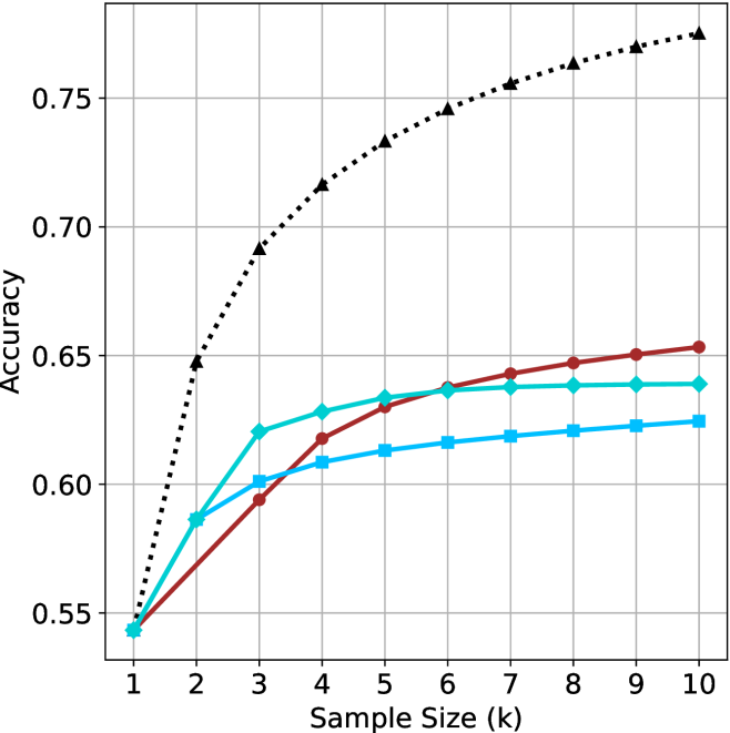
The image is a line chart plotting "Accuracy" on the y-axis against "Sample Size (k)" on the x-axis. It displays the performance of four distinct methods or models, each represented by a unique line style and color, as the amount of training data (sample size) increases from 1 to 10.
### Components/Axes
* **X-Axis (Horizontal):** Labeled "Sample Size (k)". It has major tick marks and labels for integer values from 1 to 10.
* **Y-Axis (Vertical):** Labeled "Accuracy". It has major tick marks and labels at intervals of 0.05, ranging from 0.55 to 0.75. The axis extends slightly beyond 0.75 at the top.
* **Legend:** There is no explicit legend box within the chart area. The four data series are distinguished solely by their line color, line style, and marker shape.
* **Grid:** A light gray grid is present, with vertical lines at each integer sample size and horizontal lines at each 0.05 accuracy increment.
### Detailed Analysis
The chart contains four data series. Their visual trends and approximate data points are as follows:
1. **Black Dotted Line with Upward-Pointing Triangle Markers:**
* **Trend:** This line shows the steepest initial increase and achieves the highest overall accuracy. It rises sharply from k=1 to k=4, then continues to increase at a decreasing rate, appearing to approach an asymptote near 0.77.
* **Approximate Data Points:**
* k=1: ~0.545
* k=2: ~0.645
* k=3: ~0.690
* k=4: ~0.715
* k=5: ~0.730
* k=6: ~0.745
* k=7: ~0.755
* k=8: ~0.760
* k=9: ~0.765
* k=10: ~0.770
2. **Red Solid Line with Circle Markers:**
* **Trend:** This line starts at the same point as the others at k=1. It shows a steady, nearly linear increase throughout the range, surpassing the cyan line around k=6 and ending as the second-highest.
* **Approximate Data Points:**
* k=1: ~0.545
* k=2: ~0.585
* k=3: ~0.595
* k=4: ~0.615
* k=5: ~0.630
* k=6: ~0.635
* k=7: ~0.645
* k=8: ~0.650
* k=9: ~0.650
* k=10: ~0.655
3. **Cyan Solid Line with Diamond Markers:**
* **Trend:** This line increases rapidly from k=1 to k=3, then its growth slows significantly, plateauing from approximately k=6 onward. It is overtaken by the red line in the latter half.
* **Approximate Data Points:**
* k=1: ~0.545
* k=2: ~0.585
* k=3: ~0.620
* k=4: ~0.630
* k=5: ~0.635
* k=6: ~0.640
* k=7: ~0.640
* k=8: ~0.640
* k=9: ~0.640
* k=10: ~0.640
4. **Blue Solid Line with Square Markers:**
* **Trend:** This line has the most gradual slope. It increases slowly and steadily but remains the lowest-performing series for all sample sizes greater than 1.
* **Approximate Data Points:**
* k=1: ~0.545
* k=2: ~0.585
* k=3: ~0.600
* k=4: ~0.605
* k=5: ~0.610
* k=6: ~0.615
* k=7: ~0.615
* k=8: ~0.620
* k=9: ~0.620
* k=10: ~0.625
### Key Observations
* **Common Starting Point:** All four methods begin at approximately the same accuracy (~0.545) when the sample size is 1.
* **Performance Hierarchy:** A clear performance hierarchy is established by k=2 and maintained thereafter: Black (highest) > Cyan/Red (middle, swapping order) > Blue (lowest).
* **Diminishing Returns:** All lines show diminishing returns (the slope decreases as k increases), but the rate varies dramatically. The black line's gains remain significant up to k=6, while the cyan line's gains largely stop after k=5.
* **Crossover Event:** The red line (circles) and cyan line (diamonds) cross between k=5 and k=6. The red line's more sustained growth allows it to surpass the cyan line, which plateaus earlier.
### Interpretation
This chart likely compares the learning efficiency of four different algorithms or model architectures. The data suggests:
1. **Superior Method:** The method represented by the black dotted line is significantly more data-efficient and achieves a higher performance ceiling. It effectively leverages additional samples to improve accuracy well beyond the others.
2. **Growth Patterns:** The red method demonstrates consistent, reliable learning. The cyan method learns quickly from very few samples but hits a performance limit early. The blue method learns slowly and has the lowest capacity for improvement with more data in this range.
3. **Practical Implications:** If data is extremely scarce (k=1 to 3), the cyan method is competitive with the red. However, for any application where more data is available (k>5), the red method is clearly superior to cyan, and the black method is superior to all. The choice between methods would depend on the expected available sample size and the required accuracy threshold.
4. **Underlying Cause:** The differences in curve shape (steep rise vs. plateau) could indicate variations in model complexity, the presence of regularization, or the inherent difficulty of the learning task for each approach. The black line's shape is characteristic of a high-capacity model that hasn't yet saturated, while the cyan line's shape suggests a simpler model that has reached its expressive limit.