## Violin Plot: Comparison of Mean Capacity Factor Distributions
### Overview
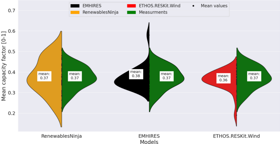
The image is a violin plot comparing the distribution of "Mean capacity factor" values from three different models against a set of measurements. The plot visualizes the probability density of the data at different values, with the width of the "violin" representing the frequency of data points. Each model is paired side-by-side with the "Measurements" distribution for direct comparison.
### Components/Axes
* **Y-Axis:** Labeled "Mean capacity factor [0-1]". The scale runs from 0.2 to 0.7, with major tick marks at 0.1 intervals (0.2, 0.3, 0.4, 0.5, 0.6, 0.7).
* **X-Axis:** Labeled "Models". It displays three categorical groups:
1. RenewablesNinja
2. EMHIRES
3. ETHOS.RESKit.Wind
* **Legend:** Positioned at the top center of the chart. It defines the color coding:
* **Black:** EMHIRES
* **Orange:** RenewablesNinja
* **Red:** ETHOS.RESKit.Wind
* **Green:** Measurements
* **Black Dot:** Mean values (indicated by a white box with black text inside each violin).
* **Data Series:** There are six violin plots in total, arranged as three pairs. Each pair consists of a model's distribution (left) and the corresponding measurements distribution (right).
### Detailed Analysis
The analysis is segmented by the three model-measurement pairs.
**1. RenewablesNinja vs. Measurements (Left Pair)**
* **RenewablesNinja (Orange, Left):** The violin is widest between approximately 0.3 and 0.45, indicating the highest data density in this range. The distribution appears slightly skewed towards higher values, with a tail extending up to ~0.6. The annotated mean value is **0.37**.
* **Measurements (Green, Right):** The distribution is fairly symmetric and centered, with the widest point near 0.4. It spans from roughly 0.2 to 0.55. The annotated mean value is **0.37**.
* **Comparison:** The means are identical (0.37). The shapes are similar, though the RenewablesNinja distribution shows a slightly longer tail towards higher capacity factors.
**2. EMHIRES vs. Measurements (Center Pair)**
* **EMHIRES (Black, Left):** This distribution is notably skewed. It has a very wide base between 0.25 and 0.4, a narrow "neck" around 0.45, and a long, thin tail extending upwards to just above 0.6. The annotated mean value is **0.38**.
* **Measurements (Green, Right):** This is the same measurements distribution as in the first pair (mean: **0.37**). It is symmetric and centered.
* **Comparison:** The EMHIRES mean (0.38) is slightly higher than the measurements mean (0.37). The key difference is in the shape: EMHIRES has a pronounced positive skew with a long upper tail, suggesting it predicts some instances of very high capacity factor that are not present in the measured data distribution.
**3. ETHOS.RESKit.Wind vs. Measurements (Right Pair)**
* **ETHOS.RESKit.Wind (Red, Left):** The distribution is relatively compact and symmetric, with the widest section between 0.3 and 0.4. It spans from about 0.2 to 0.5. The annotated mean value is **0.36**.
* **Measurements (Green, Right):** Again, the same measurements distribution (mean: **0.37**).
* **Comparison:** The ETHOS.RESKit.Wind mean (0.36) is slightly lower than the measurements mean (0.37). Its distribution is tighter (less spread) than the measurements, suggesting it predicts a narrower range of capacity factor values.
### Key Observations
1. **Central Tendency Agreement:** All three models produce mean capacity factor values very close to the measured mean of 0.37 (0.37, 0.38, 0.36). This indicates good accuracy in predicting the average.
2. **Distribution Shape Discrepancy:** While means are similar, the *shapes* of the distributions differ significantly.
* **EMHIRES** shows a strong positive skew (long upper tail).
* **RenewablesNinja** shows a mild positive skew.
* **ETHOS.RESKit.Wind** shows a slightly tighter, more symmetric distribution.
* The **Measurements** distribution is consistently symmetric and serves as the reference.
3. **Spread/Variance:** The spread of predicted values varies. EMHIRES has the largest spread (especially upwards), followed by RenewablesNinja, with ETHOS.RESKit.Wind having the smallest spread. The measurements have a moderate spread.
### Interpretation
This chart evaluates the performance of three wind power generation models by comparing their output distributions to real-world measurements. The key insight is that **matching the mean is necessary but not sufficient for a model to be accurate.**
* **What the data suggests:** All models are well-calibrated on average (mean ~0.37). However, they differ in how they represent the *variability* and *extremes* of wind capacity factor.
* **How elements relate:** The side-by-side violin plots allow for a direct visual comparison of not just central tendency but the entire probability distribution. The green "Measurements" violin acts as the benchmark.
* **Notable anomalies/trends:**
* The **EMHIRES** model's long upper tail is a critical finding. It suggests the model may over-predict the frequency or magnitude of high-output events compared to reality. This could lead to overestimation of grid stability or revenue if used for planning.
* The **ETHOS.RESKit.Wind** model's tighter distribution suggests it may under-predict the natural variability of wind power, potentially underestimating the need for grid balancing resources.
* **RenewablesNinja** appears to strike a balance, with a distribution shape closest to the measurements, albeit with a slight high-side bias.
In summary, while all models capture the average behavior, **RenewablesNinja** appears to most accurately replicate the full distribution of measured capacity factors. **EMHIRES** has a systematic bias towards predicting higher values more often than observed, and **ETHOS.RESKit.Wind** is slightly conservative, predicting a narrower range of outcomes. This analysis is crucial for model selection in energy forecasting and grid integration studies.