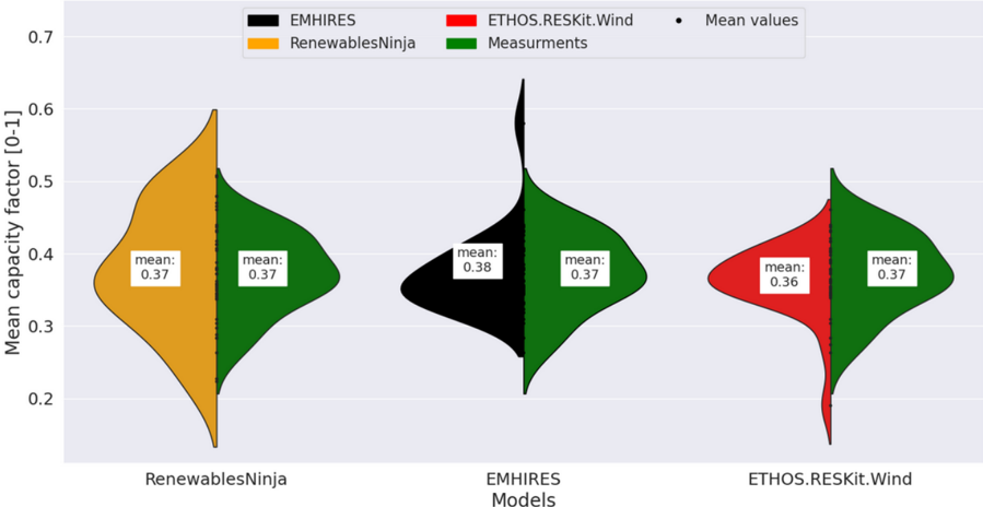
## Violin Plot: Model Comparison of Mean Capacity Factor
### Overview
The image is a violin plot comparing the distribution of mean capacity factors from three different models: RenewablesNinja, EMHIRES, and ETHOS.RESKit.Wind. Each violin plot is split vertically, showing the distribution from the model on the left and the distribution from "Measurements" on the right. The plot also displays the mean value for each distribution.
### Components/Axes
* **Title:** None explicitly present in the image.
* **X-axis:** "Models" with categories: RenewablesNinja, EMHIRES, ETHOS.RESKit.Wind
* **Y-axis:** "Mean capacity factor [0-1]" with a scale from 0.2 to 0.7, incrementing by 0.1.
* **Legend:** Located at the top of the image.
* Black: EMHIRES
* Orange: RenewablesNinja
* Red: ETHOS.RESKit.Wind
* Green: Measurements
* Black dot: Mean values
### Detailed Analysis
The violin plots show the distribution of mean capacity factors for each model and the corresponding measurements. Each violin plot is split vertically, with the model's distribution on the left and the "Measurements" distribution on the right. A white box displays the mean value for each distribution.
* **RenewablesNinja:**
* Left (Orange): The distribution is centered around 0.37.
* Right (Green): The distribution is centered around 0.37.
* **EMHIRES:**
* Left (Black): The distribution is centered around 0.38.
* Right (Green): The distribution is centered around 0.37.
* **ETHOS.RESKit.Wind:**
* Left (Red): The distribution is centered around 0.36.
* Right (Green): The distribution is centered around 0.37.
### Key Observations
* The mean capacity factor for "Measurements" is consistently around 0.37 across all three models.
* EMHIRES has a slightly higher mean capacity factor (0.38) compared to the other models.
* ETHOS.RESKit.Wind has a slightly lower mean capacity factor (0.36) compared to the other models.
* The distributions for each model and the corresponding measurements appear to be relatively similar in shape.
### Interpretation
The violin plot provides a visual comparison of the mean capacity factors predicted by three different models against actual measurements. The data suggests that all three models provide reasonable estimates of the mean capacity factor, with values close to the measured mean of 0.37. EMHIRES appears to have a slight positive bias, while ETHOS.RESKit.Wind has a slight negative bias. The similarity in the shape of the distributions suggests that the models capture the overall variability in the mean capacity factor reasonably well. The plot highlights the performance of each model relative to real-world measurements, allowing for an assessment of their accuracy and reliability.