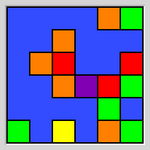
## Heatmap: Color Distribution
### Overview
The image is a heatmap-like grid with various colored squares against a blue background. The colors include red, orange, yellow, green, and purple. The squares are arranged seemingly randomly, creating a visual pattern.
### Components/Axes
* **Background Color:** Blue
* **Square Colors:** Red, Orange, Yellow, Green, Purple
* **Grid Structure:** The image is composed of a grid of squares.
### Detailed Analysis or ### Content Details
* **Blue Squares:** The majority of the grid is filled with blue squares, forming the background.
* **Red Squares:** Red squares are clustered in the upper-middle and right-middle sections of the grid.
* **Orange Squares:** Orange squares are scattered throughout the grid, primarily in the upper and middle sections.
* **Yellow Squares:** A single yellow square is located in the bottom-left quadrant.
* **Green Squares:** Green squares are concentrated in the bottom-right quadrant.
* **Purple Squares:** A single purple square is located in the middle of the grid.
### Key Observations
* The distribution of colors is uneven, with blue being the dominant color.
* Certain colors tend to cluster in specific regions of the grid.
* The yellow and purple squares are isolated.
### Interpretation
The image appears to be a visual representation of a categorical distribution. The colors could represent different categories, and their distribution across the grid might indicate their relative frequency or spatial relationships. Without additional context, it's difficult to determine the specific meaning of the colors or the grid structure. The clustering of certain colors suggests potential correlations or dependencies between the categories they represent. The isolated yellow and purple squares could be outliers or rare events.