## Area Chart: Proportion of Successful Rebuilds Over Time
### Overview
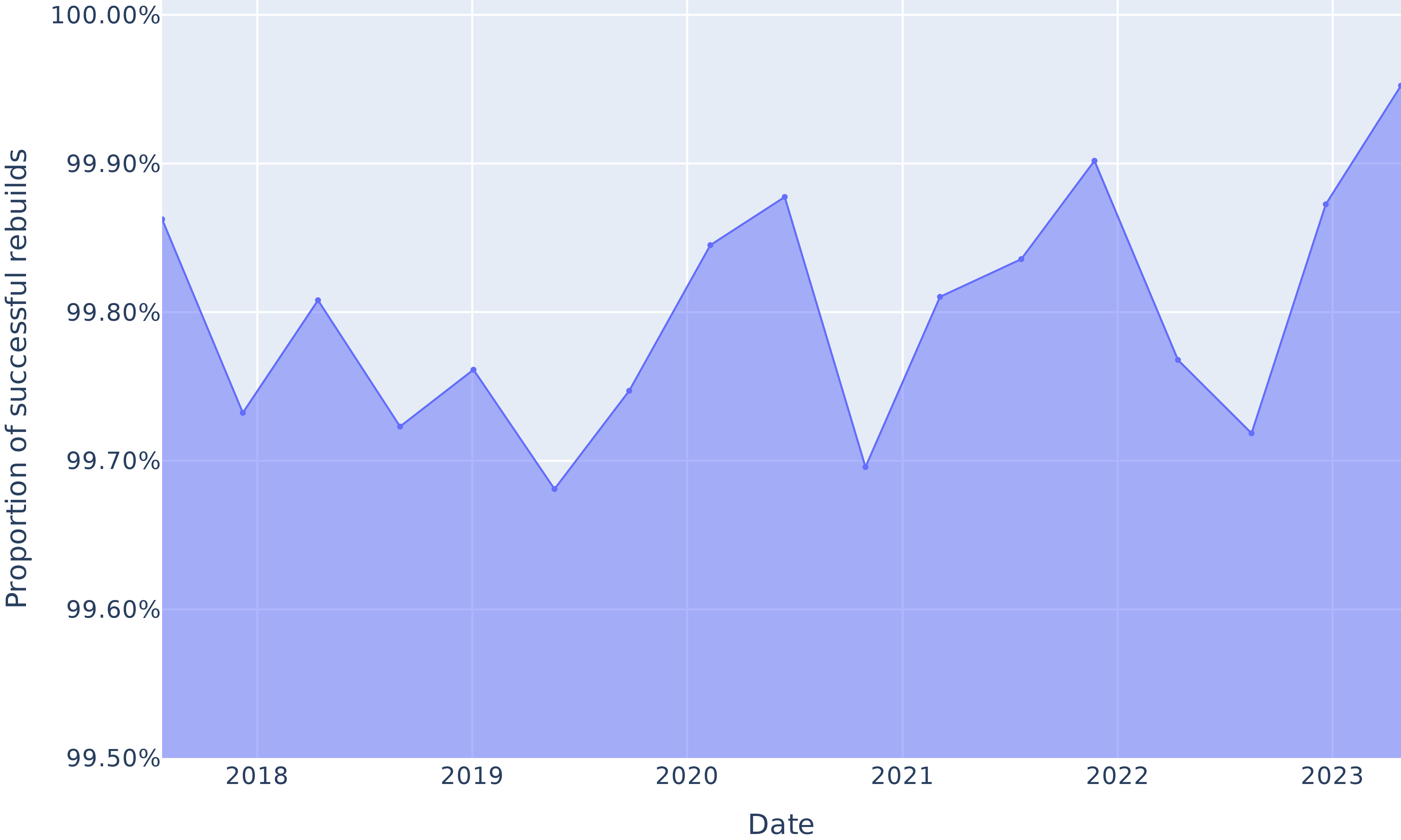
This is a time-series area chart displaying the proportion of successful rebuilds from early 2018 to late 2023. The chart shows a single data series with a high overall success rate, fluctuating within a narrow band between approximately 99.68% and 99.95%. The area below the line is filled with a light blue color.
### Components/Axes
* **Chart Type:** Area Chart (Line chart with filled area below).
* **X-Axis (Horizontal):**
* **Label:** "Date"
* **Scale:** Time-based, with major tick marks labeled for the years: 2018, 2019, 2020, 2021, 2022, 2023.
* **Range:** Spans from before the "2018" label to after the "2023" label.
* **Y-Axis (Vertical):**
* **Label:** "Proportion of successful rebuilds"
* **Scale:** Percentage, with major grid lines and labels at: 99.50%, 99.60%, 99.70%, 99.80%, 99.90%, 100.00%.
* **Range:** 99.50% to 100.00%.
* **Data Series:**
* **Visual Representation:** A single, continuous blue line connecting data points, with the area beneath it filled in a lighter shade of blue.
* **Legend:** Not present, as there is only one data series.
* **Grid:** A light gray grid is present, with horizontal lines at each labeled Y-axis percentage and vertical lines at each labeled year.
### Detailed Analysis
**Trend Verification:** The line exhibits a volatile, saw-tooth pattern with no single sustained direction. It repeatedly rises and falls within its high-percentage range.
**Data Point Extraction (Approximate Values):**
* **Start of 2018:** ~99.86%
* **Mid-2018:** Dips to ~99.73%
* **Late 2018/Early 2019:** Peaks at ~99.81%
* **Mid-2019:** Dips to ~99.72%
* **Late 2019:** Rises to ~99.76%
* **Early 2020:** Reaches a local low of ~99.68%
* **Mid-2020:** Rises to ~99.75%
* **Late 2020:** Peaks at ~99.88%
* **Early 2021:** Drops sharply to a local low of ~99.70%
* **Mid-2021:** Recovers to ~99.81%
* **Late 2021:** Rises to ~99.84%
* **Early 2022:** Reaches a significant peak at ~99.90%
* **Mid-2022:** Falls to ~99.77%
* **Late 2022:** Dips to ~99.72%
* **Early 2023:** Rises sharply to ~99.88%
* **End of 2023 (Chart Edge):** Reaches the highest visible point, approximately ~99.95%.
### Key Observations
1. **High Baseline Performance:** The proportion of successful rebuilds never falls below ~99.68%, indicating an extremely reliable process.
2. **Cyclical Volatility:** The data shows a repeating pattern of peaks and troughs, suggesting periodic fluctuations in success rates, possibly due to seasonal factors, system updates, or changes in workload.
3. **Notable Peaks:** The highest points occur in late 2020 (~99.88%), early 2022 (~99.90%), and at the end of the series in late 2023 (~99.95%).
4. **Notable Troughs:** The lowest points are in early 2020 (~99.68%) and early 2021 (~99.70%).
5. **Recent Upward Trend:** The final segment from late 2022 to late 2023 shows a strong and sustained upward trajectory, culminating in the highest value on the chart.
### Interpretation
The chart demonstrates a system or process that maintains an exceptionally high level of reliability, with success rates consistently above 99.6%. The "Proportion of successful rebuilds" metric is likely a key performance indicator (KPI) for a technical infrastructure, software deployment pipeline, or manufacturing process.
The observed volatility is the most significant feature. While the baseline is excellent, the regular dips indicate that the process is not perfectly stable. These fluctuations could be investigated to identify root causes—such as specific software releases, infrastructure changes, or increased load periods—that temporarily reduce success rates. The strong recovery and new peak at the end of 2023 suggest that recent improvements or optimizations have been highly effective, pushing the process to its best performance level within the observed timeframe. The narrow Y-axis scale (99.5% to 100%) visually amplifies these small absolute changes, which is appropriate for monitoring a high-reliability system where even a 0.1% change is meaningful.