## Line Graphs: Impulse Response Plots
### Overview
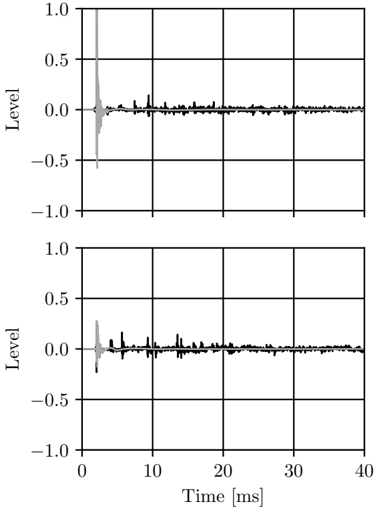
The image contains two line graphs, one above the other, displaying impulse response data. Both graphs share the same x-axis (Time in milliseconds) and y-axis (Level). Each graph contains two data series, one in gray and one in black, representing different impulse responses. The initial impulse is significantly larger than subsequent reflections.
### Components/Axes
* **X-axis:** Time [ms], ranging from 0 to 40 ms, with gridlines at intervals of 10 ms.
* **Y-axis:** Level, ranging from -1.0 to 1.0, with gridlines at intervals of 0.5.
* **Data Series:** Each graph contains two data series: one in gray and one in black. There is no explicit legend, but the gray line appears to represent the initial impulse, while the black line represents the subsequent response.
### Detailed Analysis
**Top Graph:**
* **Gray Line:** The gray line shows a sharp, large initial peak at approximately 0 ms, reaching a level of approximately 0.9. It then rapidly decays to near zero within the first few milliseconds.
* **Black Line:** The black line starts near zero and shows several smaller peaks and fluctuations after the initial impulse. These peaks occur between approximately 5 ms and 40 ms, with amplitudes generally below 0.2. The black line appears to be slightly above zero for the entire duration.
**Bottom Graph:**
* **Gray Line:** Similar to the top graph, the gray line shows a sharp, large initial peak at approximately 0 ms, reaching a level of approximately 0.3. It then rapidly decays to near zero within the first few milliseconds.
* **Black Line:** The black line starts near zero and shows several smaller peaks and fluctuations after the initial impulse. These peaks occur between approximately 5 ms and 40 ms, with amplitudes generally below 0.2. The black line appears to be slightly above zero for the entire duration.
### Key Observations
* Both graphs show a strong initial impulse followed by a series of smaller reflections or reverberations.
* The initial impulse is significantly larger in the top graph (approximately 0.9) compared to the bottom graph (approximately 0.3).
* The subsequent reflections (black line) appear to have similar characteristics in both graphs, with peaks generally below 0.2.
* The time scale is relatively short (40 ms), suggesting that these are measurements of short-term impulse responses.
### Interpretation
The graphs likely represent the impulse response of a system or environment. The initial impulse (gray line) indicates the direct sound or signal, while the subsequent reflections (black line) represent the reverberation or echoes. The difference in the initial impulse amplitude between the top and bottom graphs suggests that the measurements were taken under different conditions, such as different source levels or distances. The similarity in the subsequent reflections suggests that the reverberation characteristics of the environment are relatively consistent between the two measurements. The data suggests that the environment has a short reverberation time, as the reflections decay relatively quickly.