## Line Chart: Phase Transition Over Time
### Overview
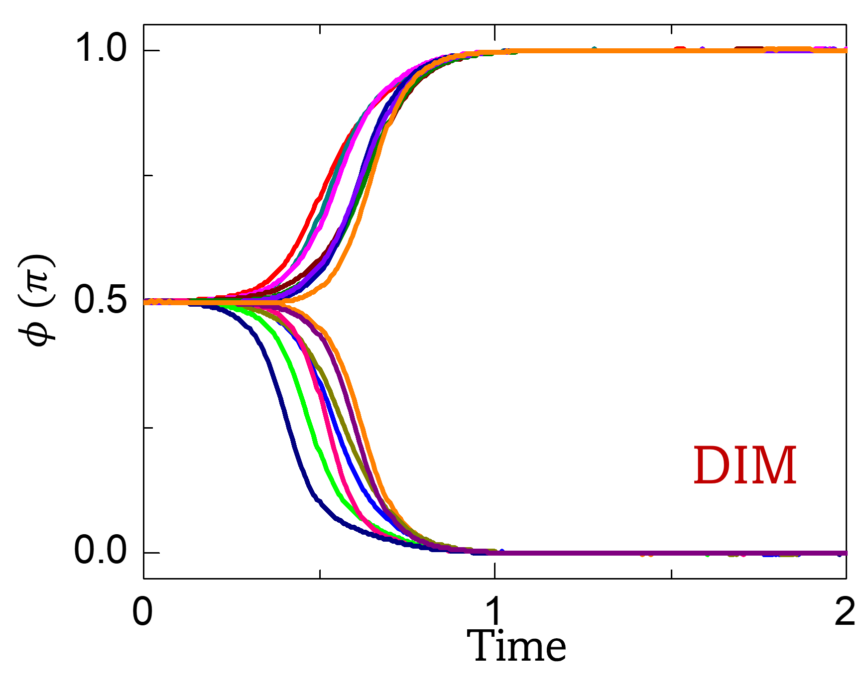
The image is a line chart depicting phase transitions over time. Several lines of different colors show how a variable, phi (φ), changes from an initial value of approximately 0.5 to either 0 or 1 over a time period from 0 to 2. The chart includes the label "DIM" in the bottom-right corner.
### Components/Axes
* **X-axis:**
* Label: "Time"
* Scale: 0 to 2, with markers at 0, 1, and 2.
* **Y-axis:**
* Label: "φ (π)"
* Scale: 0.0 to 1.0, with markers at 0.0, 0.5, and 1.0.
* **Data Series:** There are approximately 9 distinct colored lines, each representing a different condition or parameter setting. The colors include dark blue, green, pink, blue, olive, orange, red, teal, and purple. There is no explicit legend.
* **Text Label:** "DIM" in the bottom-right corner, colored red.
### Detailed Analysis
* **General Trend:** The lines start at φ = 0.5. Some lines transition downwards to φ = 0, while others transition upwards to φ = 1. The transitions occur within the time frame of approximately 0.2 to 1.0.
* **Dark Blue Line:** This line starts at φ = 0.5 and decreases to φ = 0. The transition begins around Time = 0.2 and stabilizes at φ = 0 around Time = 0.8.
* **Green Line:** This line starts at φ = 0.5 and decreases to φ = 0. The transition begins around Time = 0.3 and stabilizes at φ = 0 around Time = 0.9.
* **Pink Line:** This line starts at φ = 0.5 and decreases to φ = 0. The transition begins around Time = 0.35 and stabilizes at φ = 0 around Time = 0.9.
* **Blue Line:** This line starts at φ = 0.5 and decreases to φ = 0. The transition begins around Time = 0.4 and stabilizes at φ = 0 around Time = 0.95.
* **Olive Line:** This line starts at φ = 0.5 and decreases to φ = 0. The transition begins around Time = 0.45 and stabilizes at φ = 0 around Time = 1.0.
* **Orange Line:** This line starts at φ = 0.5 and increases to φ = 1. The transition begins around Time = 0.4 and stabilizes at φ = 1 around Time = 0.9.
* **Red Line:** This line starts at φ = 0.5 and increases to φ = 1. The transition begins around Time = 0.35 and stabilizes at φ = 1 around Time = 0.8.
* **Teal Line:** This line starts at φ = 0.5 and increases to φ = 1. The transition begins around Time = 0.3 and stabilizes at φ = 1 around Time = 0.75.
* **Purple Line:** This line starts at φ = 0.5 and increases to φ = 1. The transition begins around Time = 0.45 and stabilizes at φ = 1 around Time = 0.9.
### Key Observations
* The lines exhibit a clear bifurcation, with some transitioning to 0 and others to 1.
* The transitions occur within a relatively narrow time window.
* The "DIM" label is present but its significance is not immediately clear without additional context.
### Interpretation
The chart likely represents a system undergoing a phase transition, where the initial state (φ = 0.5) is unstable, and the system evolves towards one of two stable states (φ = 0 or φ = 1). The different colored lines could represent different initial conditions or parameter settings that influence the direction and speed of the transition. The "DIM" label might refer to the specific system or model being studied. The data suggests that the system is sensitive to initial conditions or parameter variations, leading to the observed bifurcation.