## Line Chart: Time Series of Φ(π)
### Overview
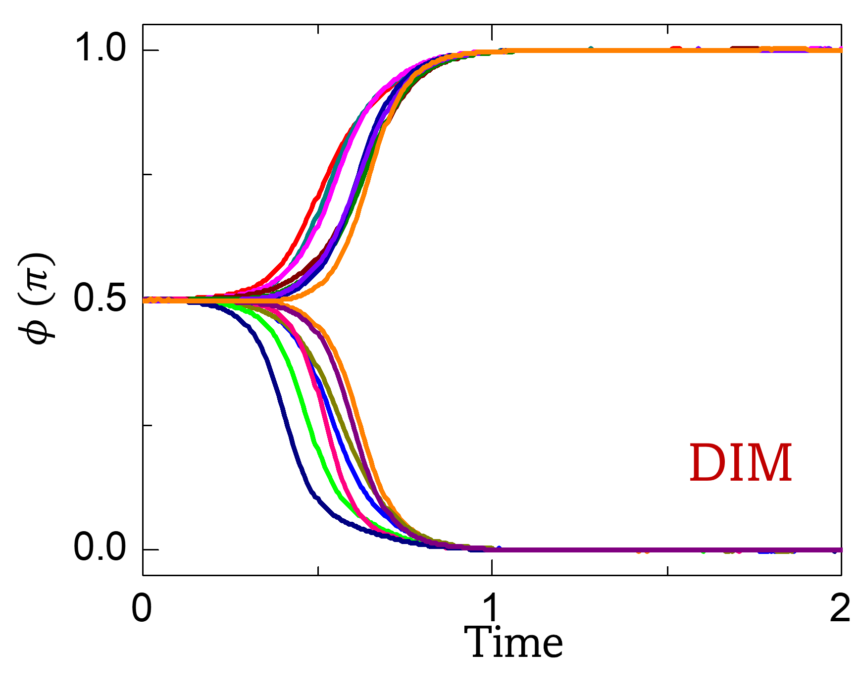
The image presents a line chart depicting the relationship between "Time" on the x-axis and "Φ(π)" on the y-axis. Multiple lines are plotted, representing different time series or conditions. The chart appears to model a dynamic process where Φ(π) changes over time, exhibiting a complex pattern of increase and decrease. A label "DIM" is present in the bottom-right corner.
### Components/Axes
* **X-axis:** Labeled "Time", ranging from approximately 0 to 2.
* **Y-axis:** Labeled "Φ(π)", ranging from approximately 0 to 1.
* **Lines:** Multiple colored lines are plotted, each representing a different time series. The colors observed are: black, green, purple, blue, cyan, magenta, and orange.
* **Label:** "DIM" is located in the bottom-right corner of the chart.
### Detailed Analysis
The chart contains several lines, each representing a different trajectory of Φ(π) over time.
* **Black Line:** Starts at approximately Φ(π) = 0.5, remains relatively constant until Time ≈ 0.7, then decreases to near 0 by Time ≈ 1.2, and remains near 0 until Time = 2.
* **Green Line:** Starts at approximately Φ(π) = 0.5, increases rapidly to a peak around Φ(π) = 0.95 at Time ≈ 0.6, then decreases to near 0 by Time ≈ 1.2, and remains near 0 until Time = 2.
* **Purple Line:** Starts at approximately Φ(π) = 0.5, decreases rapidly to near 0 by Time ≈ 0.8, and remains near 0 until Time = 2.
* **Blue Line:** Starts at approximately Φ(π) = 0.5, increases to a peak around Φ(π) = 0.95 at Time ≈ 0.6, then decreases to near 0 by Time ≈ 1.2, and remains near 0 until Time = 2.
* **Cyan Line:** Starts at approximately Φ(π) = 0.5, increases to a peak around Φ(π) = 0.95 at Time ≈ 0.6, then decreases to near 0 by Time ≈ 1.2, and remains near 0 until Time = 2.
* **Magenta Line:** Starts at approximately Φ(π) = 0.5, increases to a peak around Φ(π) = 0.95 at Time ≈ 0.6, then decreases to near 0 by Time ≈ 1.2, and remains near 0 until Time = 2.
* **Orange Line:** Starts at approximately Φ(π) = 0.5, increases to a peak around Φ(π) = 0.95 at Time ≈ 0.6, then decreases to near 0 by Time ≈ 1.2, and remains near 0 until Time = 2.
Most lines exhibit a similar pattern: an initial value around 0.5, a rapid increase to near 1, a subsequent rapid decrease to near 0, and then a plateau near 0. The timing of the peak and the rate of decrease vary slightly between the lines.
### Key Observations
* The lines generally follow a similar trend, suggesting a common underlying process.
* There is variation in the timing of the peak and the rate of decay, indicating different conditions or parameters.
* The "DIM" label's significance is unknown without further context. It could represent a specific condition, parameter setting, or data subset.
* The y-axis is labeled with a function Φ(π), suggesting a mathematical or physical context.
### Interpretation
The chart likely represents a dynamic system where a quantity Φ(π) evolves over time. The initial value of 0.5 suggests an initial state, and the subsequent increase and decrease indicate a transient process. The plateau near 0 at later times suggests a stable state or equilibrium. The variations between the lines could be due to different initial conditions, parameter settings, or external influences. The "DIM" label might indicate a specific dimension or aspect of the system being analyzed.
Without additional context, it's difficult to determine the precise meaning of Φ(π) and the underlying physical or mathematical process. However, the chart provides valuable insights into the system's behavior and the factors that influence it. The consistent pattern across the lines suggests a robust underlying mechanism, while the variations highlight the sensitivity of the system to different conditions.