## Line Graph: φ(π) vs. Time with Divergent Paths
### Overview
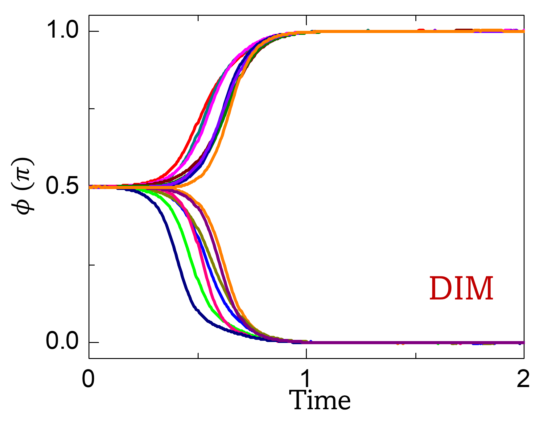
The image depicts a line graph showing the behavior of a function φ(π) over time. Multiple colored lines originate from a common point at (Time = 0.5, φ(π) = 0.5) and diverge into distinct paths. The graph includes a legend labeled "DIM" in red, though the colors of the lines are not explicitly explained in the legend. The x-axis (Time) ranges from 0 to 2, and the y-axis (φ(π)) ranges from 0.0 to 1.0.
---
### Components/Axes
- **X-axis (Time)**: Labeled "Time" with values from 0 to 2.
- **Y-axis (φ(π))**: Labeled "φ(π)" with values from 0.0 to 1.0.
- **Legend**: Located in the bottom-right corner, labeled "DIM" in red. No explicit color-to-label mapping is provided for the lines.
- **Lines**: Multiple colored lines (red, blue, green, purple, orange, etc.) originate from the point (0.5, 0.5) and diverge into different trajectories.
---
### Detailed Analysis
1. **Initial Convergence**: All lines start at the same point (Time = 0.5, φ(π) = 0.5), suggesting a shared initial condition or critical threshold.
2. **Divergence Paths**:
- **Red Line**: Ascends sharply to φ(π) = 1.0 by Time = 1.0, then remains flat.
- **Blue Line**: Descends sharply to φ(π) = 0.0 by Time = 1.0, then remains flat.
- **Green Line**: Rises to φ(π) ≈ 0.8 by Time = 1.0, then plateaus.
- **Purple Line**: Drops to φ(π) ≈ 0.2 by Time = 1.0, then plateaus.
- **Orange Line**: Remains flat at φ(π) = 0.5 throughout the entire time range.
3. **Unlabeled Colors**: Additional lines (e.g., teal, brown, pink) exhibit intermediate trends, but their exact paths are not clearly distinguishable due to overlapping or low contrast.
---
### Key Observations
- **Critical Point at Time = 0.5**: All lines originate from the same point, indicating a shared initial state or bifurcation event.
- **Divergence Patterns**: Lines exhibit distinct behaviors (ascending, descending, flat) after Time = 0.5, suggesting varying responses to an underlying parameter or condition.
- **Unlabeled Legend**: The legend "DIM" in red does not clarify the meaning of the colored lines, leaving their interpretation ambiguous.
- **Flat Lines**: The orange line (and possibly others) remains constant, implying a steady-state or equilibrium condition.
---
### Interpretation
The graph likely represents a dynamical system or model where φ(π) evolves over time under different scenarios labeled as "DIM." The convergence at Time = 0.5 suggests a critical transition or bifurcation point, after which the system branches into multiple outcomes. The flat lines (e.g., orange) may represent stable equilibria, while the ascending/descending lines indicate dynamic changes. The absence of a clear legend for the colored lines limits the ability to assign specific meanings to each path. However, the overall structure implies that "DIM" could be a parameter or model influencing the system's behavior, with different trajectories reflecting varying conditions or inputs.