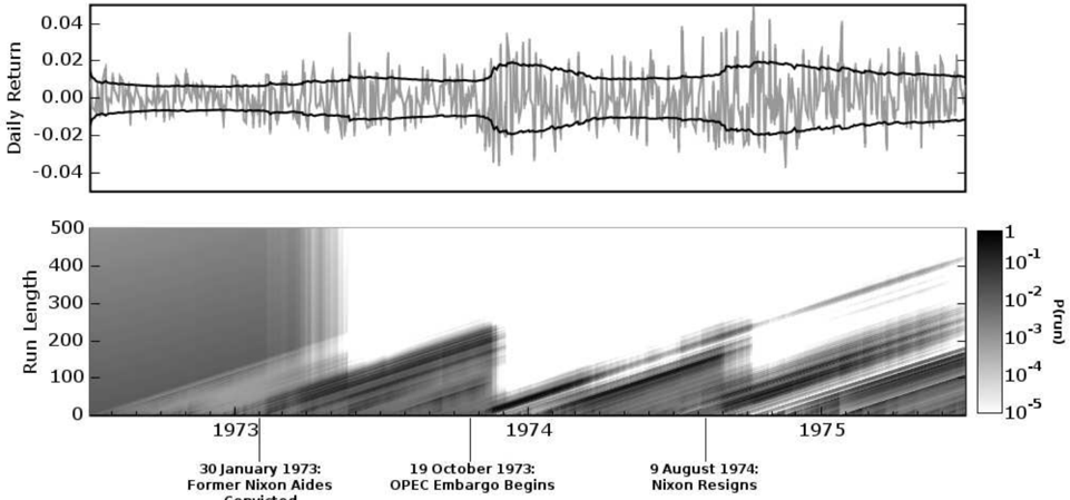
## Line Chart with Heatmap: Market Volatility and Run Length Analysis (1973-1975)
### Overview
The image contains two primary components:
1. A **line chart** titled "Daily Return" showing daily returns over time.
2. A **heatmap** labeled "Run Length" with a color scale representing probability (P(run)).
Both components are temporally aligned, spanning 1973–1975, with key historical events annotated.
---
### Components/Axes
#### Line Chart (Top)
- **Y-axis**: "Daily Return" (range: -0.04 to 0.04).
- **X-axis**: Implicit time axis (1973–1975), unlabeled but aligned with the heatmap.
- **Legend**: A single black line representing daily returns.
#### Heatmap (Bottom)
- **Y-axis**: "Run Length" (0 to 500).
- **X-axis**: Time (1973–1975), with vertical markers for:
- 30 January 1973: "Former Nixon Aides"
- 19 October 1973: "OPEC Embargo Begins"
- 9 August 1974: "Nixon Resigns"
- **Color Scale**: Right-hand gradient from white (10⁻⁵) to black (1), labeled "P(run)".
---
### Detailed Analysis
#### Line Chart Trends
- The black line fluctuates around **zero**, with peaks reaching ±0.03 and troughs near ±0.02.
- Notable volatility spikes occur around **1973–1974**, particularly near the OPEC embargo date (19 October 1973).
- Post-1974, returns stabilize closer to zero, with reduced amplitude.
#### Heatmap Patterns
- **Color Intensity**: Darker regions (higher P(run)) cluster near the bottom-left (1973) and along diagonal bands ascending to the top-right (1975).
- **Run Length**:
- Sharp increases in run length (up to ~400) occur after the OPEC embargo (19 October 1973).
- A secondary peak (~300) aligns with Nixon’s resignation (9 August 1974).
- **Probability Gradient**: The darkest areas (P(run) ≈ 1) are concentrated in the lower-left quadrant, suggesting higher probabilities of shorter run lengths in early 1973.
---
### Key Observations
1. **Event Correlation**:
- The OPEC embargo (19 October 1973) coincides with a sharp rise in run length and daily return volatility.
- Nixon’s resignation (9 August 1974) correlates with a secondary run-length peak and reduced return volatility.
2. **Probability Dynamics**:
- Higher probabilities (darker shades) of longer run lengths emerge post-1973, peaking in 1975.
- The heatmap’s diagonal bands suggest a gradual increase in run length over time, independent of daily return fluctuations.
---
### Interpretation
- **Market Volatility**: The line chart indicates that daily returns were most volatile during the OPEC embargo period, likely reflecting geopolitical/economic uncertainty. Post-1974 stability may correlate with reduced macroeconomic shocks.
- **Run Length Significance**: The heatmap’s run-length increases suggest prolonged market states (e.g., bull/bear runs) became more common after 1973, possibly due to policy shifts (e.g., Nixon’s resignation altering regulatory frameworks).
- **Anomalies**: The abrupt drop in run length in early 1973 (dark vertical band) may reflect a market reset following Nixon’s aides’ departure, preceding the OPEC shock.
The data implies that political and economic events in the early 1970s significantly influenced both short-term market returns and long-term market behavior patterns. The heatmap’s diagonal trend highlights a systemic shift toward longer market runs by 1975, potentially linked to post-Nixon policy adjustments.