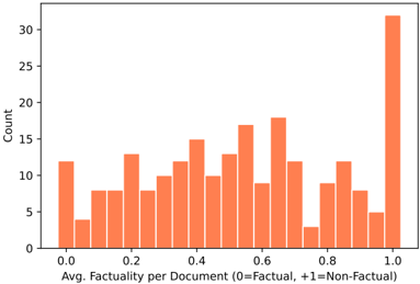
## Histogram: Average Factuality per Document
### Overview
The image displays a histogram showing the distribution of average factuality scores across a set of documents. The data is presented as a frequency count, with documents binned by their average factuality score on a scale from 0 (Factual) to +1 (Non-Factual).
### Components/Axes
* **Chart Type:** Histogram (vertical bar chart).
* **X-Axis (Horizontal):**
* **Label:** "Avg. Factuality per Document (0=Factual, +1=Non-Factual)"
* **Scale:** Linear, ranging from 0.0 to 1.0.
* **Major Tick Marks:** 0.0, 0.2, 0.4, 0.6, 0.8, 1.0.
* **Y-Axis (Vertical):**
* **Label:** "Count"
* **Scale:** Linear, ranging from 0 to 30.
* **Major Tick Marks:** 0, 5, 10, 15, 20, 25, 30.
* **Data Series:** A single series represented by orange-colored bars. There is no legend, as there is only one data category.
* **Spatial Layout:** The chart is contained within a standard rectangular frame with axes on the left and bottom. The title is implied by the axis labels.
### Detailed Analysis
The histogram consists of approximately 20-21 bars, each representing a bin of factuality scores. The approximate count for each visible bar, moving from left (score 0.0) to right (score 1.0), is as follows:
* **~0.00:** Count ≈ 12
* **~0.05:** Count ≈ 4
* **~0.10:** Count ≈ 8
* **~0.15:** Count ≈ 8
* **~0.20:** Count ≈ 13
* **~0.25:** Count ≈ 8
* **~0.30:** Count ≈ 11
* **~0.35:** Count ≈ 12
* **~0.40:** Count ≈ 15
* **~0.45:** Count ≈ 10
* **~0.50:** Count ≈ 13
* **~0.55:** Count ≈ 17
* **~0.60:** Count ≈ 9
* **~0.65:** Count ≈ 18
* **~0.70:** Count ≈ 12
* **~0.75:** Count ≈ 3
* **~0.80:** Count ≈ 9
* **~0.85:** Count ≈ 12
* **~0.90:** Count ≈ 8
* **~0.95:** Count ≈ 5
* **~1.00:** Count ≈ 32 (This is the tallest bar, extending slightly above the 30 mark on the y-axis).
**Trend Verification:** The visual trend is not a smooth curve. The distribution appears **bimodal**, with notable peaks at the extreme ends of the scale (near 0.0 and especially at 1.0) and a variable, somewhat lower distribution across the middle range (0.2 to 0.9). There is a significant dip around the 0.75 mark.
### Key Observations
1. **Polarization:** The most striking feature is the very high count (≈32) for documents with an average factuality score of exactly 1.0 (Non-Factual). This is the mode of the distribution.
2. **Secondary Peak:** There is a secondary, smaller peak at the factual end (score 0.0, count ≈12).
3. **Mid-Range Variability:** The central region (scores 0.2 to 0.9) shows considerable variability, with counts fluctuating between approximately 3 and 18. The highest point in this mid-range is at ~0.65 (count ≈18).
4. **Notable Low Point:** The bin around 0.75 has the lowest count in the entire chart (≈3), creating a distinct valley between two higher regions.
### Interpretation
This histogram suggests a **polarized dataset** regarding document factuality. The data does not follow a normal (bell curve) distribution. Instead, it indicates that documents in this collection tend to cluster at the extremes: they are either assessed as highly factual (score near 0) or, more predominantly, highly non-factual (score of 1). The significant number of documents at the 1.0 mark could imply a dataset intentionally skewed towards non-factual content, or it could reflect a measurement system where documents are often conclusively labeled as non-factual.
The variability in the middle suggests a subset of documents with mixed or ambiguous factuality, but these are less common than the extreme cases. The sharp dip at 0.75 is an anomaly that might warrant investigation—it could be an artifact of the binning process or indicate a genuine scarcity of documents scoring in that specific narrow range.
**Peircean Investigative Reading:** The chart acts as an *index* pointing to a underlying cause. The bimodal signature is a strong indicator of a non-random, potentially categorical, process in either the document generation or the factuality assessment methodology. It raises questions: Are the "non-factual" documents generated by a specific process (e.g., satire, propaganda, AI hallucination)? Is the factuality scoring model biased towards assigning extreme scores? The chart itself doesn't answer these, but it provides the critical evidence that such questions must be asked.