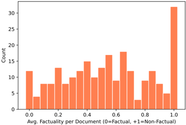
## Histogram: Factuality Distribution of Documents
### Overview
The image is a histogram showing the distribution of average factuality scores across a set of documents. The x-axis represents the average factuality per document, ranging from 0 (factual) to 1 (non-factual). The y-axis represents the count of documents falling into each factuality bin. The bars are all colored in a shade of orange.
### Components/Axes
* **X-axis:** Avg. Factuality per Document (0=Factual, +1=Non-Factual). The scale ranges from 0.0 to 1.0 in increments of 0.2.
* **Y-axis:** Count. The scale ranges from 0 to 30 in increments of 5.
* **Bars:** Represent the number of documents within each factuality range.
### Detailed Analysis
The histogram shows the distribution of documents across different factuality scores. Here's a breakdown of the approximate counts for each bin:
* 0.0: ~12
* 0.05: ~4
* 0.1: ~8
* 0.15: ~8
* 0.2: ~10
* 0.25: ~12
* 0.3: ~9
* 0.35: ~11
* 0.4: ~14
* 0.45: ~11
* 0.5: ~14
* 0.55: ~13
* 0.6: ~18
* 0.65: ~15
* 0.7: ~12
* 0.75: ~6
* 0.8: ~10
* 0.85: ~7
* 0.9: ~8
* 0.95: ~6
* 1.0: ~31
### Key Observations
* The distribution is somewhat uneven, with a large spike at the "non-factual" end (1.0).
* There are several smaller peaks and valleys across the factuality spectrum.
* The distribution is skewed towards the non-factual end, with a higher concentration of documents having a factuality score closer to 1.
### Interpretation
The histogram suggests that the dataset contains a significant number of documents that are classified as non-factual. The spike at 1.0 indicates that a large portion of the documents are strongly classified as non-factual. The presence of documents across the entire factuality spectrum suggests a range of content, from highly factual to highly non-factual, with varying degrees of factuality in between. The uneven distribution indicates that certain factuality levels are more prevalent than others within the dataset.