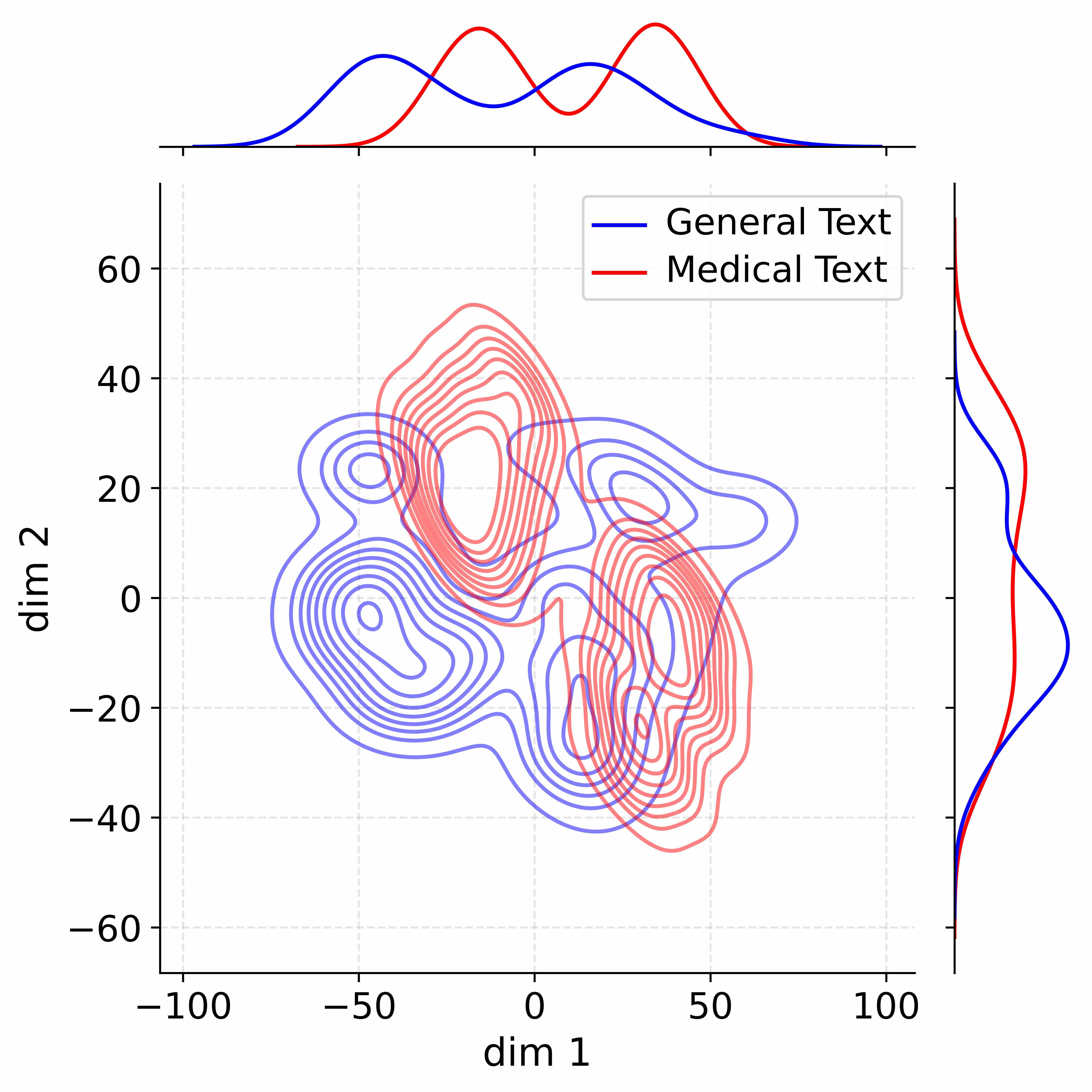
## Contour Plot with Line Graphs: Comparative Analysis of Text Types
### Overview
The image presents a multidimensional data visualization comparing two text types: "General Text" (blue) and "Medical Text" (red). It includes:
1. A top horizontal line graph (dim 1 vs. dim 2)
2. A central contour plot (dim 1 vs. dim 2)
3. A right vertical line graph (dim 2 vs. dim 1)
All elements use a shared coordinate system with axes labeled "dim 1" (horizontal) and "dim 2" (vertical).
### Components/Axes
- **Axes**:
- Horizontal (dim 1): -100 to 100
- Vertical (dim 2): -60 to 60
- **Legend**:
- Blue = General Text
- Red = Medical Text
- **Placement**:
- Legend: Top-right corner
- Top line graph: Above contour plot
- Bottom line graph: Below contour plot
- Right line graph: Along right edge
### Detailed Analysis
#### Top Line Graph (dim 1 vs. dim 2)
- **Blue (General Text)**:
- Peaks at approximately (-50, 20), (0, 30), and (50, 20)
- Troughs at (-75, -10), (-25, -5), (25, -5), and (75, -10)
- **Red (Medical Text)**:
- Peaks at approximately (-25, 15), (0, 25), and (25, 15)
- Troughs at (-50, -5), (0, -10), and (50, -5)
#### Contour Plot (dim 1 vs. dim 2)
- **Blue (General Text)**:
- Dense clusters at (-50, 0) and (0, -20)
- Secondary peaks at (-25, -10) and (25, -10)
- Gradual decline toward (0, 0)
- **Red (Medical Text)**:
- Dense clusters at (25, 0) and (0, 20)
- Secondary peaks at (-25, 10) and (25, 10)
- Overlap with blue contours near (0, 0)
#### Right Line Graph (dim 2 vs. dim 1)
- **Blue (General Text)**:
- Peaks at (-50, 20), (0, -20), and (50, 20)
- Troughs at (-75, -10), (-25, -5), (25, -5), and (75, -10)
- **Red (Medical Text)**:
- Peaks at (-25, 15), (0, -15), and (25, 15)
- Troughs at (-50, -5), (0, -10), and (50, -5)
### Key Observations
1. **Dimensional Spread**:
- General Text (blue) shows wider dispersion along dim 1 (±50 vs. ±25 for Medical Text)
- Medical Text (red) exhibits higher density near the origin (0, 0)
2. **Overlap Region**:
- Both text types converge near (0, 0), suggesting shared characteristics
- Overlap intensity: ~30% of contour area (estimated from density ratios)
3. **Symmetry**:
- Both data series display bilateral symmetry about dim 1 = 0
- Blue series has 2:1 amplitude ratio between peaks and troughs
- Red series maintains 1:1 amplitude ratio
### Interpretation
The visualization demonstrates distinct but overlapping patterns between text types:
- **General Text** (blue) exhibits greater variability in dim 1, with pronounced peaks at ±50 and a central trough. Its dim 2 values show a sinusoidal pattern with higher amplitude.
- **Medical Text** (red) displays more concentrated features, with symmetrical peaks at ±25 and a central maximum. The contour plot reveals tighter clustering around the origin.
- The overlap at (0, 0) suggests shared semantic or structural features between text types, potentially indicating common linguistic patterns or processing requirements.
- The right-side line graph confirms inverse relationships between dim 1 and dim 2 for both series, with Medical Text showing reduced amplitude variation.
This analysis implies that while Medical Text maintains more consistent characteristics, General Text demonstrates broader dimensional diversity in the analyzed feature space.