## Contour Plot: General Text vs. Medical Text
### Overview
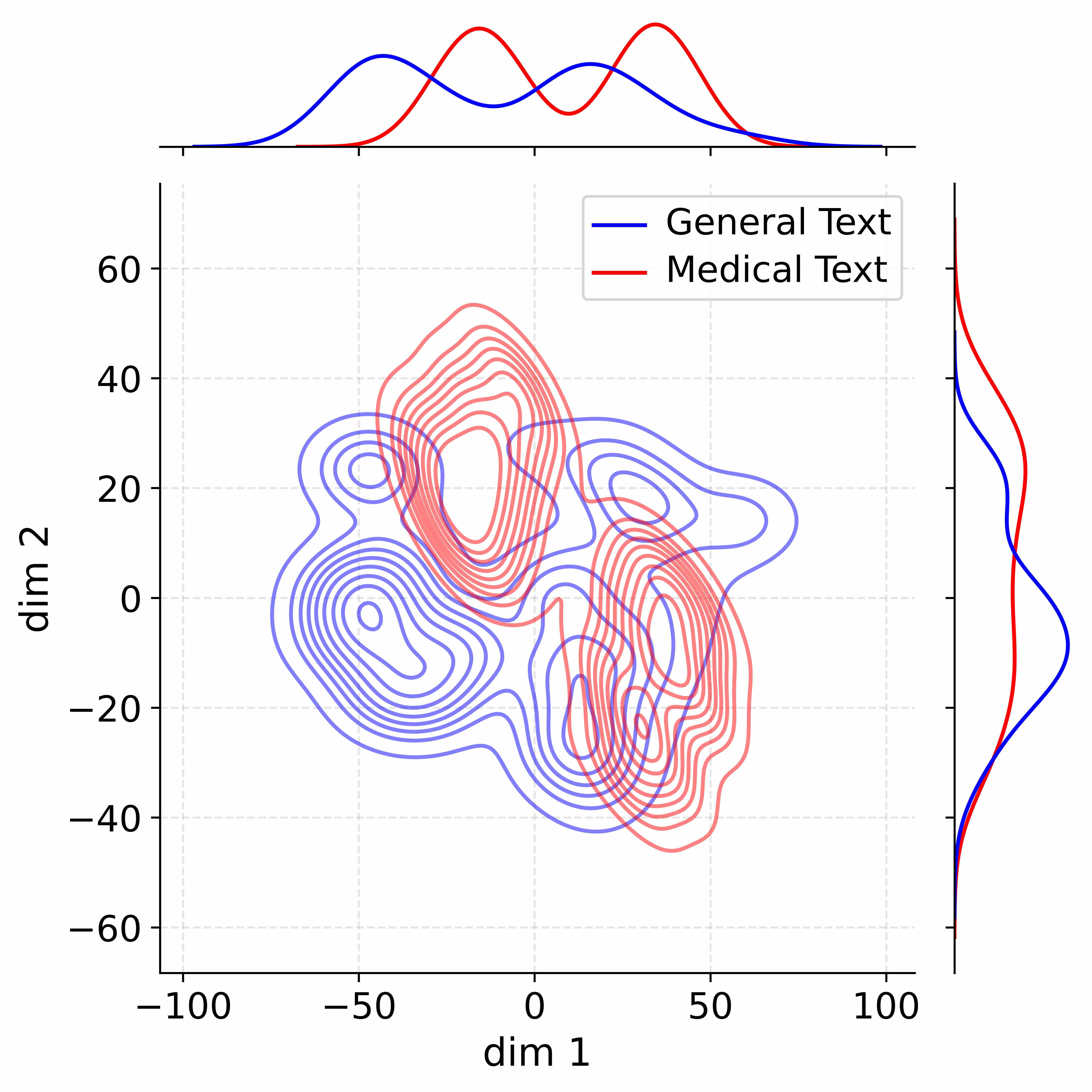
The image is a contour plot comparing the distribution of "General Text" and "Medical Text" across two dimensions (dim 1 and dim 2). The plot includes marginal distributions along the top and right edges. The "General Text" data is represented by blue lines, while the "Medical Text" data is represented by red lines.
### Components/Axes
* **Main Plot:** A 2D contour plot showing the distribution of data points.
* X-axis (dim 1): Ranges from -100 to 100, with tick marks at -100, -50, 0, 50, and 100.
* Y-axis (dim 2): Ranges from -60 to 60, with tick marks at -60, -40, -20, 0, 20, 40, and 60.
* **Top Marginal Plot:** Shows the distribution of data along the x-axis (dim 1).
* Blue line: Represents the distribution of "General Text" along dim 1. It has two peaks, one around -50 and another around 20.
* Red line: Represents the distribution of "Medical Text" along dim 1. It has two peaks, one around 20 and another around 50.
* **Right Marginal Plot:** Shows the distribution of data along the y-axis (dim 2).
* Blue line: Represents the distribution of "General Text" along dim 2. It has a single peak around 0.
* Red line: Represents the distribution of "Medical Text" along dim 2. It has a single peak around 0, but is more concentrated than the blue line.
* **Legend:** Located in the top-right corner.
* Blue line: "General Text"
* Red line: "Medical Text"
### Detailed Analysis
* **General Text (Blue):**
* In the main plot, the contours are concentrated in two main regions: one around (-50, 0) and another around (0, 0).
* The top marginal plot shows two peaks, indicating that "General Text" data is distributed across two distinct values of dim 1.
* The right marginal plot shows a single peak around 0, indicating that "General Text" data is concentrated around 0 for dim 2.
* **Medical Text (Red):**
* In the main plot, the contours are concentrated in two main regions: one around (0, 30) and another around (30, 0).
* The top marginal plot shows two peaks, indicating that "Medical Text" data is distributed across two distinct values of dim 1.
* The right marginal plot shows a single peak around 0, indicating that "Medical Text" data is concentrated around 0 for dim 2.
### Key Observations
* The distributions of "General Text" and "Medical Text" are distinct but overlapping.
* "General Text" has a higher concentration around (-50, 0), while "Medical Text" has a higher concentration around (30, 0).
* Both distributions are centered around 0 for dim 2.
### Interpretation
The contour plot visualizes the differences in the distribution of "General Text" and "Medical Text" across two dimensions. The distinct concentrations suggest that these two types of text have different characteristics in terms of dim 1 and dim 2. The overlap indicates that there are some similarities between the two types of text. The marginal distributions provide additional information about the distribution of each type of text along each dimension. The plot suggests that "General Text" and "Medical Text" can be distinguished based on their distribution in this two-dimensional space.