\n
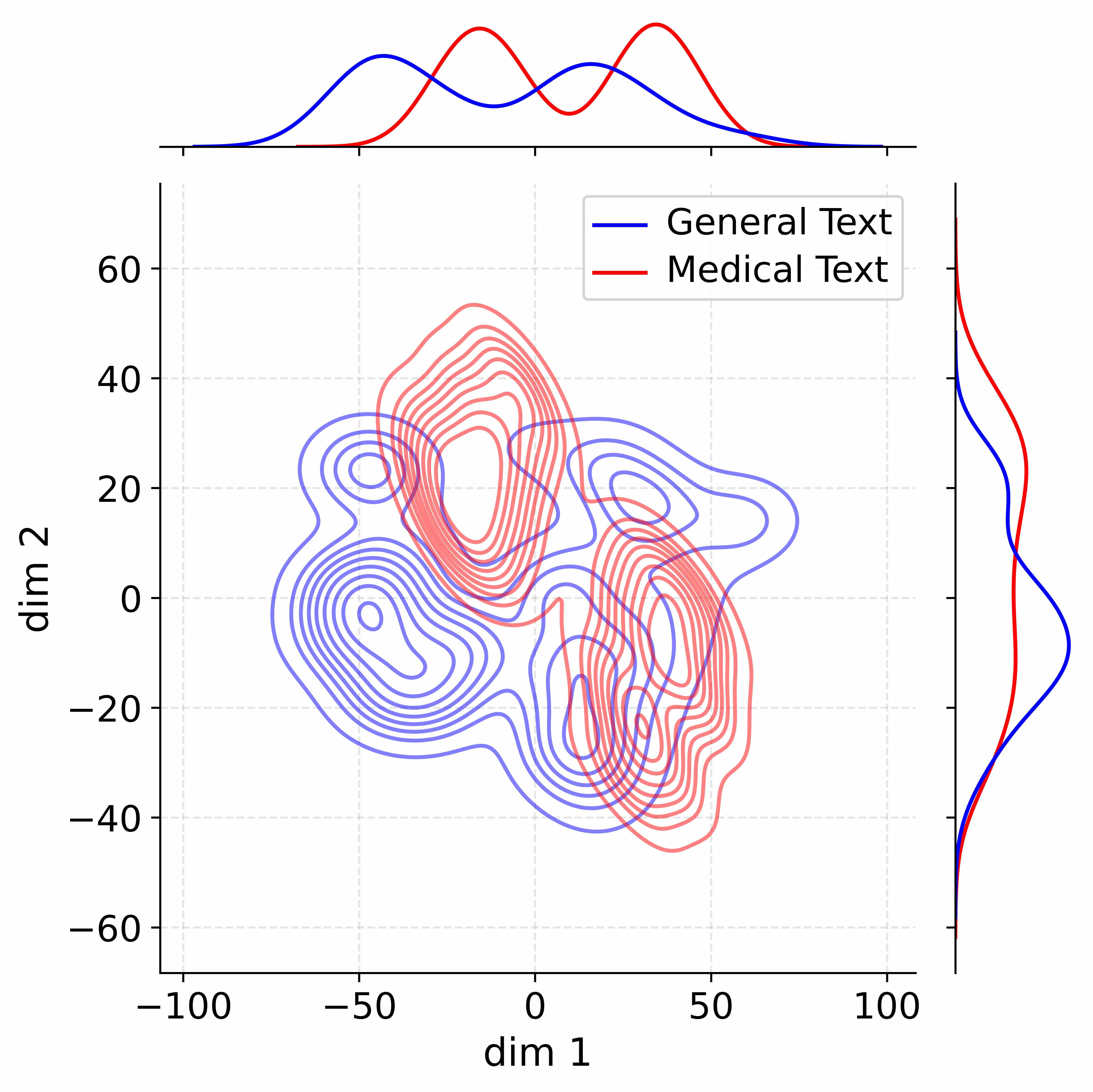
## Density Plot: Dimensionality Reduction of Text Data
### Overview
The image presents a 2D density plot visualizing the distribution of two text categories – "General Text" and "Medical Text" – projected onto two dimensions, labeled "dim 1" and "dim 2". The plot uses contour lines to represent density, with darker areas indicating higher concentrations of data points. Marginal distributions (histograms) are shown along the top and right edges, representing the distribution of each category along each dimension.
### Components/Axes
* **X-axis:** "dim 1" ranging from approximately -100 to 100.
* **Y-axis:** "dim 2" ranging from approximately -60 to 60.
* **Contour Lines:** Represent density of data points.
* **Legend (Top-Right):**
* Blue Line: "General Text"
* Red Line: "Medical Text"
* **Top Histogram:** Shows the distribution of values along "dim 1" for each text category.
* **Right Histogram:** Shows the distribution of values along "dim 2" for each text category.
* **Grid Lines:** Light gray dotted lines provide a visual reference for coordinate values.
### Detailed Analysis
The density plot shows a significant overlap between the distributions of "General Text" and "Medical Text", but also some degree of separation.
**Density Contours:**
* **General Text (Blue):** The highest density region for general text is centered around (dim 1 ≈ -20, dim 2 ≈ 10). The density decreases as you move away from this point, with a tail extending towards negative values on both dimensions.
* **Medical Text (Red):** The highest density region for medical text is centered around (dim 1 ≈ 30, dim 2 ≈ 0). Similar to general text, the density decreases with distance, with a tail extending towards positive values on both dimensions.
* **Overlap:** There is a substantial region of overlap between the two distributions, particularly around (dim 1 ≈ 0, dim 2 ≈ 0).
**Marginal Distributions (Histograms):**
* **Top Histogram (dim 1):**
* **General Text (Blue):** The distribution is roughly bell-shaped, peaking around dim 1 ≈ -20. It extends from approximately -80 to 60.
* **Medical Text (Red):** The distribution is also roughly bell-shaped, peaking around dim 1 ≈ 40. It extends from approximately -40 to 100.
* **Right Histogram (dim 2):**
* **General Text (Blue):** The distribution is somewhat skewed to the right, peaking around dim 2 ≈ 10. It extends from approximately -50 to 50.
* **Medical Text (Red):** The distribution is more symmetrical, peaking around dim 2 ≈ 0. It extends from approximately -40 to 40.
### Key Observations
* The two text categories are not perfectly separable in this 2D projection.
* "Medical Text" tends to have higher values on "dim 1" compared to "General Text".
* "General Text" tends to have higher values on "dim 2" compared to "Medical Text".
* The marginal distributions provide a clearer view of the overall distribution of each category along each dimension.
### Interpretation
This plot likely represents the result of dimensionality reduction (e.g., PCA, t-SNE) applied to text data. The original text data, which could be represented by high-dimensional vectors (e.g., word embeddings), has been projected onto two dimensions for visualization.
The fact that the two categories are not fully separated suggests that the underlying features used to represent the text (e.g., word frequencies, embeddings) do not perfectly distinguish between "General Text" and "Medical Text". There is considerable overlap in the vocabulary and linguistic patterns used in both types of text.
The differences in the marginal distributions indicate that there are some systematic differences between the two categories. For example, the higher values of "dim 1" for "Medical Text" might correspond to features related to medical terminology or specific concepts. The shape of the distributions suggests that the dimensionality reduction process has captured some of the underlying structure of the data.
The overlap in the density plot indicates that a classifier trained on this reduced dimensionality data might not achieve perfect accuracy. Further analysis, potentially using more dimensions or different feature representations, might be needed to improve the separation between the two categories.