## 2D Kernel Density Estimate Plot with Marginal Distributions: General vs. Medical Text
### Overview
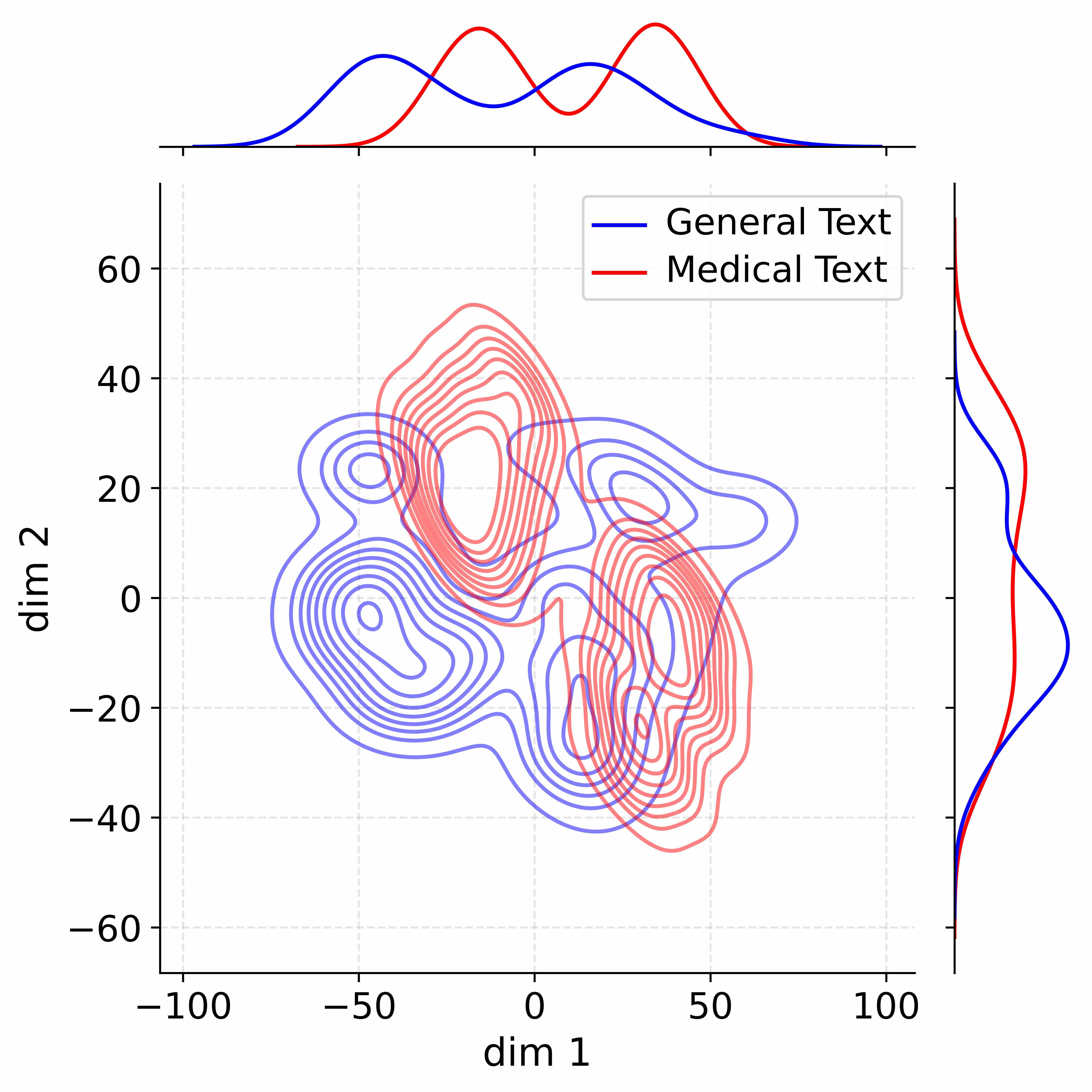
The image is a statistical visualization comparing the distribution of two datasets in a two-dimensional space. It consists of a central contour plot (a 2D kernel density estimate) and two marginal distribution plots (1D kernel density estimates) on the top and right edges. The plot compares "General Text" (blue) and "Medical Text" (red).
### Components/Axes
* **Main Plot (Center):**
* **X-axis:** Labeled "dim 1". Scale ranges from -100 to 100, with major tick marks at -100, -50, 0, 50, and 100.
* **Y-axis:** Labeled "dim 2". Scale ranges from -60 to 60, with major tick marks at -60, -40, -20, 0, 20, 40, and 60.
* **Legend:** Located in the top-right quadrant of the main plot area. It contains two entries:
* A blue line labeled "General Text".
* A red line labeled "Medical Text".
* **Grid:** A light gray dashed grid is present in the background.
* **Marginal Plot (Top):**
* Aligned with the x-axis ("dim 1") of the main plot. It shows the 1D density distribution for each dataset along this dimension.
* **Marginal Plot (Right):**
* Aligned with the y-axis ("dim 2") of the main plot. It shows the 1D density distribution for each dataset along this dimension.
### Detailed Analysis
**1. Main Contour Plot (2D Density):**
* **General Text (Blue Contours):**
* **Trend/Shape:** The distribution is multimodal, showing several distinct clusters or modes.
* **Key Density Peaks (Approximate Centers):**
* A major, dense cluster centered near `dim1 ≈ -50, dim2 ≈ 0`.
* Another significant cluster centered near `dim1 ≈ 50, dim2 ≈ 20`.
* A smaller, less dense cluster near `dim1 ≈ -25, dim2 ≈ 25`.
* **Spatial Spread:** The distribution spans a wide range, roughly from `dim1 = -80 to 80` and `dim2 = -40 to 40`.
* **Medical Text (Red Contours):**
* **Trend/Shape:** The distribution is also multimodal but appears more concentrated in specific regions compared to the blue contours.
* **Key Density Peaks (Approximate Centers):**
* A very prominent, dense cluster centered near `dim1 ≈ 0, dim2 ≈ 40`.
* Another dense cluster centered near `dim1 ≈ 30, dim2 ≈ -20`.
* **Spatial Spread:** The distribution is more vertically oriented, spanning roughly `dim1 = -40 to 60` and `dim2 = -50 to 55`.
* **Overlap:** There is significant overlap between the two distributions, particularly in the central region around `dim1 = 0 to 30` and `dim2 = -20 to 20`.
**2. Marginal Distribution Plots:**
* **Top Marginal (dim 1):**
* **General Text (Blue):** Shows a bimodal distribution with peaks at approximately `dim1 = -50` and `dim1 = 50`. The valley between them is near `dim1 = 0`.
* **Medical Text (Red):** Shows a bimodal distribution with peaks at approximately `dim1 = -10` and `dim1 = 30`. The valley is near `dim1 = 10`.
* **Right Marginal (dim 2):**
* **General Text (Blue):** Shows a broad, roughly unimodal distribution centered near `dim2 = 0`, with a slight shoulder or secondary peak near `dim2 = 20`.
* **Medical Text (Red):** Shows a bimodal distribution with peaks at approximately `dim2 = 40` and `dim2 = -20`.
### Key Observations
1. **Multimodality:** Both datasets exhibit multimodal distributions in 2D space, suggesting the presence of distinct subgroups or categories within each text type.
2. **Cluster Separation:** The primary clusters for "General Text" (blue) are separated along the `dim 1` axis (left vs. right). The primary clusters for "Medical Text" (red) are separated along both axes, creating a diagonal separation (top-center vs. bottom-right).
3. **Density Concentration:** The "Medical Text" clusters appear to have higher peak densities (more tightly packed contour lines) than the "General Text" clusters, particularly the cluster at `(0, 40)`.
4. **Marginal Confirmation:** The 1D marginal plots clearly reflect the cluster separations seen in the 2D plot. The blue line's two peaks on the top marginal correspond to its left and right clusters. The red line's two peaks on the right marginal correspond to its top and bottom clusters.
### Interpretation
This visualization likely represents the output of a dimensionality reduction technique (like t-SNE or UMAP) applied to text data, where "dim 1" and "dim 2" are the two retained dimensions. The plot demonstrates that:
* **General Text** and **Medical Text** occupy partially overlapping but distinct regions in this learned feature space. This suggests that while there is commonality, the underlying semantic or stylistic features of medical text are distinguishable from general text.
* The **multimodal nature** of each distribution implies that neither "General Text" nor "Medical Text" is a monolithic category. Each likely contains several sub-types or topics. For example, the two blue clusters might represent different genres of general text (e.g., news vs. fiction), while the two red clusters might represent different medical domains (e.g., clinical reports vs. research articles).
* The **tight clustering** of Medical Text, especially the prominent mode at `(0, 40)`, indicates a highly consistent and specific set of features defining a major subset of medical documents. The separation between its clusters suggests these subtypes are quite distinct from each other.
* The **overlap region** contains text samples that share features common to both general and medical domains, potentially representing medical texts written for a lay audience or general texts discussing health topics.
In essence, the chart provides a visual fingerprint of how two broad text categories differ and are internally structured within a common analytical space.