\n
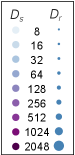
## Heatmap: Ds vs Dr Correlation
### Overview
The image presents a heatmap-like visualization correlating two parameters, labeled *Ds* and *Dr*. The visualization uses a gradient of colors to represent values, with *Ds* values listed on the left and corresponding *Dr* values represented by the size and color of circles on the right. The image appears to demonstrate a relationship between these two parameters, where increasing *Ds* values correspond to increasing *Dr* values.
### Components/Axes
* **Vertical Axis (Ds):** Labeled "Ds", with values: 8, 16, 32, 64, 128, 256, 512, 1024, 2048.
* **Horizontal Axis (Dr):** Labeled "Dr", with no numerical values explicitly shown, but represented by the size and color of circles.
* **Color Gradient:** A gradient from light blue to dark purple, representing increasing values.
* **Circles:** Varying in size and color, representing the *Dr* value for each corresponding *Ds* value.
### Detailed Analysis
The visualization shows a clear correlation between *Ds* and *Dr*. As *Ds* increases, the size and intensity of the corresponding circle (representing *Dr*) also increases.
Here's a breakdown of the approximate *Dr* values based on the circle size and color:
* Ds = 8: Dr ≈ 1 (very small, light blue circle)
* Ds = 16: Dr ≈ 2 (small, light blue circle)
* Ds = 32: Dr ≈ 3 (slightly larger, light blue circle)
* Ds = 64: Dr ≈ 4 (medium, light blue circle)
* Ds = 128: Dr ≈ 7 (medium, purple circle)
* Ds = 256: Dr ≈ 10 (medium-large, purple circle)
* Ds = 512: Dr ≈ 15 (large, dark purple circle)
* Ds = 1024: Dr ≈ 20 (very large, dark purple circle)
* Ds = 2048: Dr ≈ 25 (largest, dark purple circle)
The color gradient progresses from light blue (low *Dr* values) to dark purple (high *Dr* values). The circles increase in diameter as *Ds* increases, visually representing the positive correlation.
### Key Observations
* The relationship between *Ds* and *Dr* appears to be non-linear. The increase in *Dr* seems to accelerate as *Ds* increases.
* The visualization provides a qualitative understanding of the relationship rather than precise numerical values for *Dr*.
* The scale for *Dr* is not explicitly defined, making it difficult to determine the exact units or range.
### Interpretation
This visualization likely represents a relationship between two parameters in a system where increasing *Ds* leads to a more significant effect, measured by *Dr*. The non-linear relationship suggests that the effect of *Ds* on *Dr* is not constant; it becomes more pronounced at higher values of *Ds*.
Without knowing the context of *Ds* and *Dr*, it's difficult to provide a more specific interpretation. However, the visualization suggests a positive feedback loop or an exponential relationship between the two parameters. The visualization is a qualitative representation of a correlation, and further analysis with precise numerical data would be needed to confirm the nature of the relationship and its underlying mechanisms.