## Bar Chart: Overall Performance Comparison of Policy Models
### Overview
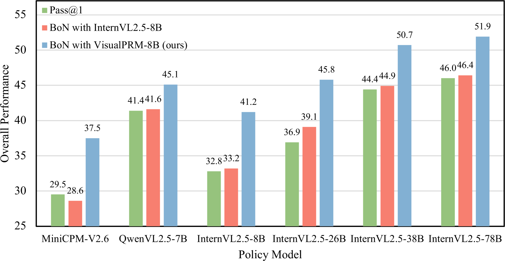
The image is a bar chart comparing the overall performance of different policy models. The y-axis represents "Overall Performance," ranging from 25 to 55. The x-axis represents "Policy Model," with several models listed. There are three data series, each represented by a different color bar: "Pass@1" (green), "BoN with InternVL2.5-8B" (red), and "BoN with VisualPRM-8B (ours)" (blue).
### Components/Axes
* **Y-axis:** "Overall Performance," with a scale from 25 to 55 in increments of 5.
* **X-axis:** "Policy Model," listing the following models: MiniCPM-V2.6, QwenVL2.5-7B, InternVL2.5-8B, InternVL2.5-26B, InternVL2.5-38B, InternVL2.5-78B.
* **Legend:** Located at the top-left of the chart, it identifies the three data series:
* Green: "Pass@1"
* Red: "BoN with InternVL2.5-8B"
* Blue: "BoN with VisualPRM-8B (ours)"
### Detailed Analysis
Here's a breakdown of the performance for each policy model across the three data series:
* **MiniCPM-V2.6:**
* Pass@1 (Green): 29.5
* BoN with InternVL2.5-8B (Red): 28.6
* BoN with VisualPRM-8B (Blue): 37.5
* **QwenVL2.5-7B:**
* Pass@1 (Green): 41.4
* BoN with InternVL2.5-8B (Red): 41.6
* BoN with VisualPRM-8B (Blue): 45.1
* **InternVL2.5-8B:**
* Pass@1 (Green): 32.8
* BoN with InternVL2.5-8B (Red): 33.2
* BoN with VisualPRM-8B (Blue): 41.2
* **InternVL2.5-26B:**
* Pass@1 (Green): 36.9
* BoN with InternVL2.5-8B (Red): 39.1
* BoN with VisualPRM-8B (Blue): 45.8
* **InternVL2.5-38B:**
* Pass@1 (Green): 44.4
* BoN with InternVL2.5-8B (Red): 44.9
* BoN with VisualPRM-8B (Blue): 50.7
* **InternVL2.5-78B:**
* Pass@1 (Green): 46.0
* BoN with InternVL2.5-8B (Red): 46.4
* BoN with VisualPRM-8B (Blue): 51.9
### Key Observations
* The "BoN with VisualPRM-8B (ours)" (blue) consistently outperforms the other two models across all policy models.
* The performance of all three data series generally increases as the "InternVL2.5" model number increases (e.g., from 26B to 78B).
* The "Pass@1" (green) and "BoN with InternVL2.5-8B" (red) models have very similar performance for each policy model, with the red bar being slightly higher in most cases.
### Interpretation
The chart demonstrates that "BoN with VisualPRM-8B (ours)" achieves the highest overall performance compared to "Pass@1" and "BoN with InternVL2.5-8B" across the tested policy models. The trend suggests that increasing the size or complexity of the "InternVL2.5" model generally leads to improved performance for all three configurations. The consistent outperformance of the "VisualPRM-8B" model indicates its effectiveness in the given task or benchmark. The similar performance between "Pass@1" and "InternVL2.5-8B" might suggest a correlation or similar underlying mechanism in their approach.