TECHNICAL ASSET FINGERPRINT
9db5bea3f04939c1478eb572
Click to view fullscreen
Press ESC or click to close
FOUND IN PAPERS
EXPERT: gemini-3.1-pro-preview VERSION 1
RUNTIME: gemini/gemini-3.1-pro-preview
INTEL_VERIFIED
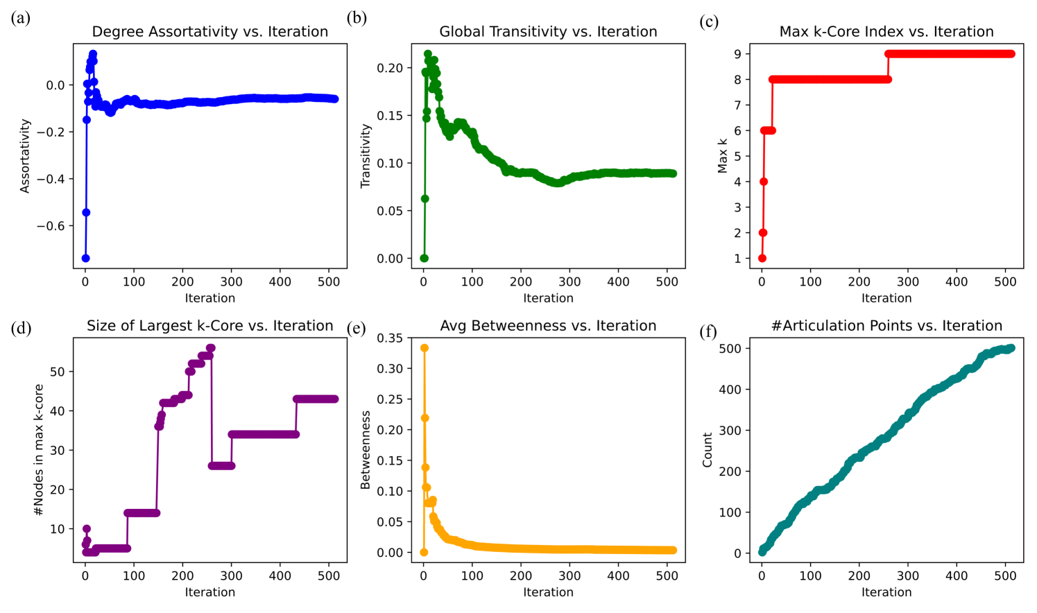
## Multi-Panel Line Charts: Network Evolution Metrics
### Overview
This image consists of a 2x3 grid of line charts, labeled (a) through (f). The charts display the evolution of various network topology metrics over a series of iterations. All six charts share a common X-axis representing "Iteration," ranging from 0 to slightly over 500. Each chart utilizes a distinct color for its data series and plots a different network metric on the Y-axis. There is no standalone legend; instead, the title of each subplot and the Y-axis label define the data being presented.
### Components/Axes
* **Global X-Axis:** Present on all six charts. Labeled "Iteration". Major tick marks are at 0, 100, 200, 300, 400, and 500.
* **Panel (a) - Top-Left:**
* Title: "Degree Assortativity vs. Iteration"
* Y-Axis Label: "Assortativity"
* Y-Axis Scale: -0.6 to 0.0 (Tick marks at -0.6, -0.4, -0.2, 0.0)
* Data Color: Blue
* **Panel (b) - Top-Center:**
* Title: "Global Transitivity vs. Iteration"
* Y-Axis Label: "Transitivity"
* Y-Axis Scale: 0.00 to 0.20 (Tick marks at 0.00, 0.05, 0.10, 0.15, 0.20)
* Data Color: Green
* **Panel (c) - Top-Right:**
* Title: "Max k-Core Index vs. Iteration"
* Y-Axis Label: "Max k"
* Y-Axis Scale: 1 to 9 (Tick marks at 1, 2, 3, 4, 5, 6, 7, 8, 9)
* Data Color: Red
* **Panel (d) - Bottom-Left:**
* Title: "Size of Largest k-Core vs. Iteration"
* Y-Axis Label: "#Nodes in max k-core"
* Y-Axis Scale: 10 to 50 (Tick marks at 10, 20, 30, 40, 50)
* Data Color: Purple
* **Panel (e) - Bottom-Center:**
* Title: "Avg Betweenness vs. Iteration"
* Y-Axis Label: "Betweenness"
* Y-Axis Scale: 0.00 to 0.35 (Tick marks at 0.00, 0.05, 0.10, 0.15, 0.20, 0.25, 0.30, 0.35)
* Data Color: Orange
* **Panel (f) - Bottom-Right:**
* Title: "#Articulation Points vs. Iteration"
* Y-Axis Label: "Count"
* Y-Axis Scale: 0 to 500 (Tick marks at 0, 100, 200, 300, 400, 500)
* Data Color: Teal/Dark Cyan
### Detailed Analysis
**Panel (a): Degree Assortativity vs. Iteration**
* *Trend:* The blue line exhibits extreme volatility in the initial iterations, featuring a sharp drop followed by a rapid spike, before dampening into a stable, slightly negative horizontal line.
* *Data Points:* The value begins at approximately -0.75 at iteration 0. It immediately spikes to a peak of roughly +0.15 around iteration 20. It then drops back down to approximately -0.15 by iteration 50. From iteration 100 through 500, the line stabilizes, hovering consistently between -0.05 and -0.10.
**Panel (b): Global Transitivity vs. Iteration**
* *Trend:* The green line shows an immediate, massive spike from zero, followed by a jagged, gradual decay curve that eventually levels off.
* *Data Points:* Starting exactly at 0.00 at iteration 0, it shoots up to a peak of ~0.21 within the first 10-15 iterations. It drops to ~0.13 near iteration 50, experiences a secondary bump to ~0.14 around iteration 80, and then steadily declines. By iteration 280, it hits a local minimum of ~0.08. It then rises slightly and stabilizes at approximately 0.09 from iteration 350 to 500.
**Panel (c): Max k-Core Index vs. Iteration**
* *Trend:* The red line follows a strict, monotonically increasing step-function. It only moves horizontally or vertically upwards.
* *Data Points:* Starting at a value of 1 at iteration 0, it rapidly steps up to 2, 4, and 6 within the first 10 iterations. By iteration ~20, it steps up to 8. It remains perfectly flat at 8 for a long duration. At approximately iteration 260, it steps up to 9, where it remains flat through iteration 500.
**Panel (d): Size of Largest k-Core vs. Iteration**
* *Trend:* The purple line is a highly volatile step-function. Unlike panel (c), it features both sharp increases and sharp decreases, forming distinct plateaus.
* *Data Points:* Starting at ~10 nodes, it drops to ~4 nodes almost immediately. It stays at ~5 nodes until iteration ~80, where it steps up to ~14. At iteration ~150, it jumps to ~36, then steps up incrementally to ~42, ~44, and ~50, peaking at ~56 nodes around iteration 250. *Crucially*, at iteration ~260, it plummets sharply down to ~26 nodes. It steps up to ~34 at iteration 300, and finally steps up to ~43 at iteration 430, remaining there until the end.
**Panel (e): Avg Betweenness vs. Iteration**
* *Trend:* The orange line demonstrates an extreme initial spike followed by a rapid, smooth exponential decay, asymptotically approaching zero.
* *Data Points:* Starting at 0.00 at iteration 0, it spikes instantly to its maximum of ~0.33 at iteration 1 or 2. It crashes rapidly, falling below 0.10 by iteration 20. By iteration 100, the value is approximately 0.02. From iteration 200 to 500, the line is virtually flat, hovering just above 0.00.
**Panel (f): #Articulation Points vs. Iteration**
* *Trend:* The teal line displays a nearly constant, linear upward slope from the beginning to the end of the observed period.
* *Data Points:* Starting at 0 at iteration 0, it grows steadily. At iteration 100, the count is ~130. At iteration 200, it is ~240. At iteration 300, it is ~350. At iteration 400, it is ~430. By iteration 500, the count reaches approximately 500.
### Key Observations
1. **Initial Chaos:** The first 50 iterations represent a period of extreme structural volatility. Assortativity (a), Transitivity (b), and Betweenness (e) all experience their most dramatic spikes and crashes during this brief initial window.
2. **Correlated Step-Changes:** There is a direct, observable correlation between Panel (c) and Panel (d) at iteration ~260. Exactly when the Max k-Core Index increases from 8 to 9, the *size* of that maximum k-core drops precipitously from ~56 to ~26.
3. **Divergent Long-Term Trends:** While metrics like Assortativity, Transitivity, and Betweenness stabilize and flatten out after iteration 200, the number of Articulation Points (f) continues to grow linearly without any sign of plateauing.
### Interpretation
These charts likely depict the evolution of a generative network model or a dynamic graph undergoing a specific iterative process (such as node addition, edge rewiring, or a specific algorithmic simulation).
* **Network Maturation:** The wild fluctuations in the first 50 iterations suggest the network starts from a highly unstable or trivial state (e.g., an empty graph or a simple chain) and rapidly forms its initial complex topology. The stabilization of Betweenness near zero indicates that as the network grows, it loses any central "bottleneck" nodes; paths become distributed.
* **Core Deepening vs. Shrinking:** The relationship between charts (c) and (d) is a classic demonstration of k-core decomposition dynamics. As the network evolves, it becomes dense enough to support a higher-order core (moving from an 8-core to a 9-core at iteration 260). However, because the criteria for a 9-core are stricter (every node must have at least 9 connections *within* that specific subgraph), many nodes that qualified for the 8-core are filtered out. Thus, the core becomes "deeper" (more densely connected) but physically smaller in terms of node count.
* **Peripheral Expansion:** The relentless linear growth of Articulation Points (f) (nodes whose removal would disconnect the graph) combined with the stabilizing dense core suggests a specific growth pattern. The network is likely developing a dense, cohesive center (evidenced by the k-core and stable transitivity) while simultaneously growing long, tree-like, or branching structures on its periphery. Every new node added to these peripheral branches creates a new articulation point, explaining the steady linear climb in chart (f) even as the core metrics stabilize.
DECODING INTELLIGENCE...