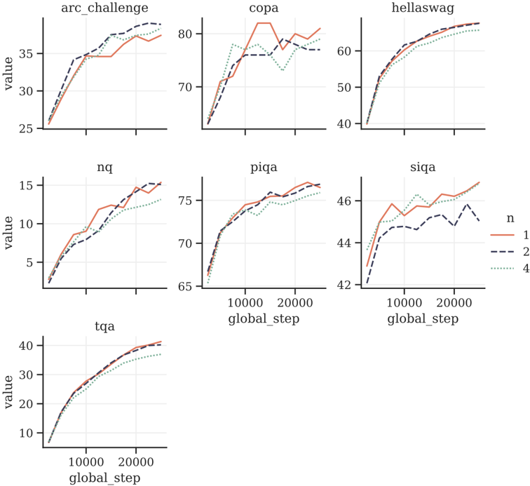
## Line Graphs: Performance Metrics Across Datasets
### Overview
The image contains seven line graphs arranged in a 3x2 grid (with one graph in the bottom row). Each graph represents the relationship between "global_step" (x-axis) and a performance metric labeled "value" (y-axis). Three data series are plotted per graph, differentiated by line color and legend labels: red (n=1), blue (n=2), and green (n=4). The graphs vary in y-axis scale and dataset-specific labels (e.g., "arc_challenge," "copa").
---
### Components/Axes
- **X-axis**: Labeled "global_step" with markers at 10,000 and 20,000. Consistent across all graphs.
- **Y-axis**: Labeled "value," with scales varying per graph (e.g., 0–40 for "arc_challenge," 0–80 for "copa").
- **Legend**: Positioned on the right side of the image. Colors correspond to:
- Red: n=1 (single participant)
- Blue: n=2 (two participants)
- Green: n=4 (four participants)
- **Dataset Labels**: Top row graphs labeled "arc_challenge," "copa," "hellaswag"; bottom row labeled "nq," "piqa," "siqa," "tqa."
---
### Detailed Analysis
1. **arc_challenge**:
- Y-axis: 0–40.
- Red (n=1): Starts at ~25, rises to ~35 by 20k steps.
- Blue (n=2): Starts at ~30, rises to ~38.
- Green (n=4): Starts at ~35, rises to ~39.
- **Trend**: All lines slope upward, with n=4 showing the steepest increase.
2. **copa**:
- Y-axis: 0–80.
- Red (n=1): Peaks at ~75 around 15k steps, then dips to ~65.
- Blue (n=2): Starts at ~60, rises to ~70.
- Green (n=4): Starts at ~65, rises to ~75.
- **Trend**: n=1 exhibits volatility; n=2 and n=4 show steady growth.
3. **hellaswag**:
- Y-axis: 0–60.
- Red (n=1): Starts at ~40, rises to ~55.
- Blue (n=2): Starts at ~45, rises to ~58.
- Green (n=4): Starts at ~50, rises to ~60.
- **Trend**: All lines slope upward, with n=4 maintaining the highest value.
4. **nq**:
- Y-axis: 0–15.
- Red (n=1): Starts at ~5, rises to ~12.
- Blue (n=2): Starts at ~7, rises to ~14.
- Green (n=4): Starts at ~9, rises to ~15.
- **Trend**: Consistent upward slopes; n=4 outperforms others.
5. **piqa**:
- Y-axis: 0–75.
- Red (n=1): Starts at ~60, rises to ~70.
- Blue (n=2): Starts at ~65, rises to ~72.
- Green (n=4): Starts at ~68, rises to ~74.
- **Trend**: Gradual increases; n=4 leads throughout.
6. **siqa**:
- Y-axis: 0–46.
- Red (n=1): Starts at ~40, rises to ~45.
- Blue (n=2): Starts at ~42, rises to ~44.
- Green (n=4): Starts at ~44, rises to ~46.
- **Trend**: Minimal differences; n=4 slightly outperforms.
7. **tqa**:
- Y-axis: 0–40.
- Red (n=1): Starts at ~20, rises to ~30.
- Blue (n=2): Starts at ~25, rises to ~32.
- Green (n=4): Starts at ~28, rises to ~35.
- **Trend**: All lines slope upward; n=4 shows the steepest gain.
---
### Key Observations
- **Consistent Trends**: Across all datasets, higher n (participants) correlates with higher "value" at 20k steps.
- **Anomalies**: In "copa," the red line (n=1) peaks and dips, suggesting potential instability or overfitting.
- **Scale Variability**: Y-axis ranges differ per graph, indicating dataset-specific metric distributions.
- **Efficiency Gaps**: Some datasets (e.g., "siqa") show minimal performance differences between n=2 and n=4, while others (e.g., "arc_challenge") exhibit larger gaps.
---
### Interpretation
The data suggests that increasing the number of participants (n) generally improves performance (value) over time. However, the relationship is not universally linear:
- **Diminishing Returns**: In "siqa," the performance gap between n=2 and n=4 narrows, implying limited benefits from additional participants.
- **Volatility**: The "copa" dataset shows instability for n=1, possibly due to noise or task-specific challenges.
- **Task Dependency**: Performance trends vary by dataset (e.g., "hellaswag" and "tqa" show steeper gains for n=4 compared to "nq" or "piqa"), suggesting that participant count impacts different tasks differently.
The graphs highlight the importance of participant scale in optimizing performance but also underscore the need for dataset-specific analysis to understand efficiency trade-offs.