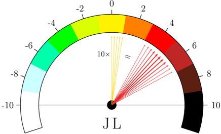
## Gauge Chart: JL Metric Scale
### Overview
The image displays a semicircular gauge or dial chart, likely representing a metric or measurement labeled "JL". The gauge features a color-coded arc spanning from -10 to +10, with a central indicator point and several radiating lines suggesting multiple readings or a distribution of values.
### Components/Axes
* **Primary Scale:** A semicircular arc calibrated from -10 (left) to +10 (right), with 0 at the top center.
* **Numerical Markers:** The scale is marked at intervals of 2: -10, -8, -6, -4, -2, 0, 2, 4, 6, 8, 10.
* **Color Segments:** The arc is divided into 10 distinct colored segments, each corresponding to a 2-unit interval on the scale.
* **Central Label:** The text "JL" is positioned directly below the central pivot point of the gauge.
* **Annotations:** Two text annotations are present within the gauge's interior:
* "10×" is located in the upper-left quadrant, near the yellow segment.
* "=" is located in the upper-right quadrant, near the red segment.
* **Indicator Lines:** Multiple thin lines radiate from the central black dot (pivot point) towards the arc. They are clustered in two groups:
* A group of approximately 5-6 yellow lines pointing towards the yellow segment (scale value ~0 to -2).
* A group of approximately 10-12 red lines pointing towards the red and dark red segments (scale value ~4 to 8).
### Detailed Analysis
**Color-to-Scale Mapping (Clockwise from left):**
| Color Segment | Scale Range |
|---------------------|-------------|
| White | -10 to -8 |
| Light Blue | -8 to -6 |
| Cyan/Turquoise | -6 to -4 |
| Green | -4 to -2 |
| Yellow | -2 to 0 |
| Orange | 0 to 2 |
| Red | 2 to 4 |
| Dark Red | 4 to 6 |
| Very Dark Red/Brown | 6 to 8 |
| Black | 8 to 10 |
**Spatial Layout:**
* The gauge is centered in the image.
* The numerical scale is positioned along the outer edge of the colored arc.
* The "JL" label is centered horizontally at the bottom of the gauge.
* The "10×" annotation is in the top-left quadrant of the gauge's interior.
* The "=" annotation is in the top-right quadrant of the gauge's interior.
* The radiating lines originate from the central black dot.
### Key Observations
1. **Bimodal Distribution:** The radiating lines suggest two primary clusters of data points or readings: one in the negative-yellow zone (~-1 to 0) and a denser cluster in the positive-red zone (~4 to 8).
2. **Asymmetry:** The distribution of indicator lines is not symmetric around 0. The cluster on the positive side (red) contains more lines and spans a wider range (4 to 8) than the cluster on the negative side (yellow, ~-1 to 0).
3. **Color Symbolism:** The color progression from white/cool colors (negative) to black/warm colors (positive) is a common visual metaphor for intensity, severity, or magnitude, with 0 (yellow) as a neutral or transition point.
4. **Annotations:** The meaning of "10×" and "=" is not explicitly defined within the image. They could indicate scaling factors, thresholds, or specific conditions related to the JL metric.
### Interpretation
This gauge chart visually represents the state or distribution of a metric called "JL". The data suggests that JL is not a single value but has a spread, with two predominant groupings. The larger, more intense grouping is in the positive range (4 to 8), indicated by the dense red lines, suggesting this is the more common or significant state. The smaller grouping is near the neutral zone (around 0).
The color coding provides an immediate qualitative assessment: readings in the red to black zones (positive 2 to 10) likely represent high, intense, or potentially critical levels of the JL metric, while readings in the white to green zones (negative -10 to -2) represent low or inverse levels. The yellow zone around 0 appears to be a transitional or baseline area.
The annotations "10×" and "=" are critical for full interpretation but lack context. "10×" near the neutral zone might imply a tenfold increase or a scaling reference point. "=" in the high-positive zone could indicate a target, an equality condition, or a point of equivalence. Without additional documentation, their precise meaning is uncertain.
**In summary, the image depicts the JL metric as having a bimodal distribution skewed towards higher positive values, with a clear visual language using color and position to denote severity or magnitude.**