## Gauge Diagram: Amplification Visualization
### Overview
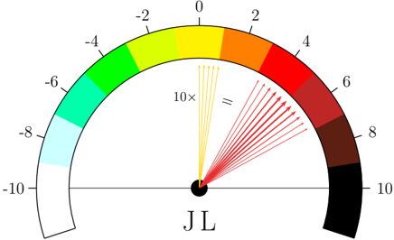
The image is a gauge diagram illustrating the concept of amplification. It features a semi-circular gauge with numerical markings ranging from -10 to 10. The gauge is color-coded, transitioning from white/light blue on the left (-10) to black on the right (10). A set of yellow arrows originating from the center are labeled "10x", and are transformed into a wider spread of red arrows, visually demonstrating a tenfold increase. The gauge is labeled "JL" at the bottom.
### Components/Axes
* **Gauge Scale:** The gauge ranges from -10 to 10, with markings at every even integer (-10, -8, -6, -4, -2, 0, 2, 4, 6, 8, 10).
* **Color Gradient:** The gauge is color-coded, transitioning from white to light blue to cyan to green to yellow to orange to red to dark red to brown to black.
* **Input Arrows:** A set of approximately 7 yellow arrows originate from the center, pointing towards the yellow section of the gauge. The arrows are labeled "10x".
* **Output Arrows:** A set of approximately 12 red arrows originate from the center, pointing towards the red and dark red sections of the gauge. The arrows are positioned after an equals sign (=).
* **Center Label:** The gauge is labeled "JL" at the bottom center.
### Detailed Analysis
* **Gauge Values:**
* Leftmost point: -10 (White)
* -8: Light Blue
* -6: Cyan
* -4: Green
* -2: Yellow-Green
* 0: Yellow
* 2: Orange
* 4: Red-Orange
* 6: Red
* 8: Dark Red/Brown
* Rightmost point: 10 (Black)
* **Input Arrows:** The yellow arrows, labeled "10x", are clustered together, indicating a small initial value. They point towards the "0" value on the gauge.
* **Output Arrows:** The red arrows are spread out, indicating a larger range of values. They point towards the "4" to "6" range on the gauge.
### Key Observations
* The diagram visually represents a tenfold amplification.
* The input arrows are concentrated, while the output arrows are dispersed, illustrating the increase in magnitude.
* The color gradient provides a visual representation of the scale, with negative values on the left and positive values on the right.
### Interpretation
The gauge diagram effectively demonstrates the concept of amplification. The "10x" label indicates a tenfold increase, which is visually represented by the transformation of the clustered yellow arrows into the spread-out red arrows. The color gradient reinforces the scale, making it easy to understand the relative magnitude of the input and output values. The diagram suggests that an initial input near zero is amplified to a range between 4 and 6. The "JL" label at the bottom is likely an identifier or abbreviation, but its specific meaning is unclear without additional context.