\n
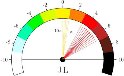
## Diagram: Color Scale with Vector Arrows
### Overview
The image depicts a semi-circular color scale ranging from blue to red, with numerical values marked along the arc. A series of yellow and red arrows emanate from a central black circle, intersecting the color scale. The diagram appears to represent a mapping between a numerical value and a color, with the arrows potentially indicating a transformation or relationship.
### Components/Axes
* **Color Scale:** A semi-circular arc divided into color segments.
* Blue: -10
* Cyan: -8
* Green: -6
* Lime: -4
* Yellow: -2, 0, 2
* Orange: 4
* Red: 6
* Dark Red: 8
* Black: 10
* **Central Circle:** A black circle at the center of the arc, serving as the origin for the arrows.
* **Arrows:** Two sets of arrows:
* Yellow Arrows: Approximately 8 arrows, originating from the central circle and pointing towards the yellow region of the color scale.
* Red Arrows: Approximately 12 arrows, originating from the central circle and pointing towards the red region of the color scale.
* **Text:** "10x" is written between the yellow and red arrows.
* **Label:** "JL" is written below the central circle.
### Detailed Analysis or Content Details
The color scale provides a mapping between numerical values and colors. The scale ranges from -10 to 10. The yellow arrows are concentrated around the values 0 to 2, while the red arrows are concentrated around the values 6 to 8. The "10x" text suggests a scaling factor applied to some input value.
The yellow arrows are approximately 8 in number, and they are all pointing towards the yellow region of the color scale. The red arrows are approximately 12 in number, and they are all pointing towards the red region of the color scale.
### Key Observations
* The arrows are not uniformly distributed across the color scale; they are clustered in the yellow and red regions.
* The "10x" label suggests a multiplication operation is involved.
* The label "JL" is present but its meaning is unclear without further context.
* The diagram does not provide any quantitative data beyond the color scale values.
### Interpretation
The diagram likely represents a visualization of a process where an input value is multiplied by 10, and the resulting value is mapped to a color. The yellow arrows could represent inputs that result in values near 0-2 after multiplication, while the red arrows represent inputs that result in values near 6-8 after multiplication. The clustering of arrows suggests that certain input values are more common or significant than others. The "JL" label could represent the author or a specific parameter of the process.
The diagram is a qualitative representation of a transformation, rather than a precise quantitative analysis. It demonstrates a relationship between an input, a scaling factor (10x), and a color-coded output. Without additional information, the exact nature of the input and the purpose of the transformation remain unclear.