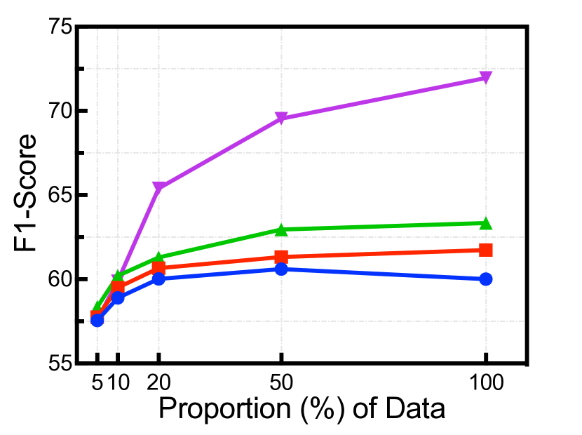
# Technical Document Extraction: Line Chart Analysis
## Chart Type
- **Line Chart** with three distinct data series represented by colored lines.
## Axes
- **X-Axis (Horizontal)**:
- **Label**: "Proportion (%) of Data"
- **Markers**: 5, 10, 20, 50, 100 (percentage values)
- **Y-Axis (Vertical)**:
- **Label**: "F1-Score"
- **Range**: 55 to 75 (increments of 5)
## Legend
- **Purple Line**: Model A
- **Green Line**: Model B
- **Blue Line**: Model C
## Key Trends
1. **Model A (Purple)**:
- **Trend**: Steady upward trajectory.
- **Performance**: Highest F1-Score at 100% data (~72).
- **Notable**: Sharp increase from 5% to 20% data (~58 to ~65).
2. **Model B (Green)**:
- **Trend**: Gradual increase followed by plateau.
- **Performance**: Peaks at 50% data (~63), then stabilizes.
- **Notable**: Minimal change between 50% and 100% data (~63 to ~63.5).
3. **Model C (Blue)**:
- **Trend**: Initial rise, then slight decline.
- **Performance**: Peaks at 50% data (~60.5), drops marginally at 100% (~60).
- **Notable**: Decline observed after 50% data proportion.
## Data Points
| Proportion (%) | Model A (F1-Score) | Model B (F1-Score) | Model C (F1-Score) |
|----------------|--------------------|--------------------|--------------------|
| 5 | ~58 | ~58 | ~58 |
| 10 | ~60 | ~60 | ~60 |
| 20 | ~65 | ~61 | ~60 |
| 50 | ~69.5 | ~63 | ~60.5 |
| 100 | ~72 | ~63.5 | ~60 |
## Additional Observations
- **Arrows**: Indicate directional trends (e.g., upward for Model A, plateau for Model B, decline for Model C).
- **Convergence**: All models start at similar F1-Scores (~58) at 5% data.
- **Divergence**: Model A outperforms others significantly at higher data proportions (>50%).
## Conclusion
- **Model A** demonstrates the most consistent improvement with increased data.
- **Model B** shows diminishing returns after 50% data.
- **Model C** exhibits a trade-off between data proportion and performance.