\n
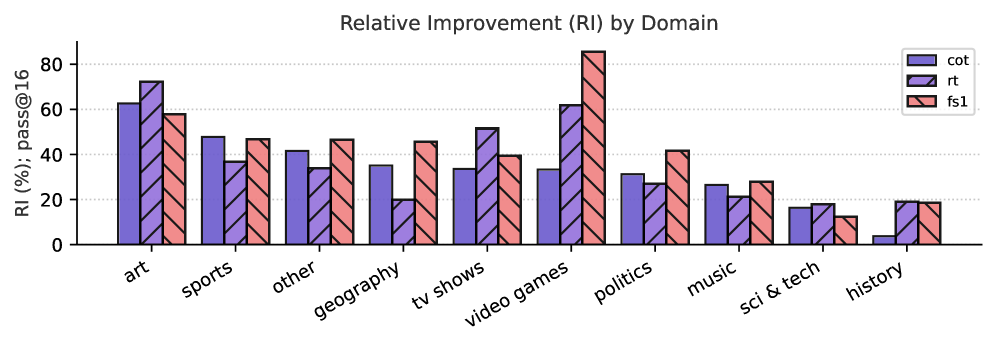
## Bar Chart: Relative Improvement (RI) by Domain
### Overview
This bar chart displays the relative improvement (RI) across different domains, measured as a percentage. Three different models ("cot", "rt", and "fs1") are compared for each domain. The Y-axis represents the RI (%) at pass@16, and the X-axis lists the domains.
### Components/Axes
* **Title:** "Relative Improvement (RI) by Domain" - positioned at the top-center of the chart.
* **X-axis Label:** "Domain" - labels the categories along the horizontal axis. The domains are: "art", "sports", "other", "geography", "tv shows", "video games", "politics", "music", "sci & tech", "history".
* **Y-axis Label:** "RI (%) ; pass@16" - labels the vertical axis, indicating the relative improvement percentage. The scale ranges from 0 to approximately 85.
* **Legend:** Located in the top-right corner of the chart.
* "cot" - represented by a solid blue color.
* "rt" - represented by a black color.
* "fs1" - represented by a red color.
### Detailed Analysis
The chart consists of grouped bar plots for each domain, representing the RI for each model.
* **Art:**
* cot: Approximately 72%
* rt: Approximately 62%
* fs1: Approximately 68%
* **Sports:**
* cot: Approximately 48%
* rt: Approximately 62%
* fs1: Approximately 44%
* **Other:**
* cot: Approximately 44%
* rt: Approximately 44%
* fs1: Approximately 44%
* **Geography:**
* cot: Approximately 48%
* rt: Approximately 32%
* fs1: Approximately 36%
* **TV Shows:**
* cot: Approximately 40%
* rt: Approximately 36%
* fs1: Approximately 40%
* **Video Games:**
* cot: Approximately 36%
* rt: Approximately 44%
* fs1: Approximately 64%
* **Politics:**
* cot: Approximately 64%
* rt: Approximately 36%
* fs1: Approximately 84%
* **Music:**
* cot: Approximately 24%
* rt: Approximately 32%
* fs1: Approximately 28%
* **Sci & Tech:**
* cot: Approximately 16%
* rt: Approximately 24%
* fs1: Approximately 12%
* **History:**
* cot: Approximately 16%
* rt: Approximately 12%
* fs1: Approximately 18%
### Key Observations
* The "fs1" model consistently demonstrates the highest relative improvement in "politics" (approximately 84%).
* The "cot" model shows the highest relative improvement in "art" (approximately 72%).
* "Sci & Tech" and "History" consistently show the lowest relative improvements across all models.
* In the "sports" domain, the "rt" model outperforms both "cot" and "fs1".
* The "video games" domain shows a significant improvement for the "fs1" model compared to "cot".
### Interpretation
The chart illustrates the performance of three different models ("cot", "rt", and "fs1") across various domains. The relative improvement (RI) varies significantly depending on the domain and the model used. This suggests that the effectiveness of each model is domain-specific. The "fs1" model appears to be particularly strong in "politics", while the "cot" model excels in "art". The consistently low performance in "sci & tech" and "history" might indicate that these domains present unique challenges for all three models, potentially due to the complexity of the subject matter or the availability of training data. The differences in performance between the models highlight the importance of selecting the appropriate model for a given task or domain. The pass@16 metric suggests a threshold for acceptable performance, and the RI indicates how much improvement is achieved relative to a baseline.