## Scatter Plots: Principal Component Analysis (PCA) for Token "deeper"
### Overview
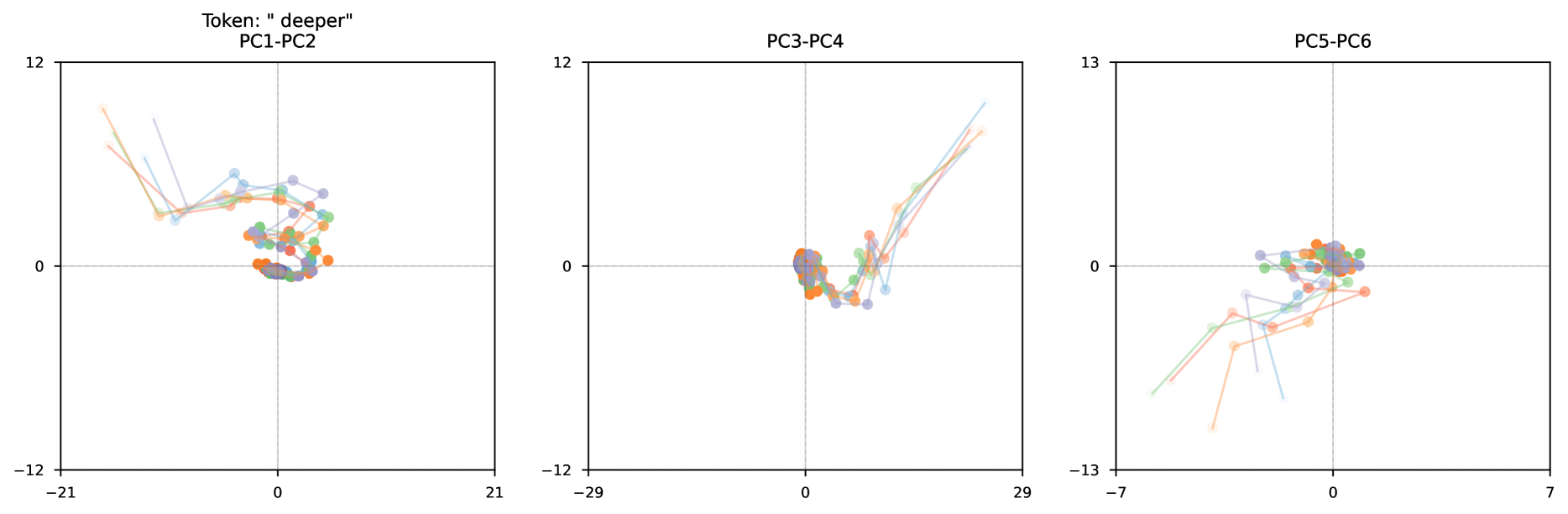
The image presents three scatter plots, each representing a projection of data onto a different pair of principal components (PCs). The plots visualize the distribution of data points associated with the token "deeper" across these principal component spaces. Each plot has a different PC pairing: PC1-PC2, PC3-PC4, and PC5-PC6. Lines connect consecutive data points, suggesting a temporal or sequential aspect to the data.
### Components/Axes
Each plot shares the following characteristics:
* **X-axis:** Ranges from approximately -30 to 30 (varying slightly between plots), representing the principal component value.
* **Y-axis:** Ranges from approximately -12 to 12 (varying slightly between plots), representing the principal component value.
* **Title:** Each plot is labeled with the corresponding PC pairing (e.g., "PC1-PC2").
* **Overall Title:** "Token: “deeper”" is present at the top-left of the first plot, indicating the data relates to the token "deeper".
* **Data Points:** Represented by colored dots, connected by lines. The colors appear to be consistent across all three plots, suggesting they represent the same categories.
* **No explicit legend:** The colors are not explicitly labeled, but can be inferred from the consistent use of colors across the plots.
### Detailed Analysis or Content Details
**Plot 1: PC1-PC2**
* **Line 1 (Orange):** Starts at approximately (-21, 10), slopes downward to (-2, -2), then rises to (2, 0).
* **Line 2 (Light Blue):** Starts at approximately (-18, 8), slopes downward to (-1, -3), then rises to (3, -1).
* **Line 3 (Green):** Starts at approximately (-15, 6), slopes downward to (-1, -4), then rises to (2, -2).
* **Line 4 (Red):** Starts at approximately (-12, 4), slopes downward to (0, -5), then rises to (1, -3).
* **Line 5 (Purple):** Starts at approximately (-9, 2), slopes downward to (1, -6), then rises to (0, -4).
* **Scattered Points (Teal):** Cluster around the origin (0,0), with points ranging from approximately (-2, -2) to (2, 2).
**Plot 2: PC3-PC4**
* **Line 1 (Orange):** Starts at approximately (-29, 10), slopes downward to (-2, 1), then rises to (2, 2).
* **Line 2 (Light Blue):** Starts at approximately (-25, 8), slopes downward to (-1, 2), then rises to (1, 3).
* **Line 3 (Green):** Starts at approximately (-21, 6), slopes downward to (0, 3), then rises to (1, 4).
* **Line 4 (Red):** Starts at approximately (-17, 4), slopes downward to (1, 4), then rises to (2, 5).
* **Line 5 (Purple):** Starts at approximately (-13, 2), slopes downward to (2, 5), then rises to (3, 6).
* **Scattered Points (Teal):** Cluster around the origin (0,0), with points ranging from approximately (-1, -1) to (1, 1).
**Plot 3: PC5-PC6**
* **Line 1 (Orange):** Starts at approximately (-7, 11), slopes downward to (-1, 2), then rises to (2, 3).
* **Line 2 (Light Blue):** Starts at approximately (-5, 9), slopes downward to (0, 3), then rises to (1, 4).
* **Line 3 (Green):** Starts at approximately (-3, 7), slopes downward to (1, 4), then rises to (2, 5).
* **Line 4 (Red):** Starts at approximately (-1, 5), slopes downward to (2, 5), then rises to (3, 6).
* **Line 5 (Purple):** Starts at approximately (1, 3), slopes downward to (3, 6), then rises to (4, 7).
* **Scattered Points (Teal):** Cluster around the origin (0,0), with points ranging from approximately (-1, -1) to (1, 1).
### Key Observations
* **Consistent Trends:** The colored lines (Orange, Light Blue, Green, Red, Purple) exhibit a similar downward-then-upward trend across all three plots. This suggests a consistent pattern in the data's behavior across different principal component spaces.
* **Clustering:** The teal points consistently cluster around the origin (0,0) in all three plots, indicating a central tendency for this data subset.
* **Variance:** The spread of the colored lines and teal points varies across the plots, indicating different levels of variance captured by each PC pairing.
* **No Legend:** The lack of a legend makes it difficult to definitively assign meaning to the colors.
### Interpretation
These plots represent a Principal Component Analysis (PCA) applied to data associated with the token "deeper". PCA is a dimensionality reduction technique that identifies the principal components – directions of maximum variance in the data. Each plot shows how the data is distributed when projected onto two of these principal components.
The consistent downward-then-upward trend of the colored lines suggests a dynamic process or a change in state over time or some other sequential variable. The lines likely represent different instances or trajectories of this process. The clustering of teal points around the origin indicates a stable or baseline state.
The fact that the patterns are visible across different PC pairings (PC1-PC2, PC3-PC4, PC5-PC6) suggests that the underlying structure is robust and not specific to any particular pair of components. The varying spread of points across the plots indicates that some PC pairings capture more of the data's variance than others.
Without a legend, the specific meaning of the colors remains unknown. They could represent different categories, classes, or features of the data. Further information about the data and the PCA process would be needed to fully interpret the results.