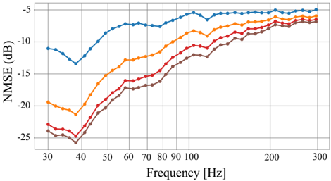
## Line Graph: NMSE Performance Across Frequency Bands
### Overview
The image depicts a line graph comparing the Normalized Mean Squared Error (NMSE) in decibels (dB) across a frequency range of 30–300 Hz for four distinct signals: an original signal and three filtered/noise variants. The y-axis represents NMSE (lower values indicate better performance), while the x-axis spans frequency in Hertz (Hz). Four colored lines (blue, orange, red, brown) represent different signal processing conditions.
### Components/Axes
- **X-axis**: Frequency [Hz], labeled with markers at 30, 40, 50, 60, 70, 80, 90, 100, 200, and 300 Hz.
- **Y-axis**: NMSE [dB], labeled with markers at -25, -20, -15, -10, -5 dB.
- **Legend**: Positioned on the right, associating colors with labels:
- Blue: "Original Signal"
- Orange: "Filtered Signal 1"
- Red: "Filtered Signal 2"
- Brown: "Noise"
### Detailed Analysis
1. **Blue Line ("Original Signal")**:
- Starts at ~-10 dB at 30 Hz, dips to ~-15 dB at 40 Hz, then rises to ~-5 dB by 300 Hz.
- Shows a U-shaped trend with a minimum at 40 Hz.
2. **Orange Line ("Filtered Signal 1")**:
- Begins at ~-20 dB at 30 Hz, peaks at ~-10 dB around 50 Hz, then stabilizes near ~-5 dB.
- Exhibits a sharp upward trend between 30–50 Hz, followed by gradual improvement.
3. **Red Line ("Filtered Signal 2")**:
- Starts at ~-25 dB at 30 Hz, rises to ~-15 dB by 100 Hz, then plateaus.
- Demonstrates a steady improvement across the frequency range.
4. **Brown Line ("Noise")**:
- Remains near ~-25 dB until 100 Hz, then increases to ~-15 dB by 300 Hz.
- Shows minimal improvement, indicating poor performance.
### Key Observations
- The "Original Signal" (blue) has the least improvement, with NMSE increasing at higher frequencies.
- "Filtered Signal 1" (orange) achieves the best performance at mid-frequencies (~50 Hz) but degrades at extremes.
- "Filtered Signal 2" (red) shows consistent improvement, outperforming the original signal at most frequencies.
- The "Noise" line (brown) has the worst NMSE, confirming its role as a baseline for comparison.
### Interpretation
The graph illustrates how signal processing techniques impact NMSE across frequencies. The original signal’s U-shaped trend suggests inherent frequency-dependent errors, possibly due to resonance or filtering artifacts. "Filtered Signal 1" improves NMSE significantly at mid-frequencies but introduces errors at extremes, indicating a trade-off in its design. "Filtered Signal 2" provides the most balanced improvement, suggesting it effectively mitigates errors across the spectrum. The "Noise" line serves as a control, highlighting the baseline degradation expected without processing.
Notably, the divergence between the filtered signals and noise at 100 Hz implies that filtering becomes less effective at higher frequencies, potentially due to overlapping spectral components. The original signal’s dip at 40 Hz may reflect a specific frequency response characteristic, such as a resonant mode or a targeted filtering effect.
This analysis underscores the importance of frequency-specific optimization in signal processing, with "Filtered Signal 2" emerging as the most robust solution for minimizing NMSE across the tested range.