\n
## Heatmaps: Spectrogram and Attention Rollout
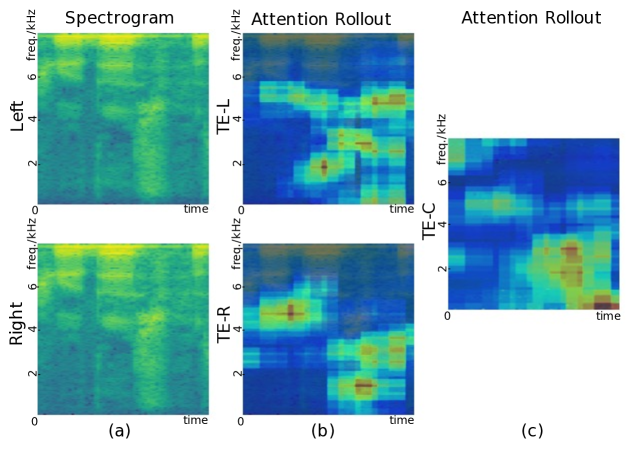
### Overview
The image presents three heatmaps visualizing data related to frequency and time. The first heatmap (a) is labeled "Spectrogram" and shows data for "Left" and "Right" channels. The second and third heatmaps (b and c) are labeled "Attention Rollout" and show data for "TE-L", "TE-R", and "TE-C" respectively. All heatmaps share the same axes: frequency (0-6 kHz) on the y-axis and time on the x-axis. The color intensity represents the magnitude of the signal or attention.
### Components/Axes
* **X-axis:** Time (unscaled)
* **Y-axis:** Frequency (kHz), ranging from 0 to 6 kHz. Marked at 0, 2, 4, and 6.
* **Color Scale:** A gradient from dark blue (low magnitude) to yellow/white (high magnitude).
* **Heatmap (a):** "Spectrogram" with two subplots: "Left" (top) and "Right" (bottom).
* **Heatmap (b):** "Attention Rollout" with two subplots: "TE-L" (top) and "TE-R" (bottom).
* **Heatmap (c):** "Attention Rollout" with one subplot: "TE-C".
* **Labels:** (a), (b), (c) are labels for each heatmap.
### Detailed Analysis or Content Details
**Heatmap (a) - Spectrogram:**
* **Left Subplot:** Shows a relatively consistent signal across time, with a concentration of energy around 2-4 kHz. There are some vertical bands of higher intensity, suggesting transient events.
* **Right Subplot:** Similar to the left subplot, with energy concentrated around 2-4 kHz. There are also vertical bands of higher intensity, but they appear slightly different in timing and frequency compared to the left subplot.
**Heatmap (b) - Attention Rollout:**
* **TE-L Subplot:** Shows a few distinct areas of high attention. One prominent area is around time = 0.5 and frequency = 2 kHz. Another is around time = 1.5 and frequency = 4 kHz.
* **TE-R Subplot:** Shows a similar pattern to TE-L, with high attention areas around time = 0.5 and frequency = 2 kHz, and time = 1.5 and frequency = 4 kHz. The intensity of these areas appears comparable to TE-L.
**Heatmap (c) - Attention Rollout:**
* **TE-C Subplot:** Shows a few distinct areas of high attention. One prominent area is around time = 0.5 and frequency = 2 kHz. Another is around time = 1.5 and frequency = 4 kHz. There is also a smaller area of attention around time = 2.0 and frequency = 1 kHz.
### Key Observations
* The Spectrogram (a) shows continuous signal activity, while the Attention Rollout (b & c) highlights specific moments in time and frequency.
* The Attention Rollout heatmaps (b & c) show similar patterns of attention for TE-L and TE-R, suggesting correlated activity.
* The Attention Rollout heatmap (c) shows a slightly different pattern, with an additional attention area not present in TE-L or TE-R.
* The attention areas in the Attention Rollout heatmaps appear to correspond to the vertical bands of higher intensity in the Spectrogram.
### Interpretation
The image likely represents an analysis of audio data, where the Spectrogram shows the frequency content over time, and the Attention Rollout heatmaps highlight specific features or events that are deemed important by an attention mechanism. The "TE" labels likely refer to different processing stages or components within the attention model (e.g., Transformer Encoder).
The similarity between TE-L and TE-R suggests that the attention mechanism is responding to features present in both the left and right audio channels. The differences in TE-C could indicate that this component is capturing additional information or processing the audio in a different way.
The correlation between the attention areas and the Spectrogram's vertical bands suggests that the attention mechanism is focusing on transient events or specific frequency components within the audio signal. This could be useful for tasks such as sound event detection or speech recognition. The image demonstrates how attention mechanisms can be used to selectively focus on relevant parts of an audio signal, potentially improving the performance of audio processing systems.