## Line Chart: Response Length/Mean
### Overview
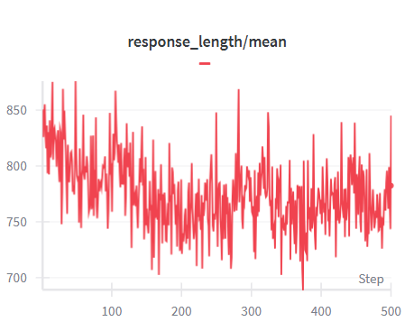
The image is a line chart showing the trend of "response_length/mean" over "Step". The chart displays fluctuations in response length, with an overall decreasing trend in the initial steps, followed by stabilization.
### Components/Axes
* **Title:** response\_length/mean
* **X-axis:** Step, with markers at approximately 0, 100, 200, 300, 400, and 500.
* **Y-axis:** Values ranging from 700 to 850, with markers at 700, 750, 800, and 850.
* **Legend:** A red line represents "response\_length/mean". The legend is located at the top of the chart, directly below the title.
### Detailed Analysis
* **Data Series:** response\_length/mean (Red Line)
* **Trend:** The red line shows a fluctuating pattern. Initially, the line decreases from approximately 840 at step 0 to around 750 at step 100. After step 100, the line fluctuates between approximately 720 and 800, showing a relatively stable trend.
* **Data Points:**
* Step 0: Approximately 840
* Step 100: Approximately 750
* Step 200: Approximately 770
* Step 300: Approximately 730
* Step 400: Approximately 760
* Step 500: Approximately 780
### Key Observations
* The response length/mean experiences a significant drop in the first 100 steps.
* After the initial drop, the response length/mean stabilizes and fluctuates within a narrower range.
* There are no significant outliers after the initial drop.
### Interpretation
The chart suggests that the response length/mean decreases initially, possibly due to an initial learning phase or adjustment. After the initial phase, the response length/mean stabilizes, indicating a more consistent behavior. The fluctuations after the initial drop could be due to variations in the input data or the model's internal dynamics. The overall trend suggests that the system reaches a stable state after the initial adjustment period.