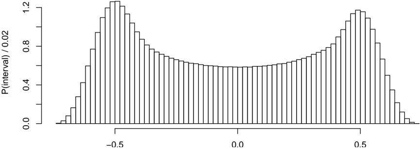
## Histogram: Bimodal Probability Distribution
### Overview
The image displays a histogram representing a probability distribution. The chart shows a bimodal (two-peaked) distribution, with the highest frequencies occurring symmetrically around the values -0.5 and 0.5 on the horizontal axis. The distribution dips to its lowest point at the center (0.0).
### Components/Axes
* **Chart Type:** Histogram (bar chart representing frequency distribution).
* **Y-Axis (Vertical):**
* **Label:** `P(interval) / 0.02`
* **Scale:** Linear, ranging from 0.0 to 1.2.
* **Tick Marks:** Major ticks at 0.0, 0.4, 0.8, and 1.2.
* **Interpretation:** The label suggests the plotted value is a probability density. The division by 0.02 likely indicates the bin width used to create the histogram, meaning the area of each bar (height * 0.02) represents the probability for that interval.
* **X-Axis (Horizontal):**
* **Label:** None explicitly stated. The axis represents a continuous numerical variable.
* **Scale:** Linear.
* **Tick Marks:** Major ticks labeled at -0.5, 0.0, and 0.5.
* **Range:** The visible data spans approximately from -0.7 to +0.7.
* **Legend:** None present.
* **Title:** None present.
### Detailed Analysis
* **Distribution Shape:** The histogram is symmetric and bimodal.
* **Peak Locations:**
* **Left Peak:** Centered approximately at x = -0.5. The tallest bars in this peak reach a y-value of approximately 1.2.
* **Right Peak:** Centered approximately at x = 0.5. The tallest bars in this peak also reach a y-value of approximately 1.2.
* **Central Trough:** The lowest point of the distribution is at x = 0.0, where the bar height is approximately 0.6.
* **Bar Characteristics:** The bars are of uniform width (consistent with the 0.02 bin width implied by the y-axis label). The height of the bars changes smoothly, creating a clear, continuous-looking distribution curve.
* **Trend Verification:** Moving from left to right:
1. From the far left (~-0.7), bar heights increase steadily, forming the left slope of the first peak.
2. Heights peak around -0.5.
3. Heights then decrease steadily towards the center, reaching a minimum at 0.0.
4. From the center, heights increase again, forming the right slope of the second peak.
5. Heights peak again around 0.5.
6. Finally, heights decrease steadily towards the far right (~+0.7).
### Key Observations
1. **Bimodality:** The most prominent feature is the presence of two distinct, symmetric modes. This indicates the underlying data or phenomenon has two prevalent states or clusters.
2. **Symmetry:** The distribution is highly symmetric around the central point (x=0.0). The shape, peak heights, and spread are nearly identical on both sides.
3. **Central Dip:** The probability density at the center (x=0.0) is roughly half that of the peaks (~0.6 vs. ~1.2).
4. **Range:** The significant data is contained within the interval of approximately [-0.6, 0.6], with tails tapering off beyond these points.
### Interpretation
This histogram visualizes the probability density of a continuous variable. The bimodal shape is the critical piece of information.
* **What it Suggests:** The data is not drawn from a single, normal (bell-shaped) distribution. Instead, it suggests the population is a mixture of two distinct sub-populations, each with its own central tendency (mean) located near -0.5 and 0.5. Examples could include the distribution of a measurement taken from two different species, the response times for two different cognitive processes, or the output of a system with two stable operating modes.
* **Relationship Between Elements:** The x-axis represents the measured variable, and the y-axis (`P(interval)/0.02`) quantifies the likelihood of observing a value within each small bin of that variable. The symmetric, mirror-image relationship between the left and right halves implies an equal weighting or balance between the two hypothesized sub-populations.
* **Anomalies/Notable Points:** There are no apparent anomalies; the distribution is very clean and smooth. The perfect symmetry might suggest this is a theoretical or simulated distribution rather than raw empirical data, which often contains noise and imperfections. The specific values (-0.5, 0.5) for the peaks are notable and would be key parameters in any model describing this data.