## Bar Chart: Probability Distribution
### Overview
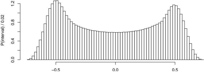
The image is a bar chart representing a probability distribution. The x-axis represents intervals, and the y-axis represents the probability of those intervals, normalized by 0.02. The distribution is bimodal, with peaks near -0.5 and 0.5, and a minimum around 0.0.
### Components/Axes
* **X-axis:** Intervals, with markers at -0.5 and 0.5, and 0.0 in the center.
* **Y-axis:** P(interval) / 0.02, with markers at 0.0, 0.4, 0.8, and 1.2.
### Detailed Analysis
The chart consists of vertical bars representing the probability density for each interval. The bars are all the same width.
* **Trend:** The probability density starts low near x = -0.7, increases to a peak around x = -0.5, decreases to a minimum around x = 0.0, and then increases again to a peak around x = 0.5, before decreasing again towards x = 0.7.
* **Values:**
* At x = -0.5, P(interval) / 0.02 is approximately 1.2.
* At x = 0.0, P(interval) / 0.02 is approximately 0.6.
* At x = 0.5, P(interval) / 0.02 is approximately 1.2.
### Key Observations
* The distribution is symmetric around x = 0.
* The probability density is highest near x = -0.5 and x = 0.5.
* The probability density is lowest near x = 0.0.
### Interpretation
The chart represents a bimodal probability distribution, indicating that values near -0.5 and 0.5 are more likely than values near 0. This type of distribution can arise in various contexts, such as mixtures of distributions or systems with two stable states. The normalization by 0.02 suggests that the interval width used for calculating the probabilities is 0.02.