\n
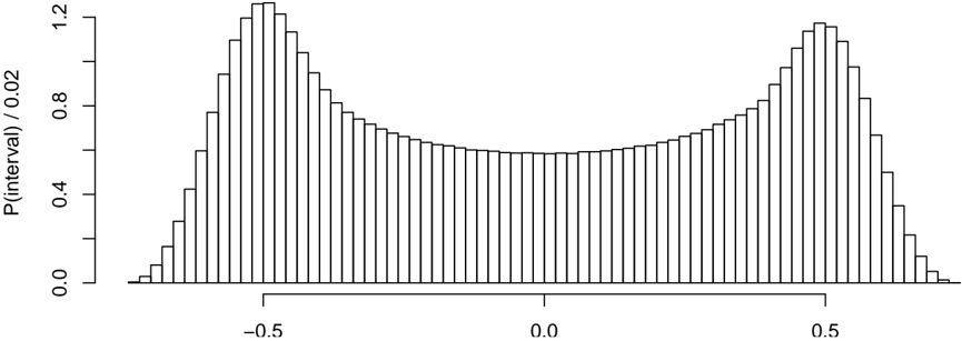
## Chart: Histogram of a Distribution
### Overview
The image presents a histogram visualizing the distribution of a dataset. The histogram displays the probability density (P(interval) / 0.02) on the y-axis against an unspecified value on the x-axis. The distribution appears roughly symmetrical and unimodal, resembling a normal distribution.
### Components/Axes
* **X-axis:** The x-axis represents the values of the dataset. The scale ranges from approximately -0.7 to 0.7, with markings at -0.5, 0.0, and 0.5. The axis is not explicitly labeled with units.
* **Y-axis:** The y-axis is labeled "P(interval) / 0.02", representing the probability density. The scale ranges from 0.0 to approximately 1.2.
* **Histogram Bars:** The histogram consists of numerous vertical bars, each representing the frequency of values within a specific interval.
### Detailed Analysis
The histogram shows a bell-shaped curve, indicating a symmetrical distribution.
* **Central Peak:** The highest frequency of values occurs around the center of the distribution, approximately at 0.0. The probability density at this point is around 1.15.
* **Left Side:** The histogram slopes downward from the central peak towards the left (negative x-values). The probability density decreases as the x-value decreases. At x = -0.5, the probability density is approximately 0.8. At x = -0.7, the probability density is approximately 0.1.
* **Right Side:** The histogram slopes downward from the central peak towards the right (positive x-values), mirroring the left side. The probability density decreases as the x-value increases. At x = 0.5, the probability density is approximately 0.8. At x = 0.7, the probability density is approximately 0.1.
* **Symmetry:** The left and right sides of the histogram are approximately symmetrical around the central peak.
* **Intervals:** The histogram appears to be constructed using relatively narrow intervals, resulting in a smooth curve.
### Key Observations
* The distribution is unimodal, meaning it has a single peak.
* The distribution is approximately symmetrical.
* The data is concentrated around the center (approximately 0.0).
* The probability density decreases rapidly as you move away from the center in either direction.
### Interpretation
The histogram suggests that the underlying data follows a normal or Gaussian distribution. The symmetry indicates that the data is evenly distributed around the mean. The concentration of data around the center suggests that values close to the mean are more common than values further away. The shape of the distribution implies that extreme values (far from the mean) are relatively rare. Without knowing the context of the data, it's difficult to provide a more specific interpretation. However, the histogram provides a clear visual representation of the data's distribution, which can be useful for statistical analysis and modeling. The y-axis scaling (P(interval) / 0.02) suggests that the actual probability density is scaled down by a factor of 0.02. This could be due to the bin width or other data processing steps.