\n
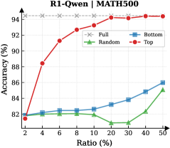
## Line Chart: R1-Qwen | MATH500 Accuracy vs. Ratio
### Overview
This line chart displays the accuracy of different sampling methods (Full, Random, Bottom, Top) on the MATH500 dataset, as a function of the ratio of data used. The x-axis represents the ratio of data used (in percentage), and the y-axis represents the accuracy (in percentage).
### Components/Axes
* **Title:** R1-Qwen | MATH500
* **X-axis Label:** Ratio (%)
* **Y-axis Label:** Accuracy (%)
* **Legend:**
* Full (represented by a grey dashed line with 'x' markers)
* Random (represented by a green solid line with triangle markers)
* Bottom (represented by a blue solid line with square markers)
* Top (represented by a red solid line with circle markers)
* **X-axis Markers:** 2, 4, 6, 8, 10, 20, 30, 40, 50
* **Y-axis Markers:** 80, 82, 84, 86, 88, 90, 92, 94
### Detailed Analysis
* **Top (Red Line):** The Top line starts at approximately 82% accuracy at a ratio of 2%, then rapidly increases to approximately 94% accuracy at a ratio of 10%. It plateaus around 94-95% accuracy from a ratio of 10% to 50%.
* **Bottom (Blue Line):** The Bottom line starts at approximately 82% accuracy at a ratio of 2%. It gradually increases to approximately 86% accuracy at a ratio of 50%, with a relatively linear trend.
* **Full (Grey Dashed Line):** The Full line remains relatively constant at approximately 94% accuracy across all ratios, from 2% to 50%.
* **Random (Green Line):** The Random line starts at approximately 82% accuracy at a ratio of 2%. It initially fluctuates around 82-83% until a ratio of 10%, then decreases to approximately 81% at a ratio of 20%. It then increases to approximately 85% at a ratio of 50%.
Here's a more detailed breakdown of the data points (approximate values):
| Ratio (%) | Top (Red) | Bottom (Blue) | Full (Grey) | Random (Green) |
|---|---|---|---|---|
| 2 | 82 | 82 | 94 | 82 |
| 4 | 88 | 83 | 94 | 82 |
| 6 | 91 | 83 | 94 | 82 |
| 8 | 92.5 | 83.5 | 94 | 82.5 |
| 10 | 94 | 84 | 94 | 82 |
| 20 | 94 | 84.5 | 94 | 81 |
| 30 | 94 | 85 | 94 | 82 |
| 40 | 94 | 85 | 94 | 84 |
| 50 | 94 | 86 | 94 | 85 |
### Key Observations
* The "Top" sampling method achieves the highest accuracy, especially at lower ratios.
* The "Full" method maintains a consistently high accuracy across all ratios.
* The "Random" method exhibits the most variability in accuracy.
* The "Bottom" method shows a steady, but relatively slow, increase in accuracy.
* The "Top" method demonstrates diminishing returns after a ratio of 10%, as accuracy plateaus.
### Interpretation
The data suggests that selecting the "top" performing samples (presumably based on some criteria) is highly effective for achieving high accuracy on the MATH500 dataset, particularly when only a small portion of the data is available. The "Full" method provides a baseline of high accuracy, but doesn't offer significant improvement over the "Top" method. The "Random" method is the least consistent, indicating that random sampling is not an optimal strategy for this task. The "Bottom" method shows some improvement with increasing data ratio, but remains significantly lower in accuracy than the "Top" and "Full" methods.
The plateauing of the "Top" method after a ratio of 10% suggests that the most informative samples are identified early on, and adding more data beyond that point doesn't yield substantial gains. This could indicate that the MATH500 dataset has a hierarchical structure, where a small subset of samples contains the majority of the relevant information. The difference between the "Top" and "Full" methods suggests that the full dataset contains some noise or less informative samples.