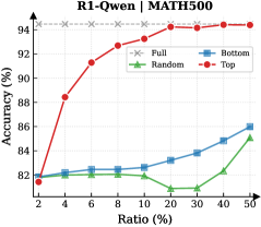
## Line Chart: R1-Qwen | MATH500
### Overview
The chart illustrates the relationship between "Ratio (%)" (x-axis) and "Accuracy (%)" (y-axis) across four distinct data series: Full, Bottom, Random, and Top. The y-axis ranges from 80% to 95%, while the x-axis spans from 2% to 50% in increments. The legend is positioned in the upper-right quadrant, with color-coded labels for each series.
### Components/Axes
- **X-axis (Ratio %)**: Labeled "Ratio (%)", with markers at 2, 4, 6, 8, 10, 20, 30, 40, and 50.
- **Y-axis (Accuracy %)**: Labeled "Accuracy (%)", with markers at 82, 84, 86, 88, 90, 92, and 94.
- **Legend**: Located in the upper-right corner, with the following mappings:
- **Full**: Gray dashed line (constant value).
- **Bottom**: Blue solid line.
- **Random**: Green solid line.
- **Top**: Red solid line.
### Detailed Analysis
1. **Full (Gray Dashed Line)**:
- Maintains a constant accuracy of **94%** across all ratios.
- Positioned at the top of the chart, unaffected by ratio changes.
2. **Top (Red Solid Line)**:
- Starts at **~82%** at 2% ratio.
- Sharp upward trend to **~94%** by 4% ratio.
- Plateaus near **94%** for ratios ≥4%.
- Key data points:
- 2%: ~82%
- 4%: ~88%
- 8%: ~92%
- 10%: ~93%
- 20%: ~94%
- 30%: ~94%
- 40%: ~94%
- 50%: ~94%
3. **Bottom (Blue Solid Line)**:
- Begins at **~82%** at 2% ratio.
- Gradual upward trend to **~86%** at 50% ratio.
- Key data points:
- 2%: ~82%
- 4%: ~82.5%
- 8%: ~83%
- 10%: ~83.2%
- 20%: ~84%
- 30%: ~84.5%
- 40%: ~85%
- 50%: ~86%
4. **Random (Green Solid Line)**:
- Stable at **~82%** until 40% ratio.
- Sudden jump to **~85%** at 50% ratio.
- Key data points:
- 2%: ~82%
- 4%: ~82.2%
- 8%: ~82.1%
- 10%: ~82%
- 20%: ~81.5%
- 30%: ~81.8%
- 40%: ~82.5%
- 50%: ~85%
### Key Observations
- **Top Series**: Dominates performance, achieving near-peak accuracy (94%) after a rapid initial increase.
- **Bottom Series**: Shows consistent but slower improvement compared to Top.
- **Random Series**: Exhibits minimal variation until a late-stage spike at 50% ratio.
- **Full Series**: Represents a theoretical upper bound, unaffected by ratio adjustments.
### Interpretation
The chart suggests that the "Top" strategy achieves the highest accuracy, particularly after a 4% ratio threshold, while the "Full" series represents an idealized baseline. The "Random" series underperforms until a late-stage anomaly, and the "Bottom" series demonstrates steady but suboptimal growth. The "Full" line’s constancy implies it may represent a control or reference model, while the "Top" line’s sharp rise indicates a highly effective, ratio-sensitive approach. The "Random" series’ late jump at 50% could signal an outlier or contextual factor not reflected in lower ratios.