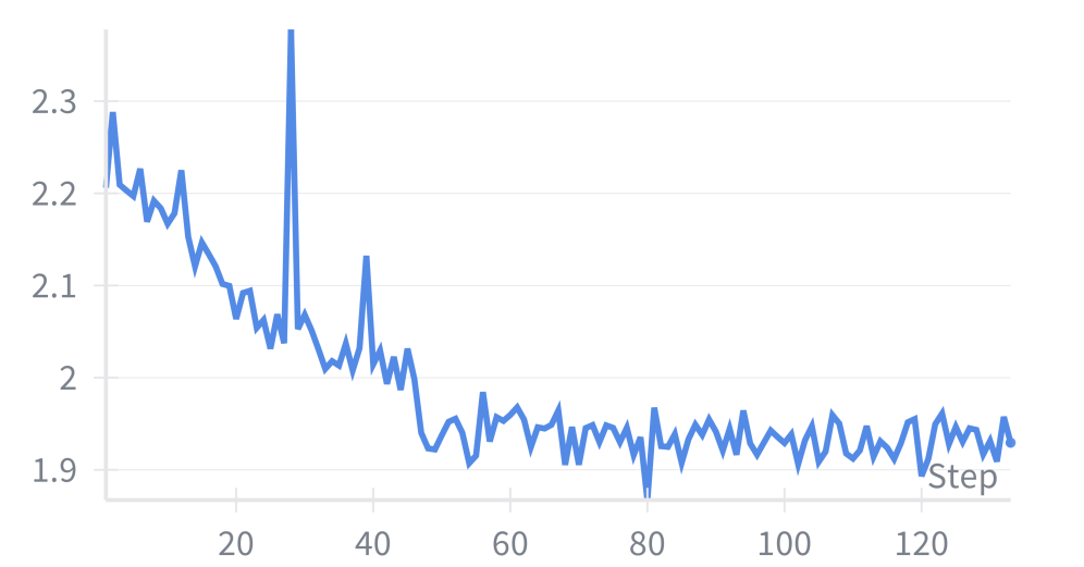
## Line Chart: Loss over Steps
### Overview
The image is a line chart showing the trend of a loss function over a number of steps. The x-axis represents the "Step" number, and the y-axis represents the loss value. The loss generally decreases over time, with some fluctuations.
### Components/Axes
* **X-axis:** "Step". The x-axis ranges from approximately 0 to 120, with tick marks at intervals of 20.
* **Y-axis:** The y-axis ranges from 1.9 to 2.3, with tick marks at intervals of 0.1.
* **Data Series:** A single blue line represents the loss value at each step.
### Detailed Analysis
* **Initial Trend:** The blue line starts at approximately 2.28 at step 0. It decreases with some fluctuations until around step 60.
* **Fluctuations:** There are notable spikes at approximately step 35 and step 40.
* **Stabilization:** After step 60, the line stabilizes and fluctuates around a value of approximately 1.95.
**Specific Data Points (Approximate):**
* Step 0: Loss ≈ 2.28
* Step 10: Loss ≈ 2.18
* Step 20: Loss ≈ 2.08
* Step 35: Loss ≈ 2.13
* Step 40: Loss ≈ 2.00
* Step 60: Loss ≈ 1.94
* Step 80: Loss ≈ 1.95
* Step 100: Loss ≈ 1.94
* Step 120: Loss ≈ 1.93
### Key Observations
* The loss function decreases significantly in the first 60 steps.
* The loss function stabilizes after 60 steps, indicating convergence.
* There are some spikes in the loss function before it stabilizes.
### Interpretation
The chart illustrates the training process of a model, where the loss function is being minimized over time. The initial decrease in loss indicates that the model is learning effectively. The stabilization of the loss function suggests that the model has converged and is no longer improving significantly. The spikes in the loss function could be due to various factors, such as changes in the training data or learning rate. Overall, the chart shows a successful training process with a decreasing loss function that eventually converges.