\n
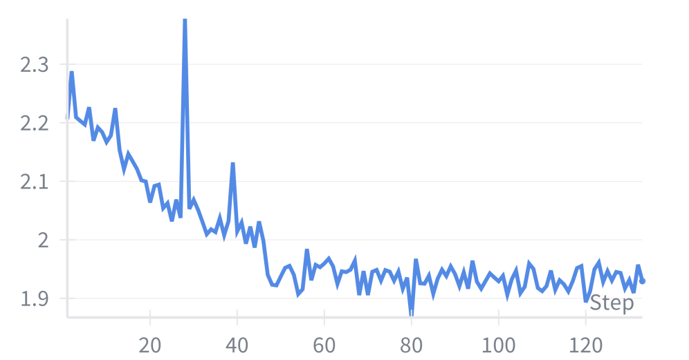
## Line Chart: Value Trend Over Steps
### Overview
The image presents a line chart depicting the trend of a single value over a series of steps. The x-axis represents the step number, ranging from 0 to approximately 125. The y-axis represents the value, ranging from approximately 1.9 to 2.3. The chart shows a decreasing trend initially, followed by stabilization with some fluctuations.
### Components/Axes
* **X-axis:** "Step" - Represents the step number. Scale is linear, ranging from 0 to 125.
* **Y-axis:** Value - Represents the measured value. Scale is linear, ranging from approximately 1.9 to 2.3.
* **Data Series:** A single blue line representing the value trend.
* **Legend:** No explicit legend is present, but the single blue line is the sole data series.
### Detailed Analysis
The line chart begins at approximately 2.28 at Step 0. The line initially exhibits a steep downward trend until around Step 20, where the value reaches approximately 2.05. From Step 20 to Step 40, the line continues to decrease, but at a slower rate, reaching a minimum value of approximately 1.95 at Step 40. There is a sharp peak at Step 42, reaching approximately 2.25. After the peak, the line quickly returns to around 1.95. From Step 40 to Step 125, the line fluctuates around a value of approximately 1.98, with minor oscillations.
Here's a breakdown of approximate values at specific steps:
* Step 0: 2.28
* Step 10: 2.15
* Step 20: 2.05
* Step 30: 2.02
* Step 40: 1.95
* Step 42: 2.25
* Step 50: 1.98
* Step 60: 1.97
* Step 70: 1.93
* Step 80: 1.95
* Step 90: 1.96
* Step 100: 1.97
* Step 110: 1.95
* Step 120: 1.98
* Step 125: 1.96
### Key Observations
* The most significant feature is the initial rapid decrease in value.
* The sharp peak at Step 42 is a notable outlier.
* After Step 40, the value stabilizes, fluctuating within a narrow range.
* The fluctuations after Step 40 appear somewhat random, with no clear upward or downward trend.
### Interpretation
The data suggests a process that initially experiences a significant reduction in value, potentially due to a rapid change or decay. The stabilization after Step 40 indicates that the process has reached a steady state or equilibrium. The outlier at Step 42 could represent an external disturbance or a temporary anomaly in the process. The fluctuations around the stabilized value suggest that the process is subject to minor variations or noise. The chart could represent the learning rate of a model during training, where the initial decrease represents rapid learning, the peak represents a potential overfitting event, and the stabilization represents convergence. Alternatively, it could represent the decay of a signal over time, with the peak representing a transient interference. Without further context, it is difficult to determine the precise meaning of the data, but the chart clearly demonstrates a dynamic process with distinct phases of change and stability.