\n
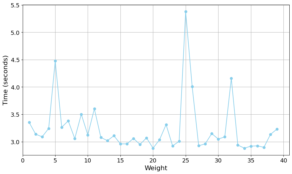
## Line Chart: Time vs. Weight
### Overview
The image presents a line chart illustrating the relationship between "Weight" and "Time (seconds)". The chart displays a single data series as a light blue line with marker points. The x-axis represents Weight, ranging from 0 to 40, and the y-axis represents Time in seconds, ranging from 2.5 to 5.5. The chart shows fluctuations in time as weight changes.
### Components/Axes
* **X-axis Label:** Weight
* **Y-axis Label:** Time (seconds)
* **X-axis Range:** 0 to 40
* **Y-axis Range:** 2.5 to 5.5
* **Data Series:** A single light blue line with marker points.
* **Gridlines:** A grid of light gray lines is present to aid in reading values.
### Detailed Analysis
The line chart shows a fluctuating relationship between weight and time. The line begins at approximately (0, 3.2).
Here's a breakdown of approximate data points, noting the visual trend:
* **(0, 3.2):** The line starts at approximately 3.2 seconds.
* **(2, 4.5):** The line sharply increases to approximately 4.5 seconds.
* **(5, 3.2):** The line decreases to approximately 3.2 seconds.
* **(8, 3.6):** The line increases to approximately 3.6 seconds.
* **(12, 3.2):** The line decreases to approximately 3.2 seconds.
* **(15, 3.0):** The line decreases to approximately 3.0 seconds.
* **(18, 3.2):** The line increases to approximately 3.2 seconds.
* **(20, 2.9):** The line decreases to approximately 2.9 seconds.
* **(24, 3.4):** The line increases to approximately 3.4 seconds.
* **(26, 5.3):** The line sharply increases to approximately 5.3 seconds.
* **(28, 3.2):** The line sharply decreases to approximately 3.2 seconds.
* **(30, 3.1):** The line slightly decreases to approximately 3.1 seconds.
* **(32, 4.2):** The line increases to approximately 4.2 seconds.
* **(35, 3.0):** The line decreases to approximately 3.0 seconds.
* **(38, 3.2):** The line increases to approximately 3.2 seconds.
* **(40, 3.4):** The line increases to approximately 3.4 seconds.
The line generally fluctuates between 3.0 and 4.0 seconds for most of the weight range, with two significant peaks at approximately Weight = 2 and Weight = 26.
### Key Observations
* **Peaks:** There are two prominent peaks in the data, one around Weight = 2 and another around Weight = 26. These represent the highest time values observed.
* **Fluctuations:** The line exhibits significant fluctuations, indicating a non-linear relationship between weight and time.
* **Minimum:** The lowest time value is approximately 2.9 seconds, occurring around Weight = 20.
* **Trend:** The overall trend is relatively stable, with fluctuations around a central value.
### Interpretation
The chart suggests that the time taken is sensitive to changes in weight. The peaks at Weight = 2 and Weight = 26 could indicate critical weight values where the process being measured experiences a slowdown or requires more time. The fluctuations suggest that the relationship between weight and time is not constant and may be influenced by other factors not represented in this chart. The data could represent the time taken to complete a task or process as a function of the weight involved. The sharp increase at Weight = 26 is particularly noteworthy and might warrant further investigation to understand the underlying cause. The relatively stable period between weights 12 and 20 suggests a more consistent process within that weight range.