\n
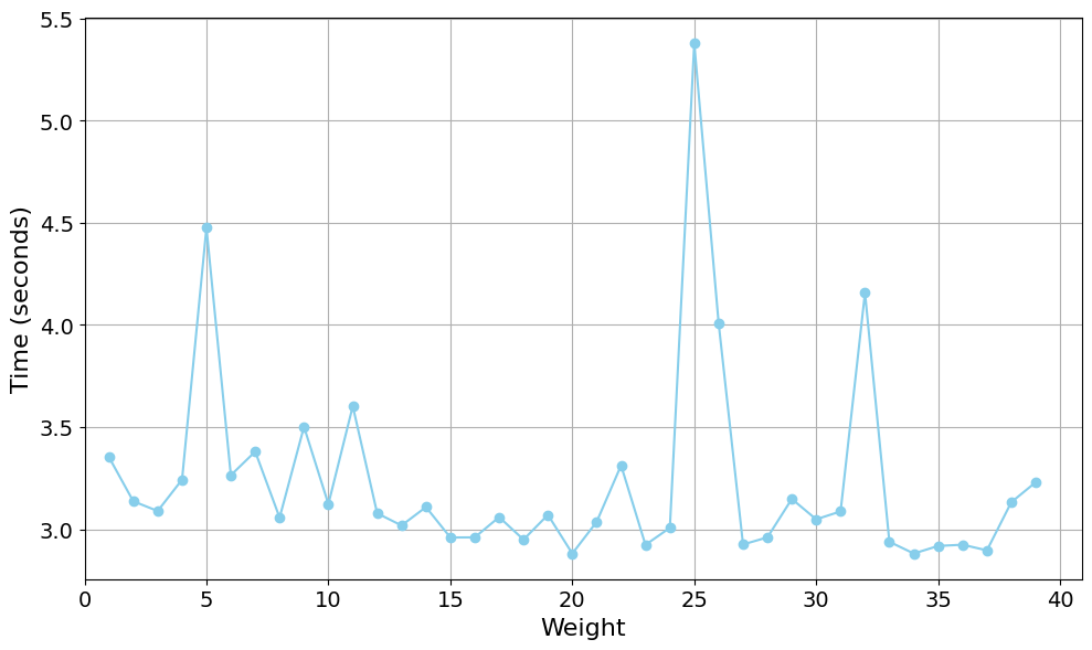
## Line Chart: Weight vs. Time
### Overview
The image displays a line chart plotting a single data series showing the relationship between a variable labeled "Weight" on the horizontal axis and "Time (seconds)" on the vertical axis. The chart features a light blue line connecting circular data points against a white background with a gray grid. The data exhibits a generally stable baseline with several prominent, sharp spikes.
### Components/Axes
* **Chart Type:** Line chart with marked data points.
* **X-Axis (Horizontal):**
* **Label:** "Weight"
* **Scale:** Linear scale ranging from 0 to 40.
* **Major Tick Marks:** At intervals of 5 (0, 5, 10, 15, 20, 25, 30, 35, 40).
* **Y-Axis (Vertical):**
* **Label:** "Time (seconds)"
* **Scale:** Linear scale ranging from 3.0 to 5.5.
* **Major Tick Marks:** At intervals of 0.5 (3.0, 3.5, 4.0, 4.5, 5.0, 5.5).
* **Data Series:** A single series represented by a light blue line (`#7eb8da` approximate hex) with circular markers at each data point.
* **Legend:** None present.
* **Grid:** A light gray grid is present, aligned with the major tick marks on both axes.
### Detailed Analysis
The data series consists of approximately 39 points, one for each integer value of Weight from 1 to 39. The following table lists the approximate Time values for key points, derived from visual inspection of the chart. Values are estimates with an uncertainty of ±0.05 seconds.
| Weight (approx.) | Time (seconds, approx.) | Note |
| :--- | :--- | :--- |
| 1 | 3.35 | Starting point |
| 2 | 3.15 | |
| 3 | 3.10 | Local minimum |
| 4 | 3.25 | |
| **5** | **4.50** | **First major peak** |
| 6 | 3.27 | |
| 7 | 3.40 | |
| 8 | 3.05 | |
| 9 | 3.50 | |
| 10 | 3.12 | |
| 11 | 3.60 | Local peak |
| 12 | 3.08 | |
| 13 | 3.02 | |
| 14 | 3.10 | |
| 15 | 2.97 | |
| 16 | 2.97 | |
| 17 | 3.06 | |
| 18 | 2.96 | |
| 19 | 3.07 | |
| **20** | **2.90** | **Global minimum** |
| 21 | 3.05 | |
| 22 | 3.32 | |
| 23 | 2.93 | |
| 24 | 3.02 | |
| **25** | **5.40** | **Global maximum, sharpest peak** |
| 26 | 4.00 | |
| 27 | 2.93 | |
| 28 | 2.97 | |
| 29 | 3.15 | |
| 30 | 3.05 | |
| 31 | 3.09 | |
| **32** | **4.17** | **Third major peak** |
| 33 | 2.95 | |
| 34 | 2.90 | |
| 35 | 2.93 | |
| 36 | 2.94 | |
| 37 | 2.92 | |
| 38 | 3.13 | |
| 39 | 3.25 | Final point |
**Visual Trend Description:** The line maintains a relatively stable baseline, fluctuating primarily between 2.9 and 3.6 seconds for most weight values. This stable trend is interrupted by three distinct, sharp upward spikes. The most significant spike occurs at Weight=25, reaching the chart's maximum. A second major spike occurs at Weight=5, and a third, slightly smaller spike occurs at Weight=32. The line returns to its baseline range immediately after each spike.
### Key Observations
1. **Baseline Stability:** For approximately 85% of the data points (weights 1-4, 6-24, 27-31, 33-39), the time value remains within a narrow band of ~2.9 to 3.6 seconds.
2. **Three Anomalous Spikes:** The data is dominated by three outliers:
* **Weight 5:** Time jumps to ~4.5s.
* **Weight 25:** Time reaches the global maximum of ~5.4s.
* **Weight 32:** Time spikes to ~4.17s.
3. **Sharp Transitions:** The spikes are characterized by very steep ascents and descents, indicating the high time value is isolated to a specific weight or a very narrow range around it.
4. **Global Extremes:** The minimum time (~2.90s) occurs at Weight=20 and Weight=34. The maximum time (~5.40s) occurs at Weight=25.
### Interpretation
This chart likely visualizes the performance (in terms of processing or response time) of a system or algorithm as a function of an input parameter called "Weight." The "Weight" could represent problem size, data volume, a complexity parameter, or a physical weight in an experiment.
The data suggests the system has a consistent, predictable performance baseline for most input weights. However, it exhibits severe, localized performance degradation at three specific weight values (5, 25, and 32). These are not gradual slowdowns but sharp, significant increases in time.
**Potential Implications:**
* **Critical Thresholds:** The weights 5, 25, and 32 may represent critical thresholds, edge cases, or specific configurations that trigger an inefficient code path, a resource bottleneck (like cache thrashing), or a complex sub-routine within the system.
* **Non-Linear Behavior:** The relationship is highly non-linear. Doubling the weight from 20 to 40 does not double the time; instead, time remains low except at the specific problematic points.
* **Optimization Target:** For system optimization, investigating the processes occurring at weights 5, 25, and 32 would yield the highest performance improvement, as addressing these outliers would dramatically improve worst-case performance without affecting the already-efficient baseline.
The absence of a title or legend suggests this chart is likely part of a larger technical report or dashboard where context is provided externally. The clean, grid-based presentation is typical of output from data analysis libraries like Matplotlib or Seaborn in Python.