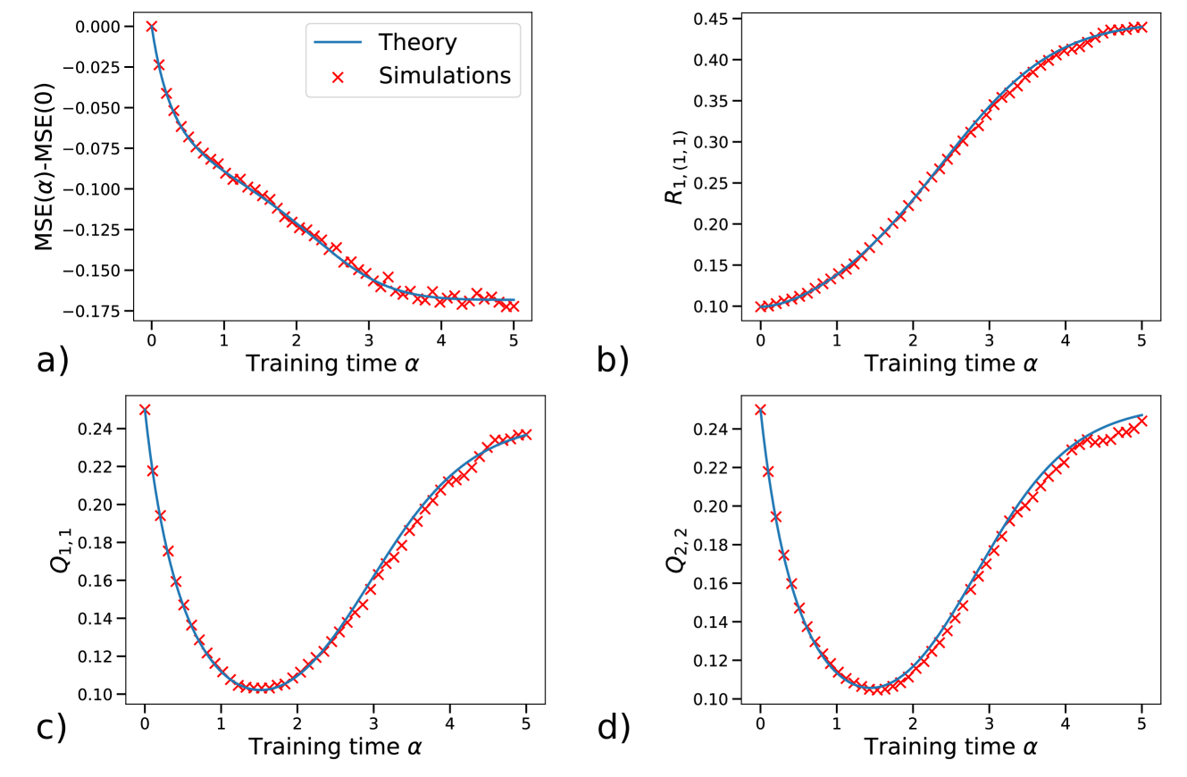
## Four Line Charts: Theory vs. Simulations
### Overview
The image contains four line charts arranged in a 2x2 grid. Each chart compares theoretical predictions (blue line) with simulation results (red 'x' markers) for different metrics as a function of "Training time α". The charts are labeled a), b), c), and d).
### Components/Axes
**General Chart Elements:**
* **X-axis:** Training time α, ranging from 0 to 5 in all four charts.
* **Legend:** Located in the top-left chart (a), indicating "Theory" (blue line) and "Simulations" (red 'x' markers). This legend applies to all four charts.
**Chart a):**
* **Y-axis:** MSE(α)-MSE(0), ranging from -0.175 to 0.000.
* **Description:** Shows the difference in Mean Squared Error (MSE) between a given training time α and the initial MSE (at α=0).
**Chart b):**
* **Y-axis:** R1,(1,1), ranging from 0.10 to 0.45.
* **Description:** Shows the value of R1,(1,1) as a function of training time.
**Chart c):**
* **Y-axis:** Q1,1, ranging from 0.10 to 0.24.
* **Description:** Shows the value of Q1,1 as a function of training time.
**Chart d):**
* **Y-axis:** Q2,2, ranging from 0.10 to 0.24.
* **Description:** Shows the value of Q2,2 as a function of training time.
### Detailed Analysis
**Chart a): MSE(α)-MSE(0) vs. Training time α**
* **Theory (blue line):** Starts at 0 and decreases rapidly, then plateaus around -0.17 after α=3.
* **Simulations (red 'x' markers):** Follow the same trend as the theory, with some fluctuations around the theoretical line.
* At α=0, MSE(α)-MSE(0) ≈ 0.00
* At α=1, MSE(α)-MSE(0) ≈ -0.075
* At α=3, MSE(α)-MSE(0) ≈ -0.16
* At α=5, MSE(α)-MSE(0) ≈ -0.17
**Chart b): R1,(1,1) vs. Training time α**
* **Theory (blue line):** Starts at approximately 0.10 and increases steadily, approaching 0.43 at α=5.
* **Simulations (red 'x' markers):** Closely match the theoretical line.
* At α=0, R1,(1,1) ≈ 0.10
* At α=1, R1,(1,1) ≈ 0.15
* At α=3, R1,(1,1) ≈ 0.32
* At α=5, R1,(1,1) ≈ 0.43
**Chart c): Q1,1 vs. Training time α**
* **Theory (blue line):** Starts at approximately 0.24, decreases to a minimum around 0.10 at α=1.5, then increases to approximately 0.23 at α=5.
* **Simulations (red 'x' markers):** Closely follow the theoretical line.
* At α=0, Q1,1 ≈ 0.24
* At α=1.5, Q1,1 ≈ 0.10
* At α=5, Q1,1 ≈ 0.23
**Chart d): Q2,2 vs. Training time α**
* **Theory (blue line):** Starts at approximately 0.24, decreases to a minimum around 0.10 at α=1.5, then increases to approximately 0.24 at α=5.
* **Simulations (red 'x' markers):** Closely follow the theoretical line.
* At α=0, Q2,2 ≈ 0.24
* At α=1.5, Q2,2 ≈ 0.10
* At α=5, Q2,2 ≈ 0.24
### Key Observations
* The theoretical predictions (blue lines) generally align well with the simulation results (red 'x' markers) across all four metrics.
* Chart a) shows a decrease in MSE difference as training time increases, indicating improved model performance.
* Chart b) shows an increase in R1,(1,1) with training time.
* Charts c) and d) show a similar trend: an initial decrease in Q1,1 and Q2,2, followed by an increase as training time increases.
### Interpretation
The charts demonstrate the relationship between training time (α) and various performance metrics (MSE difference, R1,(1,1), Q1,1, and Q2,2). The close agreement between the theoretical predictions and simulation results suggests that the theoretical model accurately captures the behavior of the system being simulated. The trends observed in each chart provide insights into how the model's performance and internal parameters evolve during the training process. Specifically, the decrease in MSE difference indicates that the model learns and improves its accuracy over time. The behavior of R1,(1,1), Q1,1, and Q2,2 suggests how the model's internal state changes as it learns. The initial decrease in Q1,1 and Q2,2, followed by an increase, might indicate an initial phase of parameter adjustment followed by a later phase of convergence or stabilization.