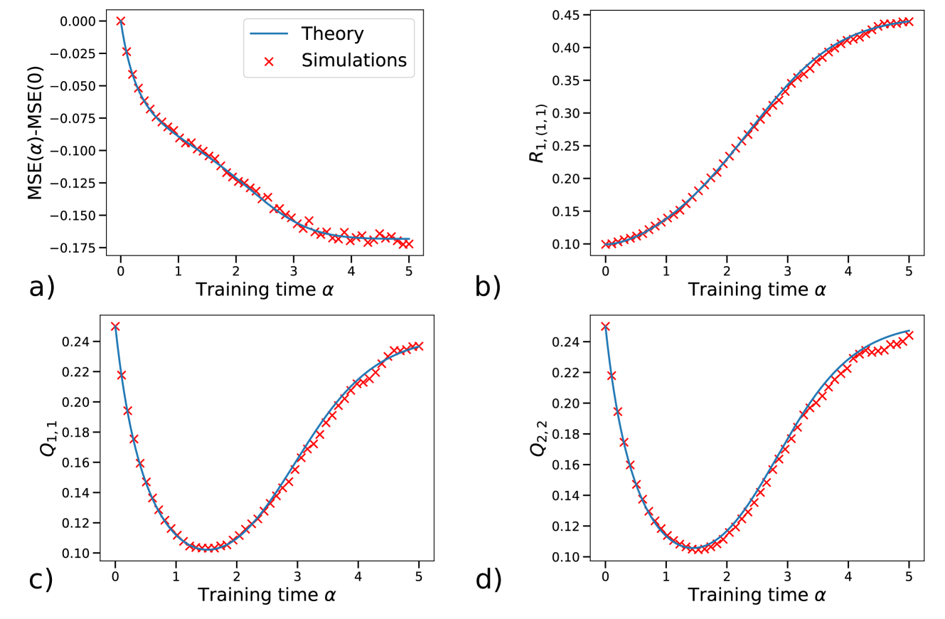
\n
## Charts: Convergence Analysis of Training Dynamics
### Overview
The image presents four separate charts (labeled a, b, c, and d) illustrating the convergence of training dynamics over time. Each chart plots a different metric against "Training time α". The charts compare theoretical predictions (represented by solid lines) with simulation results (represented by red 'x' markers).
### Components/Axes
All four charts share the following components:
* **X-axis:** Labeled "Training time α", ranging from approximately 0 to 5.
* **Legend:** Located in the top-right corner of each chart.
* "Theory" - Represented by a solid blue line.
* "Simulations" - Represented by red 'x' markers.
Each chart also has a unique Y-axis label:
* **a):** "MSE(ω)-MSE(0)" - ranging from approximately -0.000 to -0.175
* **b):** "R<sub>1,1</sub>(L,1)" - ranging from approximately 0.10 to 0.45
* **c):** "Q<sub>1,1</sub>" - ranging from approximately 0.12 to 0.24
* **d):** "Q<sub>2,2</sub>" - ranging from approximately 0.10 to 0.24
### Detailed Analysis or Content Details
**a) MSE(ω)-MSE(0) vs. Training time α**
* **Trend:** The simulation data (red 'x' markers) and the theoretical curve (blue line) both exhibit a decreasing trend, indicating a reduction in the difference between the current Mean Squared Error (MSE) and the initial MSE as training time increases. The rate of decrease slows down as time progresses.
* **Data Points (approximate):**
* α = 0: MSE(ω)-MSE(0) ≈ -0.000
* α = 1: MSE(ω)-MSE(0) ≈ -0.050
* α = 2: MSE(ω)-MSE(0) ≈ -0.120
* α = 3: MSE(ω)-MSE(0) ≈ -0.150
* α = 4: MSE(ω)-MSE(0) ≈ -0.160
* α = 5: MSE(ω)-MSE(0) ≈ -0.165
**b) R<sub>1,1</sub>(L,1) vs. Training time α**
* **Trend:** Both the simulation data and the theoretical curve show an increasing trend, suggesting that the value of R<sub>1,1</sub>(L,1) grows with training time. The rate of increase slows down as time progresses.
* **Data Points (approximate):**
* α = 0: R<sub>1,1</sub>(L,1) ≈ 0.10
* α = 1: R<sub>1,1</sub>(L,1) ≈ 0.20
* α = 2: R<sub>1,1</sub>(L,1) ≈ 0.30
* α = 3: R<sub>1,1</sub>(L,1) ≈ 0.37
* α = 4: R<sub>1,1</sub>(L,1) ≈ 0.40
* α = 5: R<sub>1,1</sub>(L,1) ≈ 0.42
**c) Q<sub>1,1</sub> vs. Training time α**
* **Trend:** Both the simulation data and the theoretical curve initially decrease and then increase, forming a U-shaped curve. This suggests that Q<sub>1,1</sub> initially decreases with training time, reaches a minimum, and then starts to increase.
* **Data Points (approximate):**
* α = 0: Q<sub>1,1</sub> ≈ 0.24
* α = 1: Q<sub>1,1</sub> ≈ 0.20
* α = 2: Q<sub>1,1</sub> ≈ 0.16
* α = 3: Q<sub>1,1</sub> ≈ 0.18
* α = 4: Q<sub>1,1</sub> ≈ 0.21
* α = 5: Q<sub>1,1</sub> ≈ 0.23
**d) Q<sub>2,2</sub> vs. Training time α**
* **Trend:** Similar to chart c, both the simulation data and the theoretical curve exhibit a U-shaped curve, indicating that Q<sub>2,2</sub> initially decreases, reaches a minimum, and then increases with training time.
* **Data Points (approximate):**
* α = 0: Q<sub>2,2</sub> ≈ 0.24
* α = 1: Q<sub>2,2</sub> ≈ 0.18
* α = 2: Q<sub>2,2</sub> ≈ 0.14
* α = 3: Q<sub>2,2</sub> ≈ 0.16
* α = 4: Q<sub>2,2</sub> ≈ 0.20
* α = 5: Q<sub>2,2</sub> ≈ 0.22
### Key Observations
* In all charts, the simulation data closely follows the theoretical predictions, indicating a good agreement between the model and the simulations.
* The MSE difference (chart a) consistently decreases, suggesting that the model is learning and improving its performance.
* R<sub>1,1</sub>(L,1) (chart b) increases with training time, potentially indicating a growing correlation or relationship between certain parameters.
* Q<sub>1,1</sub> and Q<sub>2,2</sub> (charts c and d) exhibit non-monotonic behavior, suggesting a more complex dynamic where these parameters initially decrease and then increase during training.
### Interpretation
The charts demonstrate the convergence behavior of a training process. The close alignment between the "Theory" and "Simulations" suggests that the underlying mathematical model accurately captures the dynamics of the system being trained. The decreasing MSE (chart a) confirms that the training process is leading to improved performance. The behavior of Q<sub>1,1</sub> and Q<sub>2,2</sub> (charts c and d) suggests that the training process involves a period of initial adjustment followed by a stabilization or refinement phase. The increasing R<sub>1,1</sub>(L,1) (chart b) could indicate the development of a stronger relationship between certain variables as training progresses. Overall, the data suggests a well-behaved and converging training process, with the simulations validating the theoretical predictions. The U-shaped curves in charts c and d could be indicative of an optimization process that initially explores different parameter configurations before settling into a more stable state.